skip to Main Content

I am trying to create a button with a plus icon centered in the middle however if I use react-native-vector-icons then it has extra spacing underneath and if I use <Text>+</Text> it has extra spacing above. I have tried the solutions from React Native: Perfectly align Text in circle but nothing has worked yet.

Button code:

<View>
  <Pressable
    style={styles.button}
    onPress={() => navigation.navigate('Add Habit')}>
    <Icon name="plus" size={40} color={'black'} />
  </Pressable>
</View>


const styles = StyleSheet.create({
  button: {
    backgroundColor: '#219ebc',
    width: 75,
    height: 75,
    borderRadius: 100,
    display: 'flex',
    justifyContent: 'center',
    alignItems: 'center',
    elevation: 3,
    position: 'absolute',
    bottom: 10,
    right: 10,
    lineHeight: 0,
  },
});

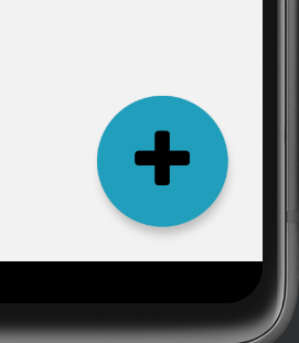
image of button not centrally aligned

2

Answers


  1. import React from 'react';
    import { View, StyleSheet, Pressable } from 'react-native';
    import Icon from 'react-native-vector-icons/FontAwesome'; // Assuming you're using FontAwesome icons
    
    const AddButton = ({ navigation }) => {
      return (
        <View style={styles.container}>
          <Pressable
            style={styles.button}
            onPress={() => navigation.navigate('Add Habit')}>
            <Icon name="plus" size={40} color={'black'} />
          </Pressable>
        </View>
      );
    };
    
    const styles = StyleSheet.create({
      container: {
        position: 'absolute',
        bottom: 10,
        right: 10,
      },
      button: {
        backgroundColor: '#219ebc',
        width: 75,
        height: 75,
        borderRadius: 100,
        justifyContent: 'center',
        alignItems: 'center',
        elevation: 3,
      },
    });
    
    export default AddButton;
    
    Login or Signup to reply.
  2. There is a little misalignment because the icon used has a different size. You can use other icons like FontAwesome5, FontAwesome6, or others from the library. If you use the same icon, you can force the icon alignment by transform with translateY, it’s valid for the text too.

    enter image description here

    import { FontAwesome, FontAwesome5, FontAwesome6 } from '@expo/vector-icons';
    
    export default function App() {
      return (
        <SafeAreaView style={styles.container}>
          <Pressable
            style={styles.button}
            onPress={() => alert('The button was pressed!')}
          >
            <FontAwesome style={styles.iconBg}  name="plus" size={40} color="black" />
          </Pressable>
          <Pressable
            style={styles.button}
            onPress={() => alert('The button was pressed!')}
          >
            <FontAwesome style={[styles.iconBg, styles.iconCentered]}  name="plus" size={40} color="black" />
          </Pressable>
          <Pressable
            style={styles.button}
            onPress={() => alert('The button was pressed!')}
          >
            <FontAwesome5 style={styles.iconBg}  name="plus" size={40} color="black" />
          </Pressable>
          <Pressable
            style={styles.button}
            onPress={() => alert('The button was pressed!')}
          >
            <FontAwesome6 style={styles.iconBg}  name="plus" size={40} color="black" />
          </Pressable>
          <Pressable
            style={styles.button}
            onPress={() => alert('The button was pressed!')}
          >
            <Text style={[styles.iconBg, styles.text]}>+</Text>
          </Pressable>
        </SafeAreaView>
      );
    }
    
    const styles = StyleSheet.create({
      container: {
        flex: 1,
        flexDirection: 'row',
        justifyContent: 'center',
        alignItems: 'center',
        backgroundColor: '#ecf0f1',
      },
      iconBg: {
        // Comment the next line to remove the bgColor
        backgroundColor: 'white',
      },
      iconCentered: {
        transform: [
          {
            translateY: 1.5
          }
        ]
      },
      text: {
        fontSize: 40,
        lineHeight: 40,
        textAlignVertical: 'center',
      },
      button: {
        backgroundColor: '#219ebc',
        width: 75,
        height: 75,
        borderRadius: 75,
        justifyContent: 'center',
        alignItems: 'center',
        elevation: 3,
      },
    });
    

    You can see the full example on this Expo Snack.

    I used @expo/vector-icons because it uses react-native-vector-icons.

    Login or Signup to reply.
Please signup or login to give your own answer.
Back To Top
Search