


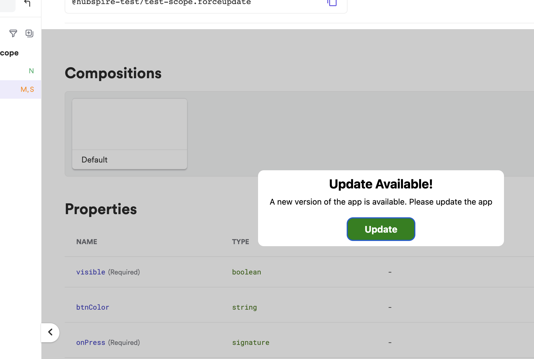
I build a component using bit, and exported it to the localhost, and below is how the preview was shown.
Below is the image how it should appear 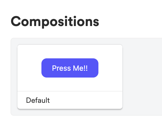
The expected behavior was showing the component under the Compositions.
I have used Modal in this component I think that’s what is causing this issue.
Below is the code using which this component was built
import React from 'react';
import {
  StyleSheet,
  Text,
  TouchableOpacity,
  TouchableOpacityProps,
  View,
} from 'react-native';
import Modal from 'react-native-modal';

interface forceupdateProps extends TouchableOpacityProps {
  visible: boolean;
  btnColor?: string;
  onPress: () => void;
}

const forceupdate = ({visible, onPress, btnColor}: forceupdateProps) => {
  return (
    <View style={{flex: 1}}>
      <Modal backdropOpacity={0.3} isVisible={visible}>
        <View style={styles.modalContainer}>
          <View style={styles.container}>
            <Text style={styles.headerText}>Update Available!</Text>
            <Text style={styles.contentText}>
              A new version of the app is available. Please update the app
            </Text>
            <TouchableOpacity
              style={[
                styles.btnContainer,
                btnColor ? {backgroundColor: btnColor} : null,
              ]}
              onPress={onPress}>
              <Text style={styles.btnText}>Update</Text>
            </TouchableOpacity>
          </View>
        </View>
      </Modal>
    </View>
  );
};

export default forceupdate;

const styles = StyleSheet.create({
  modalContainer: {
    flex: 1,
    justifyContent: 'center',
    alignItems: 'center',
  },
  container: {
    backgroundColor: '#fff',
    marginHorizontal: 20,
    padding: 10,
    paddingHorizontal: 20,
    borderRadius: 10,
    alignItems: 'center',
  },
  headerText: {
    fontWeight: 'bold',
    fontSize: 22,
    marginBottom: 10,
  },
  contentText: {
    textAlign: 'center',
    fontSize: 14,
    marginBottom: 20,
  },
  btnContainer: {
    backgroundColor: '#555555',
    paddingVertical: 10,
    paddingHorizontal: 30,
    borderRadius: 10,
  },
  btnText: {
    color: '#fff',
    fontWeight: 'bold',
    fontSize: 16,
  },
});
I was to know if this issue is from my side or if its a bug from the bit.dev’s side
2
Answers
Important aspect here is Modal renders above the container which its rendered, its like a absolutely placed container, if you want to rendered as you mentioned above remove the modal and add a conditional rendering instead.
Check the code below.. hope it helps you.
Eg:
I’m not sure to clearly understand what is the issue that you have.
If I understand correctly, you don’t see the button in the composition card when the modal is open.
Maybe if you make the card bigger, it will help you.
You can do so in your compositions file: