


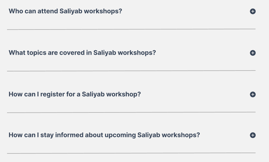
I aim to create a custom MUI accordion which should look like this:
Now, I have attempted in creating this custom MUI accordion using these code structure (this accordion also uses some custom search box functionality and custom accordion data)
Accordion source code:
import * as React from "react";
import { useState } from "react";
import AccordionMUI from "@mui/material/Accordion";
import AccordionSummary from "@mui/material/AccordionSummary";
import AccordionDetails from "@mui/material/AccordionDetails";
import Typography from "@mui/material/Typography";
import ExpandMoreIcon from "@mui/icons-material/ExpandMore";
import "./globals.css";
import { accordionData } from "./accordionData.js";
import AddCircleIcon from "@mui/icons-material/AddCircle";
import RemoveCircleIcon from "@mui/icons-material/RemoveCircle";


export default function SimpleAccordion() {
  const [search, setSearch] = useState("");
  return (
    <div>
      <input
        onChange={(e) => setSearch(e.target.value)}
        type="text"
        placeholder="Search"
      />

      {accordionData
        .filter((item) => {
          return search.toLowerCase() === ""
            ? item
            : item.sectionTitle.toLowerCase().includes(search);
        })
        .map((item) => (
          <AccordionMUI key={item.id} className="accordionMui">
            <AccordionSummary
              expandIcon={<AddCircleIcon sx={{ color: "#384558" }} />}
              aria-controls="panel1a-content"
              id="panel1a-header"
            >
              <Typography>
                <b>{item.sectionTitle}</b>
              </Typography>
            </AccordionSummary>
            <AccordionDetails>
              <Typography>{item.sectionContent}</Typography>
            </AccordionDetails>
          </AccordionMUI>
        ))}
    </div>
  );
}
CSS styling source code:
.accordionMui {
  background-color: rgba(242, 242, 242, 0.1);
  box-shadow: none;
  color: #384558;
}

#panel1a-header {
  padding-top: 5%;
  padding-bottom: 5%;
}
Full working demo here on CodeSandbox.
It currently looks like this:
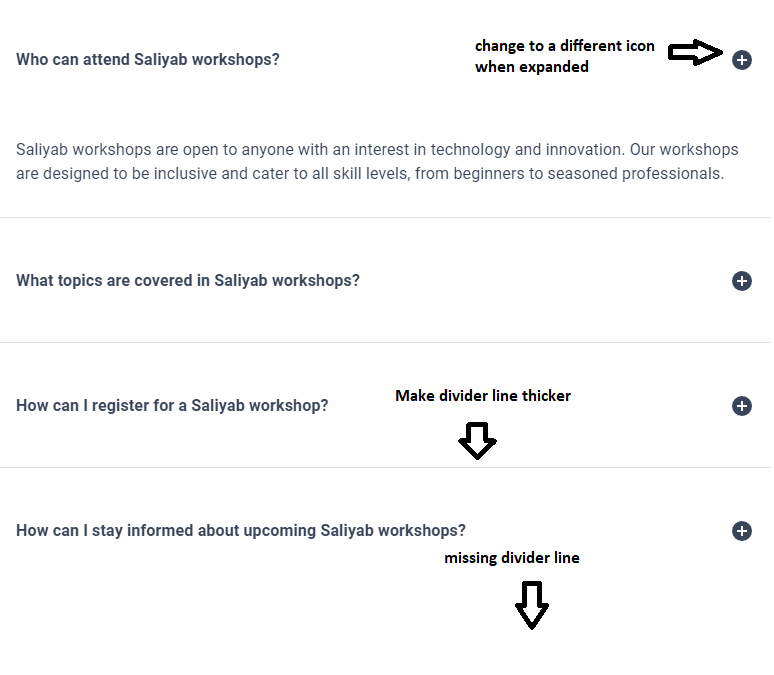
My issue is that the last divider line of my accordion is not showing up unlike from its previous sections where there is a divider line on them below. I also want to override the styling of the divider line of the accordion and make it thicker.
I also wanted to change the collapse icons into their respective states (not expanded accordion will display AddCircleIcon, expanded accordion will display RemoveCircleIcon) but a problem arises which shows Cannot find name ‘expanded’ when I use this ternary condition expanded={expanded === 'panel1'} just like from this stack accepted question (How to change icon when accordion summary is expanded?). Thus, I am not sure how to change the collapse icons based from their states of being expanded or not expanded yet.
I am still quite confused and unsure on which classes I should use on the Accordion API of MUI and it would be of great help to gain some guides in regards to properly customizing and overriding the Accordion component from MUI as I am still learning MUI along the way.
Your responses would indeed help me a lot on this one. Thank you very much.
2
Answers
You could do like this:
-> As per the mui accordion documentation and the way of doing in the stack question is almost same:
You need to set state to handle
AccordionMUIand control by usingicons.–> You need to remove this: (to show background color instead of
box-shadow)Updated demo:
I hope this helps!
Great question.
The
Accordioncomponent is a MUI-opinionatedCollapsecomponent. Perhaps instead of trying to wrangleAccordion, how about making a custom component usingCollapse?CodeSandbox Example