


I have looked through all the documentation, but I still cannot customize the Y-axis like this.
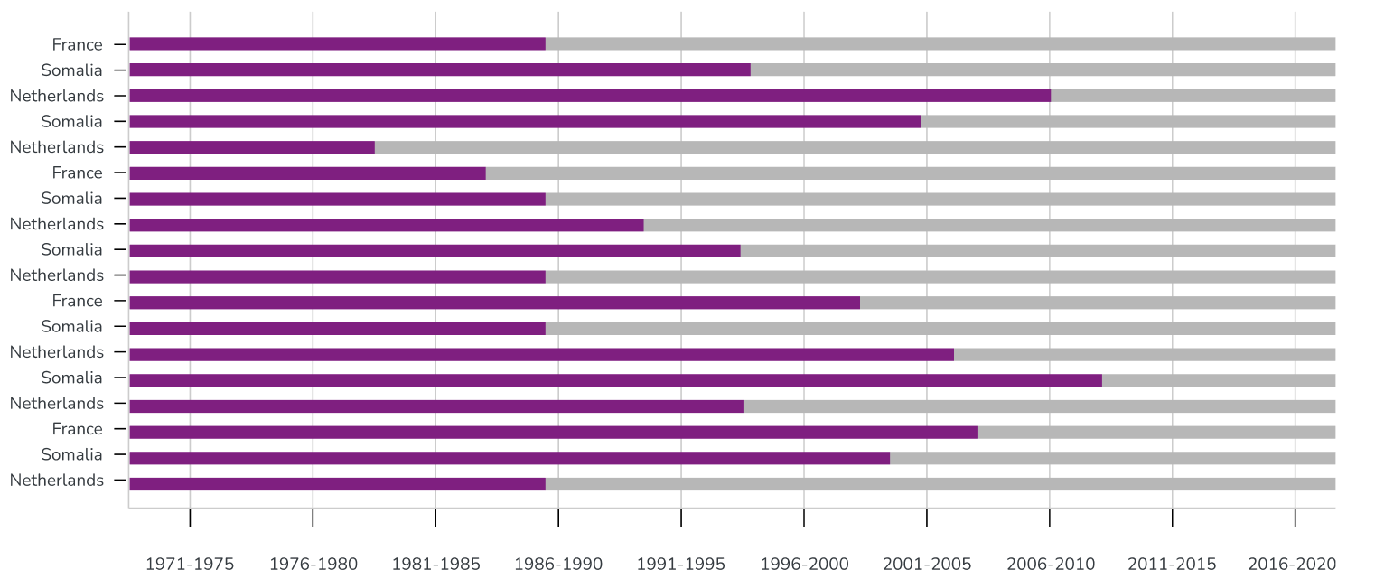
I need to fix the year time series, only 10 points need to be displayed, and I can adjust the title like "1999-2000"
This is my current config:
{
chart: {
type: "bar",
stacked: true,
},
xAxis: {
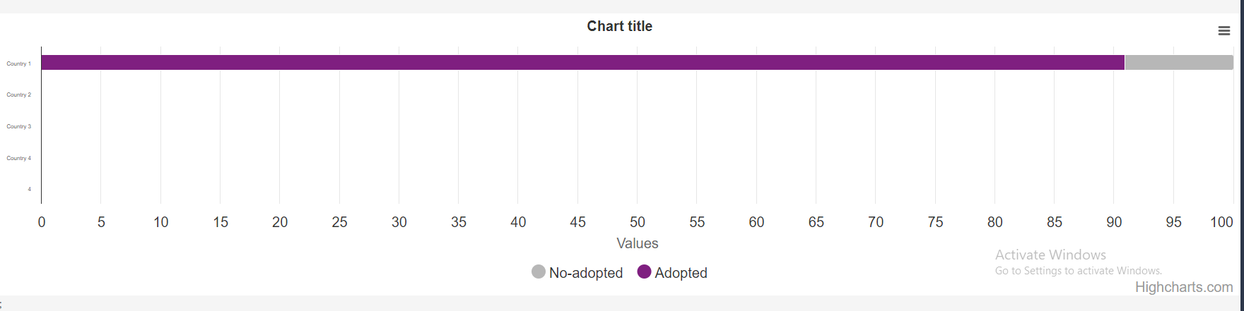
categories: ["Country 1", "Country 2", "Country 3", "Country 4"],
},
plotOptions: {
series: {
stacking: "percent",
dataLabels: {
enabled: false,
},
},
},
series: [
{
name: "No-adopted",
data: [1, 0, 0, 0, 0],
color: "#B7B7B7",
},
{
name: "Adopted",
data: [10, 0, 0, 0, 0],
color: "#861086",
},
],
};
This is the current seeing:
Thanks for your help!
2
Answers
Update
Hey sorry for the dumb answer without reading your question close enough. I went back and done some research, but wasn’t able to find a good way to achieve this. However, I was able to get it close to the screen shot you provided — by using the combination of
tickIntervalandcategoriesinyaxis:I am repeating the same thing for 10 times to make it total of 100 + 1 (index 0) times to fill out all the y-axis (total of 100 due to being a percentage).
Elegant? Absolutely not, but I wasn’t able to find the proper solution to this problem.
Heres codesandbox demo: https://codesandbox.io/s/cranky-wescoff-lvk9j2?file=/src/Example.tsx
You can use
yAxis.tickPositionerandyAxis.labels.formatterfunctions to achieve the result that you want to achieve. For example:Live demo: https://jsfiddle.net/BlackLabel/2gr1L493/
API Reference:
https://api.highcharts.com/highcharts/xAxis.labels.formatter
https://api.highcharts.com/highcharts/xAxis.tickPositioner