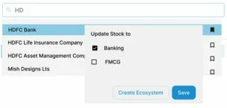
Basically I want to create 3 modals stacked on top of one another, like the image below.
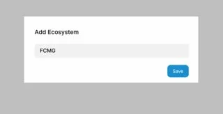
Clicking on the Create Ecosytem will open another shadcn Dialog like 2nd image below
The problem I am facing it is to effectively stack it one above the other
So there are 3 Modals,
- Search Modal
- Watchlist Modal
- Add Ecosystem Modal
- When there is only 1 modal (Search Modal) , clicking outside should close the modal
- When there is 2 modal (WatchList Modal and Search Modal), clicking outside should first close the Watchlist Modal(Top in the stack), and then clicking again outside should close the Search Modal
- Similar story with the Add Ecosystem Modal, that it needs to be properly stacked,
Like Search Modal -> Watchlist Modal -> Add Ecosystem Modal.
Using the present onFocus onBlur is really ineffective, so How can i proceed?
p.s: I am open to using modal/dialog from material/ui and shadcn, positioning is my concern…
Code snippets below, full code link at the very bottom
SearchBar.tsx
"use client";
import { useEffect, useState } from "react";
import SearchResult from "./SearchResult";

export default function SearchBar() {
  const [results, setResults] = useState([]);
  const [isVisible, setIsVisible] = useState(false);

  const stockMapping = [
    {
      StockId: 2,
      StockName: "Tata Consultancy Services Limited",
      Ecosystem: [
        {
          EcosystemName: "Eco1",
          EcosystemId: 21,
        },
        {
          EcosystemName: "Eco2",
          EcosystemId: 22,
        },
      ],
    },
    {
      StockId: 4,
      StockName: "ICICI Bank Limited",
      Ecosystem: [
        {
          EcosystemName: "ddfs",
          EcosystemId: 13,
        },
      ],
    },
    {
      StockId: 1,
      StockName: "Reliance Industries Limited",
      Ecosystem: [],
    },
    {
      StockId: 5,
      StockName: "State Bank of India",
      Ecosystem: [],
    },
  ];

  const [searchInput, setSearchInput] = useState("");
  const handleChange = async (value) => {
    setSearchInput(value);
  };

  useEffect(() => {
    const filteredStocks = stockMapping.filter((stock) =>
      stock.StockName.toLowerCase().includes(searchInput.toLowerCase())
    );
    setResults(filteredStocks);
  }, [searchInput]);

  const handleFocus = () => {
    setIsVisible(true);
  };

  const handleBlur = () => {
    // Adding a small delay to allow time for the click event on the results to trigger before hiding them
    setTimeout(() => {
      setIsVisible(false);
    }, 100);
  };

  return (
    <div className="bg-gray-200 flex w-[600px] mr-32 ">
      <div className=" bg-white rounded-md  w-full relative z-0">
        <div className="flex items-center border rounded-md h-full px-4">
          <input
            placeholder="Search for stocks"
            value={searchInput}
            onChange={(e) => handleChange(e.target.value)}
            className="bg-transparent border-none h-full ml-2 w-full focus:outline-none"
            onFocus={handleFocus}
            onBlur={handleBlur}
          />
        </div>
        {results && results.length > 0 && (
          <div
            className={`inset w-full absolute inset-x-0 z-10 top-8 rounded-md bg-white shadow-md mt-4 max-h-300 overflow-y-auto ${
              isVisible ? `block` : `hidden`
            }`}
          >
            {results
              ? results
                  .slice(0, 5)
                  .map((result, id) => (
                    <SearchResult result={result} key={id} />
                  ))
              : isVisible && <div>No results found</div>}
          </div>
        )}
      </div>
    </div>
  );
}
SearchResult
const SearchResult = ({ result }) => {
  return (
    <div className="search-result p-2 ml-5 flex justify-between hover:bg-gray-300 ">
      {result.StockName}
      {result.Ecosystem.length > 0 ? (
        <div className="cursor-pointer">Added</div>
      ) : (
        <div className="cursor-pointer">Add now</div>
      )}
    </div>
  );
};

export default SearchResult;
Get the full code link here: https://github.com/krishnaacharyaa/search-nextjs-modal


2
Answers
One approach would be to have each modal actually be two divs: one "background" div that if clicked, closes the modal, and one actual div for the modal content.
In the image below, the red would be your main page.
The first modal would consist of a div that is the size of the red rectangle where if you click it, the modal will close; and the actual modal content would be the the orange rectangle.
The second modal would consist of a div that is the size of the red rectangle where if you click it, the second modal will close; and the actual modal content would be the the yellow rectangle.
The third modal would consist of a div that is the size of the red rectangle where if you click it, the third modal will close; and the actual modal content would be the the green rectangle.
This will also allow you to set a background color and opacity on the "background" divs to gray out the stuff behind the modal if you please.
Also, consider making each modal a parallel route. This is the standard way modals are done in next.js as it allows you to have them all as server components as you are not using react state to handle open/close
The idea mentioned by Makazau is correct. RadixUI, the headless UI powering shadcn, includes a
<Dialog.Overlay>component that renders a<div>; clicking on it will close the dialog.In shadcn, this is exported as
DialogOverlaywith styles that cover the entire screen, defined asfixed inset-0 z-50 bg-black/80. It is internally utilized by the<DialogContent>component.To implement your case, you just need to render
<DialogOverlay />in every nested dialog.Where
<DialogContent>renders a new<Portal>for each dialog, and its own<Overlay>A working example of your design should look like this