


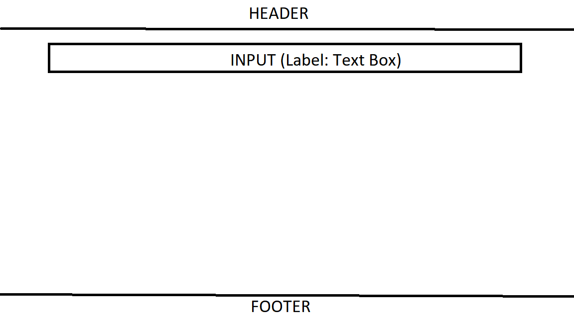
I’m trying to build a basic website as my first project using React and Tailwind CSS. I have made three components namely – Header, Input and Footer in my react app. My header is placed at the top by default. Next comes my input component where I take input from user and want this component to fill the rest of the space with input fields center middle top. I want my footer to be pinned to bottom.
This is what I want to achieve exactly.
Below is my react code:
App.js:
import React from 'react';
import Header from "./components/Header";
import Footer from './components/Footer';
import Input from './components/Input';

export default function App() {
  return (
    <div className='flex flex-col min-h-screen'>
    <Header />
    <Input />
    <Footer />
    </div>
  )
}
Header.jsx:
import React from 'react';

function Header() {
    return (
        <div className='basis-full mt-5 mb-5'>
            <h1 className="text-5xl font-bold text-center text-blue-1">
                Grocery Tracker
            </h1>
        </div>
    );
}

export default Header;
Input.jsx:
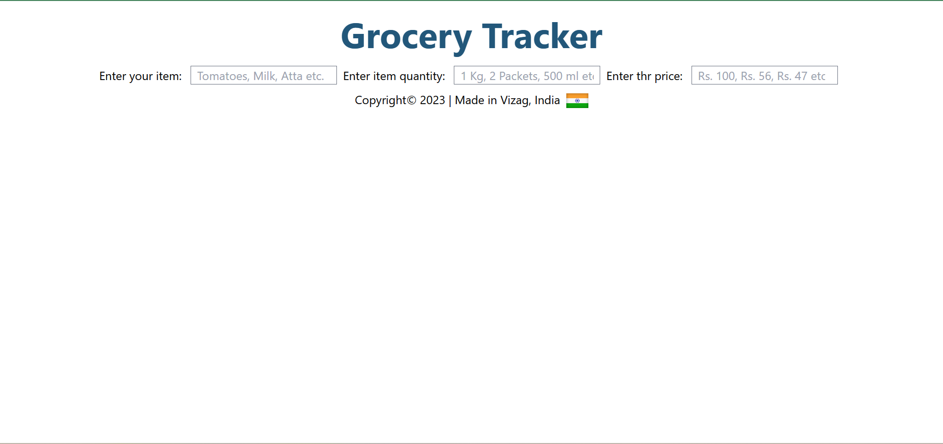
import React from 'react';

function Input(){
  return(

    <div className='flex justify-evenly'>
      <form action="/" method="post">
      <label  for="itemName">Enter your item: </label>
      <input className="border border-gray-500 focus:border-black cursor-text px-2 ml-2 mr-2" autoFocus type="text" name="items" id="items" placeholder="Tomatoes, Milk, Atta etc."/>
      <label  for="itemQuantity">Enter item quantity: </label>
      <input className="border border-gray-500 focus:border-black cursor-text px-2 ml-2 mr-2" autoFocus type="text" name="items" id="items" placeholder="1 Kg, 2 Packets, 500 ml etc."/>
      <label  for="itemPrice">Enter thr price: </label>
      <input className="border border-gray-500 focus:border-black cursor-text px-2 ml-2 mr-2" autoFocus type="number" name="items" id="items" placeholder="Rs. 100, Rs. 56, Rs. 47 etc."/>
      </form>
      </div>
  )
}

export default Input;
Also, when i add flex-grow property to my input flex, then the justify-evenly is not working.
Footer.jsx:
import React from 'react';
import indianFlag from '../images/ind.jpg';

function Footer(){
  return(
    <div className='flex items-end pt-2 justify-center end gap-2 mb-5'>
        <div>
            <p text-color='black'>
                Copyright© 2023 | Made in Vizag, India
            </p>
        </div>
        <div>
        <img height='30px' width='30px' src={indianFlag} alt='Indian Flag' />
        </div>
    </div>
  );
}

export default Footer;
2
Answers
To achieve this, first add
position:relativeto thebody.Update the styles in
Footer.jsxlike thisThis will pin your footer to the very bottom of the page.
You can use some "generic" CSS and
gridwhich gives us the "holy grail" view with a header, left / main/ right and footer – just un-comment what you need/include on your page. I added some color and comments in the CSS to help with understanding what is where.Note: I used
grid-areas:but also put in and commented out thegrid-column:if that is the way you wish to say what is where.No header or sides: just un-comment a side for example if you need it.