


I am making an app using react mui – bootstrap.
I have a form people need to write in, and a submit button icon from mui.
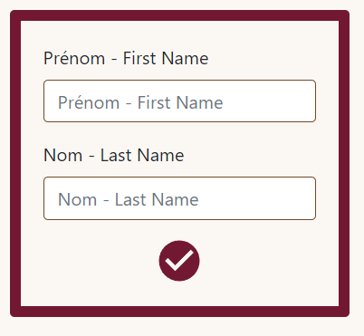
This is what it looks like, and how I want it to stay
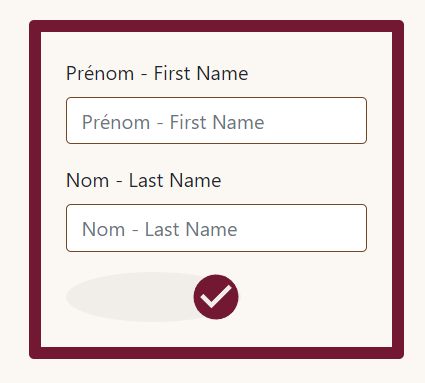
This is what it looks like when I hover with the mouse on the check icon
I do not understand why the button has a different size when I hover and when I click the shadow has an outline. (picture below)
shadow and outline when clicked on button
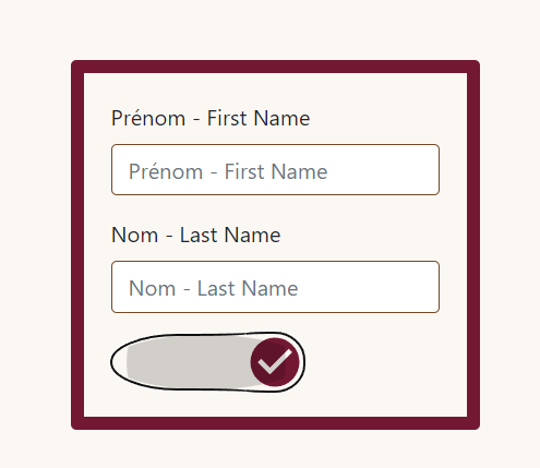
I tried to remove border or outline, but it doesn’t change anything.
Button element on my browser is completely different than my code in vscode:
<button class="MuiButtonBase-root MuiIconButton-root MuiIconButton-sizeMedium icon css-78trlr-MuiButtonBase-root-MuiIconButton-root" tabindex="0" type="button" aria-label="check"><svg class="MuiSvgIcon-root MuiSvgIcon-fontSizeMedium checkIcon css-i4bv87-MuiSvgIcon-root" focusable="false" aria-hidden="true" viewBox="0 0 24 24" data-testid="CheckCircleIcon"><path d="M12 2C6.48 2 2 6.48 2 12s4.48 10 10 10 10-4.48 10-10S17.52 2 12 2zm-2 15-5-5 1.41-1.41L10 14.17l7.59-7.59L19 8l-9 9z"></path></svg><span class="MuiTouchRipple-root css-8je8zh-MuiTouchRipple-root"></span></button>
Here is my App.jsx
import React from "react";
import Form from 'react-bootstrap/Form';
import Card from 'react-bootstrap/Card';
import IconButton from '@mui/material/IconButton';
import CheckCircleIcon from '@mui/icons-material/CheckCircle';

function App() {
    return (

      <div className="center">
          <Card className="card">
            <Form>
              <Form.Group className="mb-3" controlId="">
                <Form.Label>Prénom - First Name</Form.Label>
                <Form.Control className="control" type="text" placeholder="Prénom - First Name" />
              </Form.Group>

              <Form.Group className="mb-3" controlId="">
                <Form.Label>Nom - Last Name</Form.Label>
                <Form.Control className="control" type="text" placeholder="Nom - Last Name" />
              </Form.Group>
              <IconButton aria-label="check" className="icon">
                <CheckCircleIcon className="checkIcon"/>
              </IconButton>
            </Form>
          </Card>
      </div>

    )

}

export default App;
Here is my css:
.center {
    display: flex;
    align-items: center;
    justify-content: center;
    width: 100%;
    height: 100vh;
    margin: auto;
    background-color: #fbf8f3;
}

.card {
    width: 300px;
    border: 10px solid #731833;
    background-color: #fbf8f3;
    padding: 20px;
}

.control {
    border: 1px solid #734825;
}
.icon {
    padding: 0;
    border: none;
    outline: none;
}

.checkIcon {
    color: #731833;
    margin-left: 100px;
    transform: scale(1.8);
}
Any help appreciated thanks a lot
2
Answers
I see you have applied
margin-lefton.checkIconclass. That’s causing the IconButton to expand horizontally. MUI’sIconButtoncomponent hasborder-radius: 100%by default. So if the width increases, it looks like this.In order to centralize the IconButton, you can do this:
Form is a flex container now, and IconButton will align itself centrally
You’ve applied the layout-related style to the button’s content instead of the button itself. To achieve the desired styling, you should modify your CSS as follows:
To see the solution with the corrected styling for the shadow, you can check out this link: https://codesandbox.io/s/stack-oveflow-how-to-add-mui-react-button-icon-in-a-clean-way-f8l6w6?file=/src/styles.css:303-551.