I have prepared a simple test case at Github for my question:
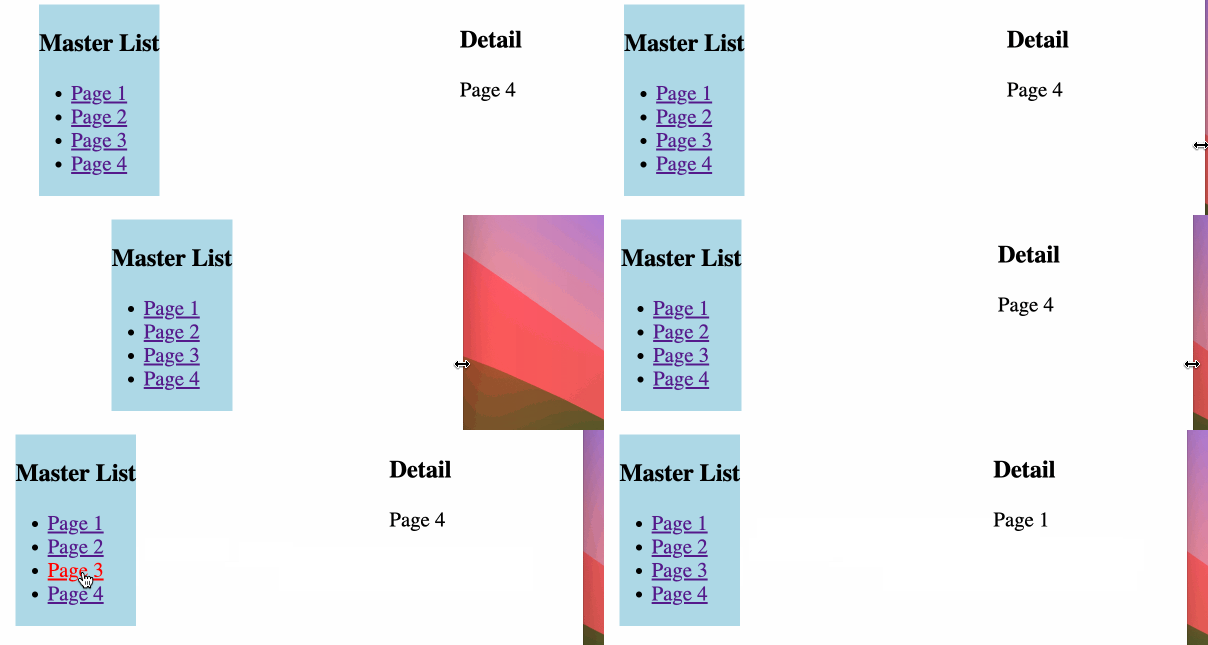
In RouterLayout.jsx a media query makes the Outlet disappear at narrow screens, as you can see in the animated screenshot, where I drag the browser side to make it smaller:
RootLayout.jsx
import { Outlet } from "react-router";
import { useMediaQuery } from "@react-hook/media-query";
import MasterList from "../components/MasterList";

export default function RootLayout() {
  const isSmallScreen = useMediaQuery("(max-width: 768px)");

  return (
    <div
      style={{
        display: "flex",
        justifyContent: "space-around",
        alignItems: "flex-start",
      }}
    >
      <MasterList />
      {!isSmallScreen && (
        <div>
          <h3>Detail</h3>
          <Outlet />
        </div>
      )}
    </div>
  );
}
My question please:
At small mobile phone screens only the Master List should be displayed. And when a Link is clicked there, then a Page1 or other pages should be displayed, with a possibility to return back to the Master List. This does not work yet.
At large tablet and computer screens both Master List and Page1 or others are displayed near each other. This works in my code already.
Should I add some attribute to the Links in the MasterList.jsx below?
MasterList.jsx
import { Link } from "react-router-dom";

const MasterList = () => {
  const pages = [
    { id: 1, title: "Page 1" },
    { id: 2, title: "Page 2" },
    { id: 3, title: "Page 3" },
    { id: 4, title: "Page 4" },
  ];

  return (
    <div>
      <h2>Master List</h2>
      <nav>
        <ul>
          {pages.map((page) => (
            <li key={page.id}>
              <Link to={"/page" + page.id}>{page.title}</Link>
            </li>
          ))}
        </ul>
      </nav>
    </div>
  );
};

export default MasterList;
App.jsx
import {
  Route,
  RouterProvider,
  createBrowserRouter,
  createRoutesFromElements,
} from "react-router-dom";
import Page1 from "./pages/Page1";
import Page2 from "./pages/Page2";
import Page3 from "./pages/Page3";
import Page4 from "./pages/Page4";
import RootLayout from "./layouts/RootLayout";

const router = createBrowserRouter(
  createRoutesFromElements(
    <Route path="/" element={<RootLayout />}>
      <Route path="page1" element={<Page1 />} />
      <Route path="page2" element={<Page2 />} />
      <Route path="page3" element={<Page3 />} />
      <Route path="*" element={<Page4 />} />
    </Route>
  )
);

const App = () => {
  return <RouterProvider router={router} />;
};

export default App;

 Question posted in


2
Answers
I don’t know what the best approach to achieve this is, but it needs to incorporate the fact that Outlet renders child routes in the Parent Component.
I would explore useMatches to see if you can use it to determine whether the Parent component was rendered on
/parentor/parent/child. With that information, you could conditionally render the navigation elements:On smaller view sizes where the
Outletisn’t rendered the nestedRoutecomponents no longer have a place to render out theirelementcontent. If I understand your post correctly you want to useRootLayoutand theOutleton the larger non-"mobile" view sizes, and on mobile view sizes renderRootLayoutas a sibling route instead of a parent route, so all the other routes are accessible.Example refactor:
Create two root layouts, mobile and non-mobile.
Update
Appto use the media query hook and conditionally render one root layout or the other, and conditionally render theMasterListas an index route on smaller screens.Alternative
An alternative might be to utilize the
useMatchhook to test if the root"/"is the currently matched route and renderMasterList. The logic is a bit more convoluted and a little less DRY. The gist here is to render the normalMasterListandOutleton larger view sizes, and on mobile views conditionally renderMasterListonly if on the home page, otherwise render theOutletfor the nested routes.Example: