skip to Main Content

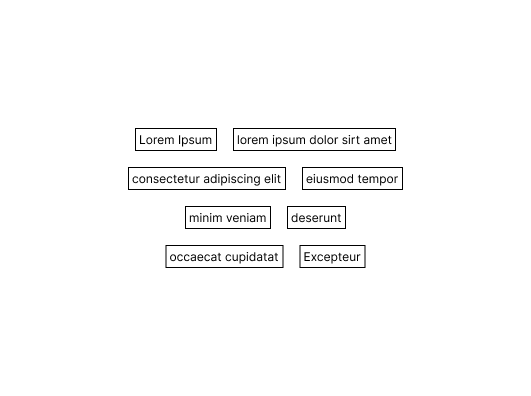
I have this layout that I am trying to build:

Two column layout with fit-content items.

I am struggling to figure out how I can use display: flex or display: grid to achieve the result.

The criteria here is:

  • There are only two items per row
  • The items must only be the width of their content
  • They should be centered to the container.

I have tried with display: grid but the items always span the width of the grid.

I tried the following

.container {
  display: flex;
  justify-content: center;
}

ul {
  padding: 0;
  margin: 0;
  list-style-type: none;
}

.grid {
  display: grid;
  grid-template-columns: auto auto;
  justify-content: center;
}

.grid > * {
  width: fit-content;
  border: 1px solid grey;
}
<div class="container">
  <ul class="grid">
    <li>Hello World</li>
    <li>Foo</li>
    <li>Bar</li>
    <li>Lorem ipsum</li>
    <li>Dolor Set Amigo</li>
    <li>Some other placeholder</li>
  </ul>
</div>

2

Answers


  1. I don’t think that’s possible with your current HTML setup.

    Here an example which uses an additional div for each row holding 2 items.

    Hope this helps / fits your needs

    .container {
      display: flex;
      flex-direction: column;
      border: 1px solid red;
      align-items: center;
      justify-content: space-evenly;
      width: 500px;
      height: 150px;
    }
    
    .row > em:not(:last-child) {
        margin-right: 10px;
    }
    
    em {
        padding: 2px 5px;
        border: 1px solid grey;
    }
    <div class="container">
        <div class="row">    
            <em>Hello World</em>
            <em>Foo</em>
        </div>
        <div class="row">    
            <em>Bar</em>
            <em>Lorem ipsum</em>
        </div>
        <div class="row">    
            <em>Dolor Set Amigo</em>
            <em>Some other placeholder</em>
        </div>
    </div>
    Login or Signup to reply.
  2. A solution which forces line breaks is to make an empty list item which spans the full width of the parent using flex basis.

    .break {
      flex-basis: 100%;
    }
    
    ul {
      list-style-type: none;
      display: flex;
      flex-wrap: wrap;
      justify-content: center;
      gap: 20px;
    }
    <ul>
      <li>Hello Wd</li>
      <li>Helloaaa World</li>
      <li class="break" />
      <li>Helor World Worldld</li>
      <li>Hello WorldWorldWorldWorld</li>
      <li class="break" />
      <li>HelorWorldWorldld</li>
      <li>Hello World</li>
      <li class="break" />
      <li>Helorld</li>
      <li>Hello WorldWorldWorldWorldWorld</li>
    </ul>
    Login or Signup to reply.
Please signup or login to give your own answer.
Back To Top
Search