skip to Main Content

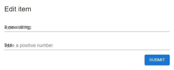
I’m trying to make a page for editing but the problem is react MUI does not properly render text fields after I updated my form data via reset method of react-hook-form.

This is what it looks like:

enter image description here

However, if I click submit, react-hook-form calls my function with proper data, but the form itself presented incorrectly.

I made an example to reproduce it.
Here is my code (you can also playround with it in https://codesandbox.io/s/sweet-bush-dy8qh8):

model:

import * as yup from "yup";
import { InferType } from "yup";

export const SCHEMA = yup.object({
  string: yup.string().defined().required("Required").max(100, "Too long"),
  number: yup.number().defined().required("Required").min(1, "Must be positive")
});

export type FormValues = InferType<typeof SCHEMA>;

export const INITIAL_VALUES: FormValues = {
  string: "",
  number: 0
};

And the form:

import { Grid, Box, TextField, Typography, Button } from "@mui/material";
import { useForm } from "react-hook-form";
import { SCHEMA, INITIAL_VALUES, FormValues } from "./model";
import { yupResolver } from "@hookform/resolvers/yup";
import { useEffect, useState } from "react";

export default function EditItemView() {
  const resolver = yupResolver(SCHEMA);
  const [isLoading, setLoading] = useState(false);
  const {
    register,
    handleSubmit,
    reset,
    formState: { errors }
  } = useForm<FormValues>({ resolver, mode: "all" });

  useEffect(() => {
    setLoading(true);
    // pretend loading from server
    setTimeout(() => {
      reset({ number: 944, string: "a new string" });
      setLoading(false);
    }, 2000);
  }, []);

  return (
    <Box padding={2}>
      <form onSubmit={handleSubmit((formData) => console.log(formData))}>
        <Grid container direction="column" alignItems="stretch" spacing={2}>
          <Grid item>
            <Typography variant="h5">Edit item</Typography>
            {isLoading && <Typography>Loading...</Typography>}
          </Grid>
          <Grid item>
            <TextField
              {...register("string")}
              variant="standard"
              fullWidth
              label="Type a string"
              defaultValue={INITIAL_VALUES.string}
              error={!!errors["string"]}
              helperText={errors["string"]?.message}
            />
          </Grid>
          <Grid item>
            <TextField
              {...register("number")}
              variant="standard"
              fullWidth
              label="Type a positive number"
              defaultValue={INITIAL_VALUES.string}
              error={!!errors["number"]}
              helperText={errors["number"]?.message}
            />
          </Grid>
          <Grid item container justifyContent="flex-end">
            <Grid>
              <Button disabled={isLoading} type="submit" variant="contained">
                Submit
              </Button>
            </Grid>
          </Grid>
        </Grid>
      </form>
    </Box>
  );
}

Any ideas how to fix this?

2

Answers


  1. Chosen as BEST ANSWER

    Looks like I found a simple way to fix it. I need to use InputLabelProps: { shrink } and manully tell it wheter to shrink the label or not depending on value:

    import { Grid, Box, TextField, Typography, Button } from "@mui/material";
    import { useForm } from "react-hook-form";
    import { SCHEMA, INITIAL_VALUES, FormValues } from "./model";
    import { yupResolver } from "@hookform/resolvers/yup";
    import { useEffect, useState } from "react";
    
    export default function EditItemView() {
      const resolver = yupResolver(SCHEMA);
      const [isLoading, setLoading] = useState(false);
      const {
        register,
        handleSubmit,
        reset,
        getValues,
        formState: { errors }
      } = useForm<FormValues>({ resolver, mode: "all" });
    
      useEffect(() => {
        setLoading(true);
        // pretend loading from server
        setTimeout(() => {
          reset({ number: 944, string: "a new string" });
          setLoading(false);
        }, 2000);
      }, []);
    
      return (
        <Box padding={2}>
          <form onSubmit={handleSubmit((formData) => console.log(formData))}>
            <Grid container direction="column" alignItems="stretch" spacing={2}>
              <Grid item>
                <Typography variant="h5">Edit item</Typography>
                {isLoading && <Typography>Loading...</Typography>}
              </Grid>
              <Grid item>
                <TextField
                  {...register("string")}
                  variant="standard"
                  fullWidth
                  label="Type a string"
    
                  InputLabelProps={{ shrink: !!getValues("string") }}
    
                  defaultValue={INITIAL_VALUES.string}
                  error={!!errors["string"]}
                  helperText={errors["string"]?.message}
                />
              </Grid>
              <Grid item>
                <TextField
                  {...register("number")}
                  variant="standard"
                  fullWidth
                  label="Type a positive number"
                  defaultValue={INITIAL_VALUES.string}
    
                  InputLabelProps={{ shrink: !!getValues("number") }}
    
                  error={!!errors["number"]}
                  helperText={errors["number"]?.message}
                />
              </Grid>
              <Grid item container justifyContent="flex-end">
                <Grid>
                  <Button disabled={isLoading} type="submit" variant="contained">
                    Submit
                  </Button>
                </Grid>
              </Grid>
            </Grid>
          </form>
        </Box>
      );
    }


  2. You can use a styled version of the TextField component to make it act like OutlinedInput like this –

    import {TextField as MuiTextField, styled, TextFieldProps} from "@mui/material";
    
    const TextField = styled(MuiTextField, {
      shouldForwardProp: (prop) => prop !== "notched"
    })<TextFieldProps & { notched?: boolean }>(({ notched, theme }) =>
      notched
        ? {
            "& > label": {
              marginTop: -theme.spacing(3),
              transform: "scale(0.75)"
            }
          }
        : {}
    );
    

    Here’s a Codesandbox with your example.

    Login or Signup to reply.
Please signup or login to give your own answer.
Back To Top
Search