<div className='flex justify-between w-full'>
   <div className='px-1 w-full'>
       <img
         src='https://images.unsplash.com/photo-1566275529824-cca6d008f3da?ixlib=rb-4.0.3&ixid=M3wxMjA3fDB8MHxzZWFyY2h8NXx8cGhvdG98ZW58MHx8MHx8fDA%3D&auto=format&fit=crop&w=800&q=60'
         alt='Pic'
         className='h-10 w-10 rounded-full border-2 w-full'
        />
   </div>
   <p className='border-2'><span className='text-lg font-semibold'>dottt</span>  Lorem Ipsum is simply dummy text of the printing and typesetting industry. Lorem Ipsum has been the industry's standard dummy text ever since the 1500s, when an unknown printer took a galley of type and scrambled it to make a type specimen book.</p>
 </div>
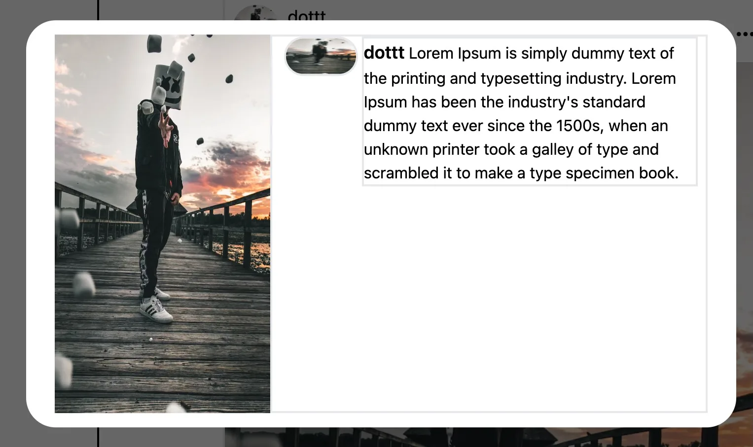
how to make this(small) image circular and text container align with same & i’m using tailwind css?


2
Answers
I believe the problem comes from the fact that you’ve set the width of the image twice.
w-full w-10and one them getting overridden by the other.You can set
rounded-full max-w-full h-autoto make your image circular. Hope this helps.it because the width is set again to w-full, this make the h is not same as w, then the image streched to w-full and h-10. instead, you can use w-10 only if you want to set the w and h in the same time as your h is 10. in other side, you can use
w-full aspect-square object-coverif you want to set the w-full and the h same as w.you can see the example here