I’ve followed the tutorial here to add material UI to my app: https://mui.com/material-ui/getting-started
But some components appear not to be styled and customizing the theme doesn’t seem to work either…
I am setting up my theme this way:
// theme.ts
import {createTheme} from '@mui/material/styles';

const ourTheme = createTheme({
    typography: {
        h1: {
            fontSize: '3rem',
            color: 'red',
        },
    },
});

export default ourTheme;
And I wrap my whole app in a ThemeProvider like so:
// App.tsx
import {ThemeProvider} from '@mui/material/styles';
import theme from './theme';
import Home from './pages/Home';

const App: React.FC = () => (
    <ThemeProvider theme={theme}>
        <Home />
    </ThemeProvider>
);
and Home is just a test page defined this way:
// pages/Home.tsx
const Home: React.FC = () => {
    return (
        <div>
            <Typography component='h1'>Home</Typography>
            <p>
                Hello to us, and hello to you!
            </p>
            <p>lala!! :{')'}</p>
            <p>
                <Button variant='contained' color='primary'>
                    This does nothing.
                </Button>
            </p>
        </div>
    );
};
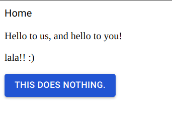
The issue is that the page appears this way:
While I am expecting the h1 to be large and red.
I have tried without my custom theme and the h1 is still unstyled (almost the same as normal text).
Am I missing something obvious here?


2
Answers
I'm stupid, it was
variant='h1'and notcomponent='h1', duh...Try to change your App like this
reference: https://mui.com/material-ui/customization/how-to-customize/#4-global-css-override