


I’m currently working on a React application where I’m trying to integrate Swiper.js with Material-UI (MUI) cards to create a slideable carousel of app cards. However, I’m encountering an issue where only one card appears, and the navigation arrows are missing. I’ve followed the documentation and suggestions, but I can’t seem to get it to work correctly.
Here’s a breakdown of what I’ve done:
I’ve installed the Swiper.js library using npm install swiper.
I’ve imported the necessary dependencies and set up the Swiper in my component. However, despite my efforts, I’m only seeing one card in the swiper and the navigation arrows are not visible.
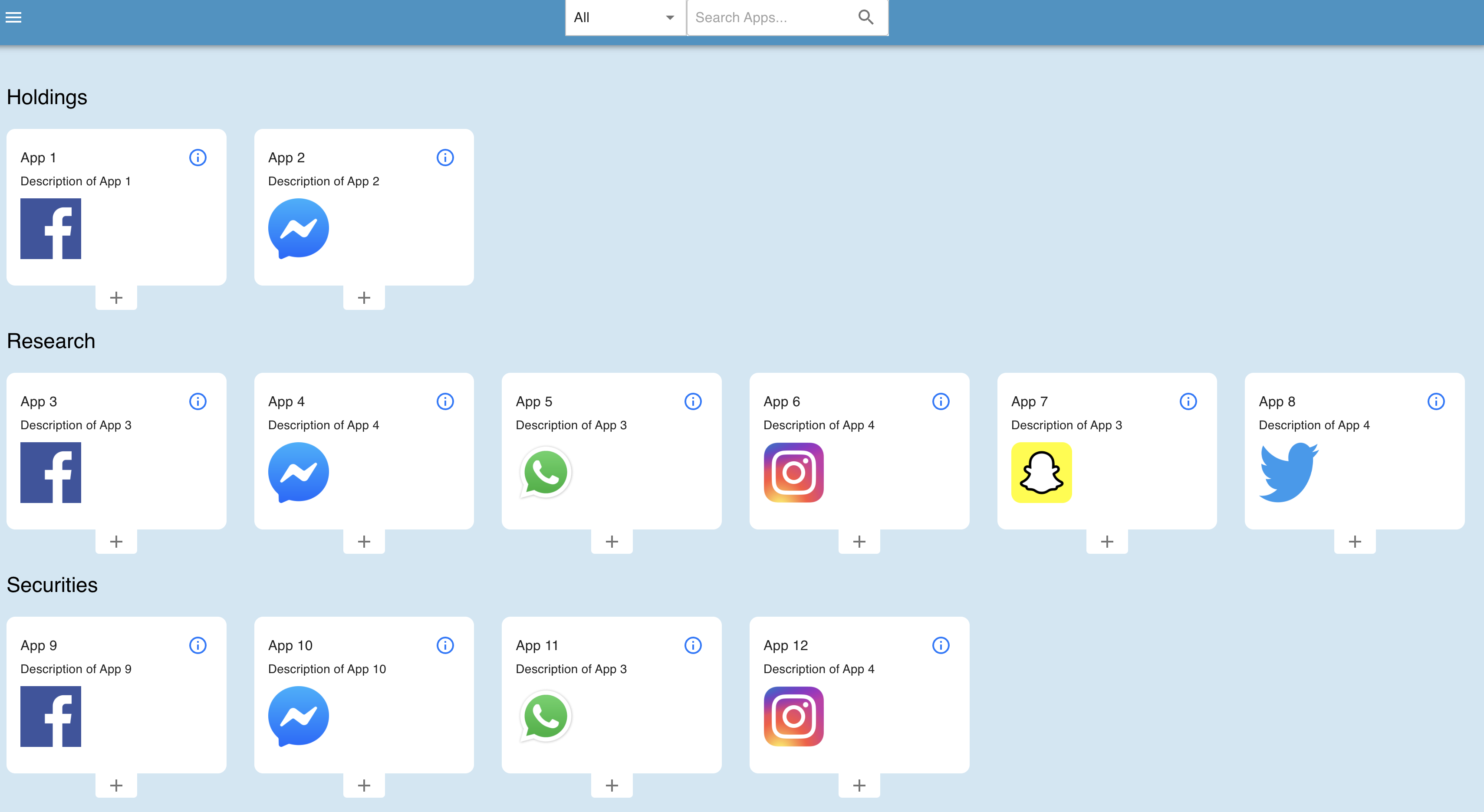
My appsData structure contains an array of objects with app information, including names, descriptions, and image URLs. I’ve tried filtering and mapping this data to create the app cards within the Swiper.
I’ve reviewed the Swiper.js documentation and tried different configurations, but I’m still facing this issue. Could there be any conflicts with MUI or CSS styling that could affect the Swiper’s behavior?
import React from "react";
import { Typography, Card, CardContent, Grid } from "@mui/material";
import IconButton from "@mui/material/IconButton";
import AddIcon from "@mui/icons-material/Add";
import InfoIcon from "@mui/icons-material/InfoOutlined";
import { Swiper, SwiperSlide } from "swiper/react";
import { Navigation } from "swiper";
import SwiperCore from "swiper";
import ArrowCircleLeftSharpIcon from "@mui/icons-material/ArrowCircleLeftSharp";
import ArrowCircleRightSharpIcon from "@mui/icons-material/ArrowCircleRightSharp";
import "swiper/css/navigation";
import "swiper/swiper-bundle.min.css";
import "swiper/css";
import "../styles.css";

const fontFamily = "sans-serif";
SwiperCore.use([Navigation]);

function AppsCatalog({
  handleAddToMyApps,
  handleInfoDialogOpen,
  showDisabledApps,
  appsData,
  selectedCategory,
  searchQuery
}) {
  return (
    <div>
      {appsData.map((categoryData) => {
        const filteredApps = categoryData.apps.filter(
          (app) =>
            (selectedCategory === "All" ||
              categoryData.category === selectedCategory) &&
            (showDisabledApps || !app.disabled) &&
            app.name.toLowerCase().includes(searchQuery.toLowerCase())
        );

        if (filteredApps.length === 0) {
          return null;
        }

        return (
          <div key={categoryData.category} style={{ margin: "20px 0" }}>
            <Typography
              variant="h5"
              gutterBottom
              style={{ color: "black", fontWeight: "400", fontFamily }}
            >
              {categoryData.category}
            </Typography>
            <Swiper
              spaceBetween={20}
              slidesPerView={3}
              navigation={{
                prevEl: ".swiper-button-prev",
                nextEl: ".swiper-button-next"
              }}
            >
              <Grid container spacing={4}>
                {filteredApps.map((app, index) => (
                  <SwiperSlide key={index}>
                    <Grid item xs={12} sm={12} md={2} lg={2} key={index}>
                      <Card
                        key={app.name}
                        variant="outlined"
                        style={{
                          marginTop: "12px",
                          fontFamily,
                          borderRadius: "10px",
                          border: "none"
                        }}
                      >
                        <CardContent>
                          <div
                            style={{
                              display: "flex",
                              alignItems: "center",
                              justifyContent: "space-between"
                            }}
                          >
                            <Typography variant="body1" style={{ fontFamily }}>
                              {app.name}
                            </Typography>
                            <IconButton
                              aria-label="delete"
                              size="small"
                              sx={{ color: "#007bff" }}
                              onClick={() => handleInfoDialogOpen()}
                            >
                              <InfoIcon />
                            </IconButton>
                          </div>
                          <Typography variant="body2" style={{ fontFamily }}>
                            {app.description}
                          </Typography>
                          <div>
                            <img
                              className="app-image"
                              src={app.imageUrl}
                              alt={app.name}
                            />
                          </div>
                        </CardContent>
                      </Card>
                      <div
                        style={{
                          display: "flex",
                          justifyContent: "center",
                          fontFamily
                        }}
                      >
                        <IconButton
                          onClick={() => handleAddToMyApps(app)}
                          // disabled={app.disabled}
                          aria-label="delete"
                          size="large"
                          sx={{
                            border: "none",
                            borderRadius: "4px",
                            borderTopLeftRadius: 0,
                            borderTopRightRadius: 0,
                            padding: "2px 12px",
                            borderTop: "none",
                            backgroundColor: "#fff"
                          }}
                        >
                          <AddIcon />
                        </IconButton>
                      </div>
                    </Grid>
                  </SwiperSlide>
                ))}
              </Grid>
            </Swiper>
            <IconButton
              className="swiper-button-prev"
              disableFocusRipple
              disableRipple
            >
              <ArrowCircleLeftSharpIcon />
            </IconButton>
            <IconButton
              className="swiper-button-next"
              disableFocusRipple
              disableRipple
            >
              <ArrowCircleRightSharpIcon />
            </IconButton>
          </div>
        );
      })}
    </div>
  );
}
And here’s a sample structure of my appsData:
const appsData = [
  {
    category: "Holdings",
    apps: [
      {
        name: "App 1",
        description: "Description of App 1",
        disabled: true,
        imageUrl:
          "https://assets.ccbp.in/frontend/react-js/app-store/social-facebook.png"
      },
      {
        name: "App 2",
        description: "Description of App 2",
        disabled: false,
        imageUrl:
          "https://assets.ccbp.in/frontend/react-js/app-store/social-messenger.png"
      }
    ]
  },
  {
    category: "Research",
    apps: [
      {
        name: "App 3",
        description: "Description of App 3",
        disabled: false,
        imageUrl:
          "https://assets.ccbp.in/frontend/react-js/app-store/social-facebook.png"
      },
      {
        name: "App 4",
        description: "Description of App 4",
        disabled: true,
        imageUrl:
          "https://assets.ccbp.in/frontend/react-js/app-store/social-messenger.png"
      },
      {
        name: "App 5",
        description: "Description of App 3",
        disabled: false,
        imageUrl:
          "https://assets.ccbp.in/frontend/react-js/app-store/social-whatsapp.png"
      },
      {
        name: "App 6",
        description: "Description of App 4",
        disabled: true,
        imageUrl:
          "https://assets.ccbp.in/frontend/react-js/app-store/social-instagram.png"
      },
      {
        name: "App 7",
        description: "Description of App 3",
        disabled: false,
        imageUrl:
          "https://assets.ccbp.in/frontend/react-js/app-store/social-snapchat.png"
      },
      {
        name: "App 8",
        description: "Description of App 4",
        disabled: true,
        imageUrl:
          "https://assets.ccbp.in/frontend/react-js/app-store/social-twitter.png"
      }
    ]
  },
  {
    category: "Securities",
    apps: [
      {
        name: "App 9",
        description: "Description of App 9",
        disabled: false,
        imageUrl:
          "https://assets.ccbp.in/frontend/react-js/app-store/social-facebook.png"
      },
      {
        name: "App 10",
        description: "Description of App 10",
        disabled: true,
        imageUrl:
          "https://assets.ccbp.in/frontend/react-js/app-store/social-messenger.png"
      },
      {
        name: "App 11",
        description: "Description of App 3",
        disabled: false,
        imageUrl:
          "https://assets.ccbp.in/frontend/react-js/app-store/social-whatsapp.png"
      },
      {
        name: "App 12",
        description: "Description of App 4",
        disabled: true,
        imageUrl:
          "https://assets.ccbp.in/frontend/react-js/app-store/social-instagram.png"
      }
    ]
  },
  {
    category: "My Account",
    apps: [
      {
        name: "App 13",
        description: "Description of App 3",
        disabled: false,
        imageUrl:
          "https://assets.ccbp.in/frontend/react-js/app-store/social-facebook.png"
      },
      {
        name: "App 14",
        description: "Description of App 4",
        disabled: true,
        imageUrl:
          "https://assets.ccbp.in/frontend/react-js/app-store/social-messenger.png"
      },
      {
        name: "App 15",
        description: "Description of App 9",
        disabled: false,
        imageUrl:
          "https://assets.ccbp.in/frontend/react-js/app-store/social-whatsapp.png"
      },
      {
        name: "App 16",
        description: "Description of App 10",
        disabled: true,
        imageUrl:
          "https://assets.ccbp.in/frontend/react-js/app-store/social-instagram.png"
      },
      {
        name: "App 17",
        description: "Description of App 3",
        disabled: false,
        imageUrl:
          "https://assets.ccbp.in/frontend/react-js/app-store/social-snapchat.png"
      },
      {
        name: "App 18",
        description: "Description of App 4",
        disabled: true,
        imageUrl:
          "https://assets.ccbp.in/frontend/react-js/app-store/social-twitter.png"
      },
      {
        name: "App 19",
        description: "Description of App 3",
        disabled: false,
        imageUrl:
          "https://assets.ccbp.in/frontend/react-js/app-store/social-pinterest.png"
      },
      {
        name: "App 20",
        description: "Description of App 4",
        disabled: true,
        imageUrl:
          "https://assets.ccbp.in/frontend/react-js/app-store/social-wechat.png"
      },
      {
        name: "App 21",
        description: "Description of App 9",
        disabled: false,
        imageUrl:
          "https://assets.ccbp.in/frontend/react-js/app-store/social-linkedin.png"
      },
      {
        name: "App 22",
        description: "Description of App 10",
        disabled: true,
        imageUrl:
          "https://assets.ccbp.in/frontend/react-js/app-store/social-telegram.png"
      },
      {
        name: "App 23",
        description: "Description of App 3",
        disabled: false,
        imageUrl:
          "https://assets.ccbp.in/frontend/react-js/app-store/games-subway-surfers.png"
      },
      {
        name: "App 124",
        description: "Description of App 4",
        disabled: true,
        imageUrl:
          "https://assets.ccbp.in/frontend/react-js/app-store/games-crossy-road.png"
      },
      {
        name: "App 25",
        description: "Description of App 3",
        disabled: false,
        imageUrl:
          "https://assets.ccbp.in/frontend/react-js/app-store/games-super-chef.png"
      },
      {
        name: "App 26",
        description: "Description of App 4",
        disabled: true,
        imageUrl:
          "https://assets.ccbp.in/frontend/react-js/app-store/games-angry-birds.png"
      }
    ]
  }
];
Please find the work around link – https://codesandbox.io/s/apps-catalogue-stckoverflow-swiper-3l2qm7?file=/src/AppsCatalog/AppsCatalog.js
Here is the example before integrating with swiper js – https://codesandbox.io/s/apps-catalogue-v2-y463jz
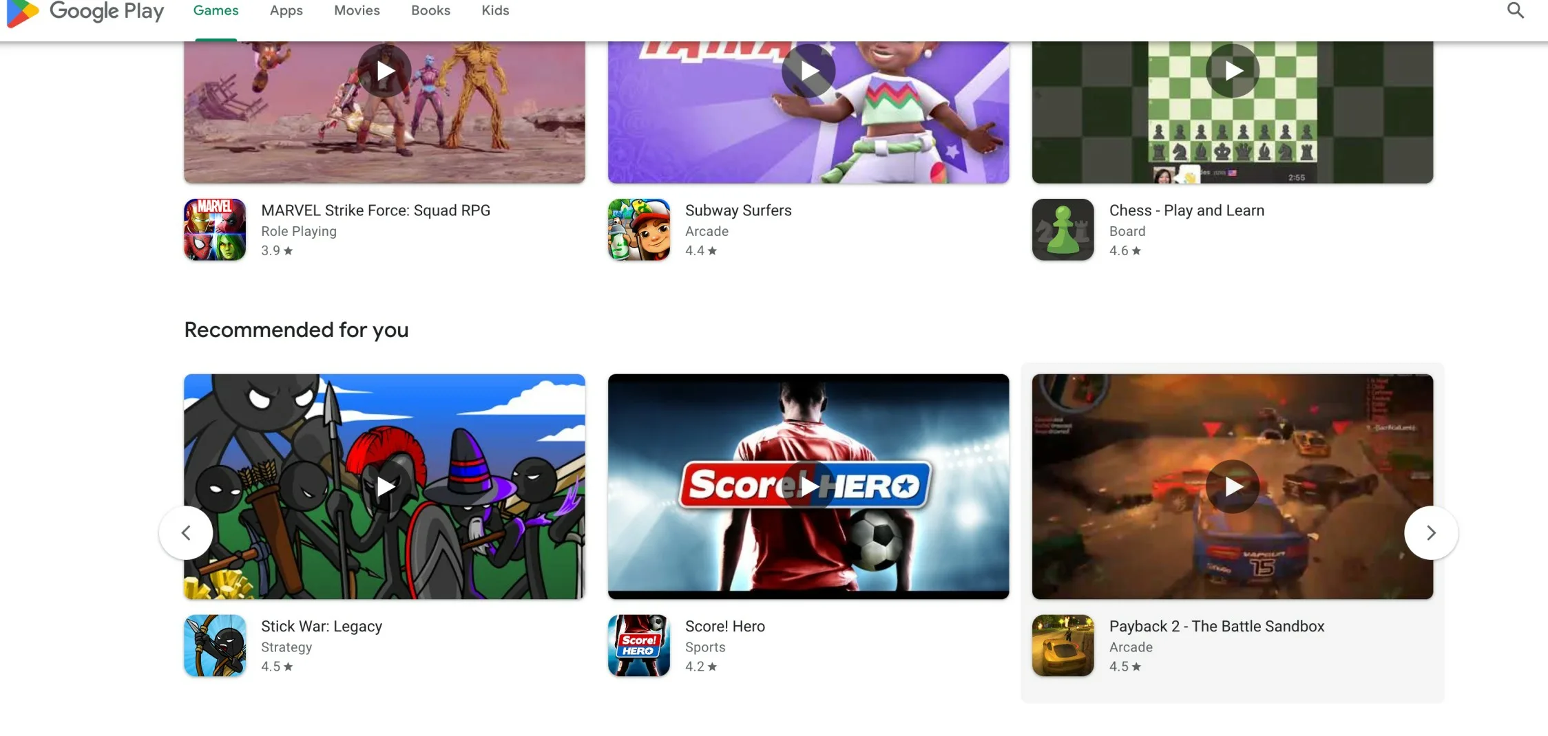
I need to make the cards swipeable like this in the below screenshot
Could you please help me identify what might be causing this issue? Are there any common pitfalls or conflicts to watch out for when integrating Swiper.js with Material-UI components?
Any assistance or guidance would be greatly appreciated! Thank you in advance.
2
Answers
To address the first issue you are facing:
What seems to be missing is a width constraint in order to confine the slider inside the viewport. You can easily solve that by adding the
sxprop which is for the sizing of elements in MUI on your<Main>component insideAppsCatalog/index.js. As demonstrated below:As for the second issue
There are 3 ways I can think of using/implementing navigation.
Set the
navigationprop totrueon<Swiper />Create two custom buttons without any icons and use their classes as you are doing now with
navigation={{ prevEl, nextEl }}. That approach is more likely to be used if you want to change the position of the navigation buttons without writing with custom css.Create two custom buttons with your preferred icons and styles. To position them in a similar way as in the screenshot you provided it would be much easier if you use a container and position it instead of the buttons individually. You will also need a way to control the slider, thankfully by passing a ref to
<Swiper>you have access to the previous and next methods, ex.ref.current.swiper.slideNext(). Take a look at this SO answer for more information.I installed the project and worked on it locally, and worked to fix issues in it, you can download the new template from the following link:
https://www.dropbox.com/scl/fo/ar8zf3ufbhse7mgrqnqu8/h?rlkey=4y3yoqjzj3uakerk4kzvs5k4b&dl=0
First issue
You defined navigation module to the
Swiperand then you add another navigation, so you made a conflict.Swiper has styles for
.swiper-button-prevand.swiper-button-next, so by defining the navigation buttons with these names, you let swiper use there custom styles.You should name them by different classname since you are going to add the HTML/JSX of them manually, to prevent any styling confliction.
Second issue
Since you are wrapping
swipercomponent in a map, you should be aware of somethings that you may face. Swiper uses elements ids and classnames to manage slider actions, so it is better to give each slider a unique id. for navigation, since you named the buttons with the same name, they will affect all sliders, so you should give eachswipernavigation element a unique classname from the other to prevent confliction.Third issue
I found that you hardcoded slidesPerView param and made it 3, its better to make it changable according to device width to acheive responsive design.
All this changes can make the answer looks too long and you may not understand something in it, so I uploaded the fixed template via dropbox, the link is in the beginning of the answer, and you download it, install it, and start working in it.
I also added comments in the code I added with the reason of adding it, so you will find it easy to understand, and you can message me if there is something is not clear.
I used
vitein my working, so you may find different file structure, and the files are named.jsx. You can use my template or copy components code into you workspace its up to you.Hope this was helpfull.