function StartGameScreen() {
return (
<View style={styles.inputContainer}>
    <TextInput style={styles.numberInput} maxLength={2}
    keyboardType="number-pad"
    autoCapitalize="none"
    autoCorrect={false}
    />
    <PrimaryButton>Reset</PrimaryButton>
    <PrimaryButton>Confirm</PrimaryButton>
</View>)
}
const styles = StyleSheet.create({
inputContainer: {
    backgroundColor : '#ff6868',
    marginTop : 100,
    padding : 16,
    marginHorizontal : 24,
    borderRadius : 8,
    shadowColor : 'black',
    shadowOffset : {width : 0, height : 2},
    shadowRadius : 6,
    shadowOpacity  :0.25
},
numberInput : {
    height: 50,
    width : 50,
    fontSize : 32,
    borderBottomColor : 'yellow',
    borderBottomWidth : 2,
    color : 'yellow',
    marginVertical : 8,
    fontWeight : 'bold',
    textAlign : 'center'

}
})
This is my component code and my style code.
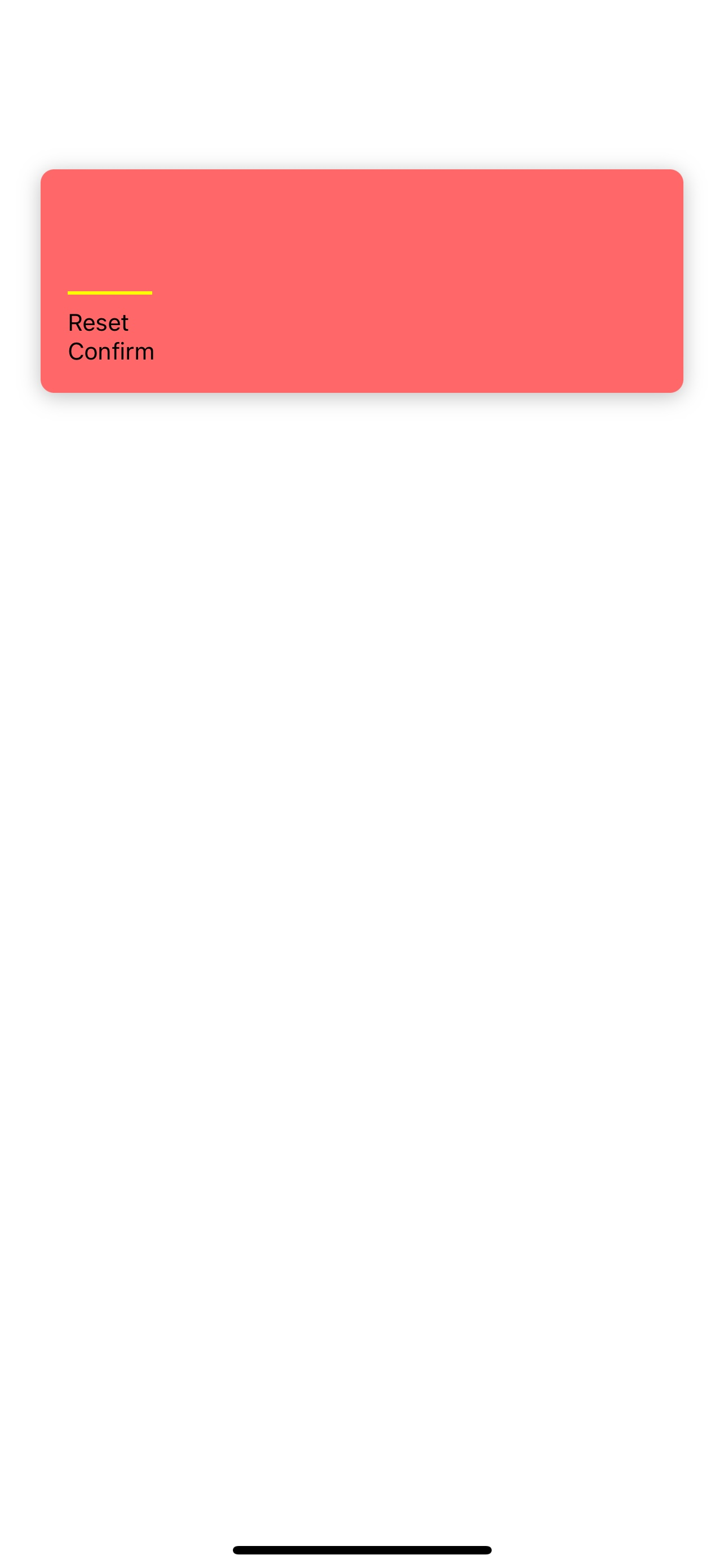
And this picture is a result when i rendered.
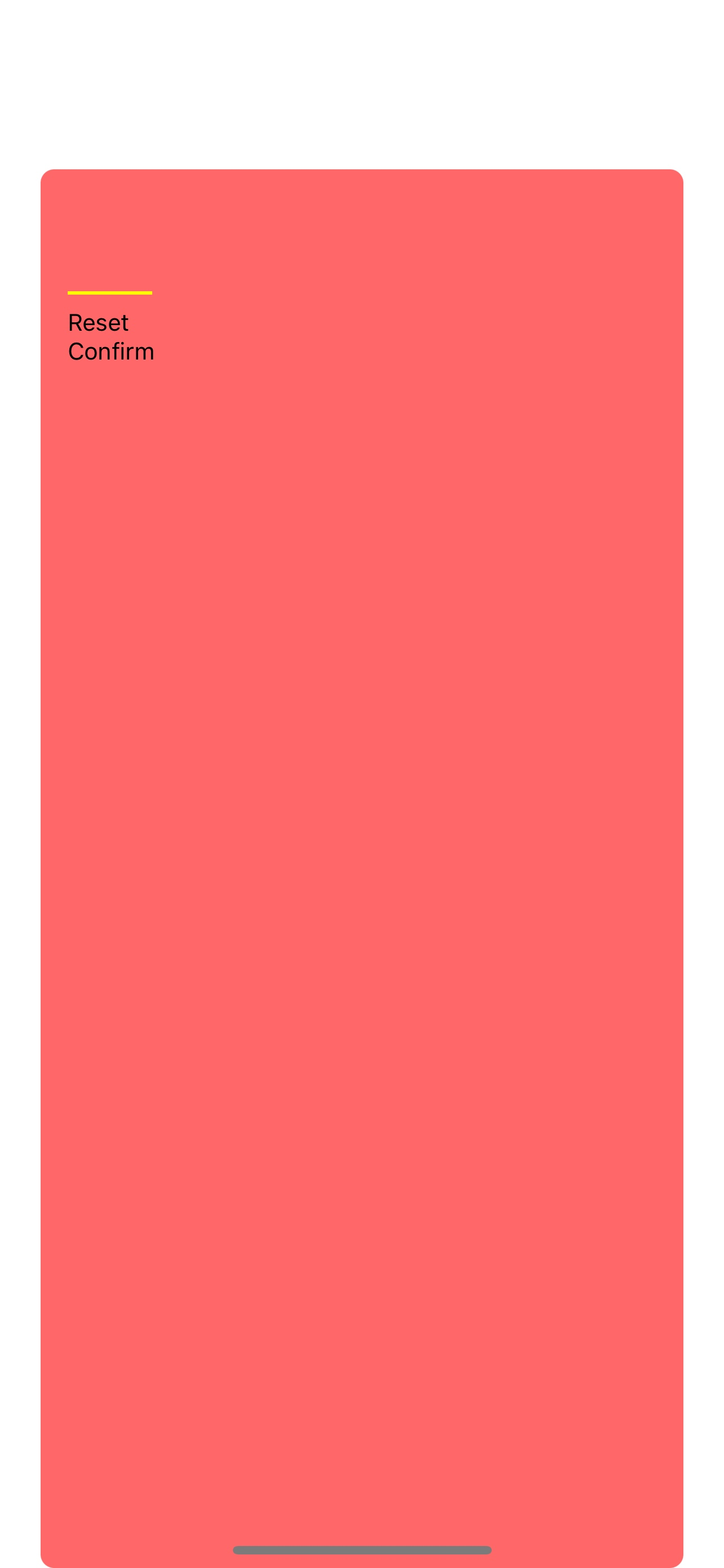
But when i change View to ScrollView, it rendered to this. (‘View’ compoenet to ‘ScrollView’)
Im curious that i used same style elements but why i got different result.
Thank you so much.

 Question posted in


2
Answers
Wrapping your
ScrollViewinsideSafeAreaViewwill fix this issue for you.It’s happening because your
ScrollViewwill take whatever height is available to it and by default it is100%.Another, solution could be to wrap your container
Viewinside of aScrollView.It appears that in your case, the unexpected layout that occurs after switching to ScrollView may be caused by the marginTop: 100 in the inputContainer style. If the content is not tall enough to fit the given area, the marginTop may push the content down, leaving empty space at the top.