skip to Main Content

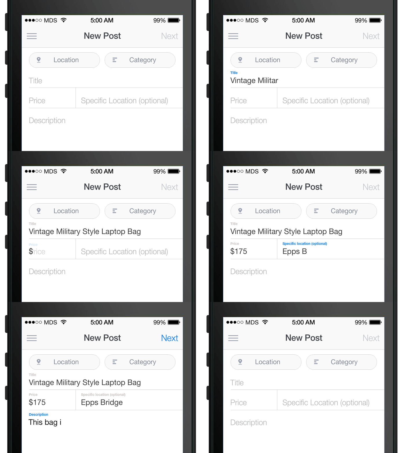
I’m attempting to replicate the experience from the Shopify checkout in my WooCommerce checkout page by animating the labels when the user focuses on a certain input, just like this:

Floating labels - Image from Matt D. Smith

I’ve tried using input:focus ~ label, but it won’t work because the default WooCommerce input is inside a span (.woocommerce-input-wrapper) like this:

<!-- The basic markup for each input -->
<p class="form-row form-row-first validate-required" id="billing_first_name_field" data-priority="10">
    <label for="billing_first_name" class="">Nombre&nbsp;<abbr class="required" title="obligatorio">*</abbr></label>
    <span class="woocommerce-input-wrapper">
        <input type="text" class="input-text " name="billing_first_name" id="billing_first_name" placeholder="" value="" autocomplete="given-name">
    </span>
</p>

<!-- CSS -->
<style>
.woocommerce-billing-fields__field-wrapper .form-row{
    position: relative;
}
.woocommerce-billing-fields__field-wrapper .form-row label{
    position: absolute;
    top: 11px;
    left: 11px;
    padding: 0;
    color: #808080;
    transition: .35s;
}
.woocommerce-billing-fields__field-wrapper .form-row input:focus ~ label{
    top: -8px;
    font-size: 12px;
    font-weight: 500;
}
</style>

Thanks!

3

Answers


  1. I hope you find these codes useful

    my css:

    label {}

    .woocommerce form .form-row label {
        position: absolute;
        left: 10px;
        top: 15px;
    }
    
    .woocommerce form .form-row {
        position: relative;
    }
    
    label.floatlabel {
        top: -30px !important;
    }
    

    mu jQuery :

    jQuery('.woocommerce form .form-row input').click(function(){
    
    var label = jQuery("label[for='" + jQuery(this).attr('id') + "']");
    
    if(jQuery('floatlabel').length ){
    
    jQuery('label.floatlabel').removeClass('floatlabel');
    
    }
    
    jQuery(label).addClass('floatlabel');
    
    })
    
    Login or Signup to reply.
  2. The major issue with woocommerce checkout inputs is that labels are before inputs. For floating labels to work you need to place the labels after the inputs then it is all easy. (You can use any css method here: https://css-tricks.com/float-labels-css/).

    I have tried finding a way to revert these elements in html but without success. I also tried using flexbox in css along with column-reverse but the animation didn’t seem to work.

    Basically the answer we are searching for is to the question: How to place labels after inputs in woocommerce checkout?

    @Morteza Barati’s answer could be good but it doesn’t work properly. If inputs are autofilled then the label sits on top of them + once label moves up in case field is erased it won’t come back down.

    Login or Signup to reply.
  3. As already mentioned: There is no standardized way to change the input-label position on text input.

    Off-topic: The design pattern in your screenshot comes from Googles material design (at least that’s where it’s commonly used and seen today). You can find more about that pattern here: https://material.io/components/text-fields

    Solution with JS and CSS

    You need some CSS and JS code to implement that design pattern. There are four different states you need to cover:

    1. When a field receives the text-focus: Move the label up.
    2. When a field loses focus and has no content: Move the label down.
    3. When a field loses focus and has content: Leave the label up.
    4. When a field has a value on page load: Move the label up.

    Here’s a short demo – the important part is the JS code which adds CSS classes to the field container on focus, blur and input.

    jQuery('.form-row :input').each(function() {
      var $input = jQuery(this);
      var $row   = $input.closest('.form-row');
      
      // Is the field filled on page load?
      if ($input.val()) {
        $row.addClass('-filled');
      }
      
      // Enter or leave the "focus" state.
      $input.on('focus', function() {
        $row.addClass('-focus');
      });
      $input.on('blur', function() {
        $row.removeClass('-focus');
      });
    
      // When the fields input value changes, add or remove the "-filled" state
      $input.on('input', function() {
        if ($input.val()) {
          $row.addClass('-filled');
        } else {
          $row.removeClass('-filled');
        }
      });
    })
    .form-row {
      position: relative;
      padding-top: 20px; /* top padding adds space for the label */
      margin: 10px 0;
    }
    
    .form-row label {
      position: absolute;
      top: 20px; /* initially, the label is down */
      left: 0;
      color: #aaa;
      transition: all 0.3s;
    }
    
    /* Give both the label and input field the same padding/box-size */
    .form-row input, 
    .form-row label {
      font-size: 16px;
      line-height: 22px;
      padding: 8px 12px;
      margin: 0;
    }
    
    /* When the field is focused or filled, move the label up */
    .form-row.-focus label,
    .form-row.-filled label {
      color: #6200ee;
      font-size: 12px;
      top: 0;
      padding: 0;
      line-height: 20px; /* Set the line height to the top-padding */
    }
    <script src="https://cdnjs.cloudflare.com/ajax/libs/jquery/3.3.1/jquery.min.js"></script>
    
    <div class="woocommerce-billing-fields__field-wrapper">
    
    <p class="form-row">
        <label for="field1">
            Field 1&nbsp;<abbr class="required">*</abbr>
        </label>
        <span class="woocommerce-input-wrapper">
            <input type="text" id="field1">
        </span>
    </p>
    
    <p class="form-row">
        <label for="field2">
            FIeld 2&nbsp;<abbr class="required">*</abbr>
        </label>
        <span class="woocommerce-input-wrapper">
            <input type="text" id="field2" value="Initial Value">
        </span>
    </p>
    
    </div>

    Pure CSS

    TL;DR; this is not possible in WooCommerce out-of-the-box.

    Note: A pure CSS solution is also possible when your comes after the field and could look like the below sample.
    It works by using the input fields "placeholder" as the initial caption. The CSS selector :not(:placeholder-shown) matches every text field that has a value. The CSS selector :focus handles the input fields focus state.

    However, this is just a sample and is not possible in WooCommerce without writing custom cart and checkout templates to produce the correct HTML elements.

    .form-row {
      position: relative;
      padding-top: 20px;
      margin: 10px 0;
    }
    
    .form-row label {
      position: absolute;
      color: #6200ee;
      font-size: 12px;
      top: 0;
      left: 0;
      padding: 0;
      line-height: 20px;
      opacity: 0;
      transition: all 0.3s;
    }
    
    .form-row input {
      font-size: 16px;
      line-height: 22px;
      padding: 8px 12px;
      margin: 0;
    }
    
    /* Here's the logic: */
    
    .form-row input:focus::placeholder {
      opacity: 0;
    }
    
    .form-row input:focus + label,
    .form-row input:not(:placeholder-shown) + label {
      opacity: 1;
    }
     <p class="form-row">
        <input type="text" id="field1" placeholder="My Field">
        <label for="field1">
            My Field
        </label>
    </p>
    Login or Signup to reply.
Please signup or login to give your own answer.
Back To Top
Search