skip to Main Content

I am trying to create a custom search box. Please see code below.

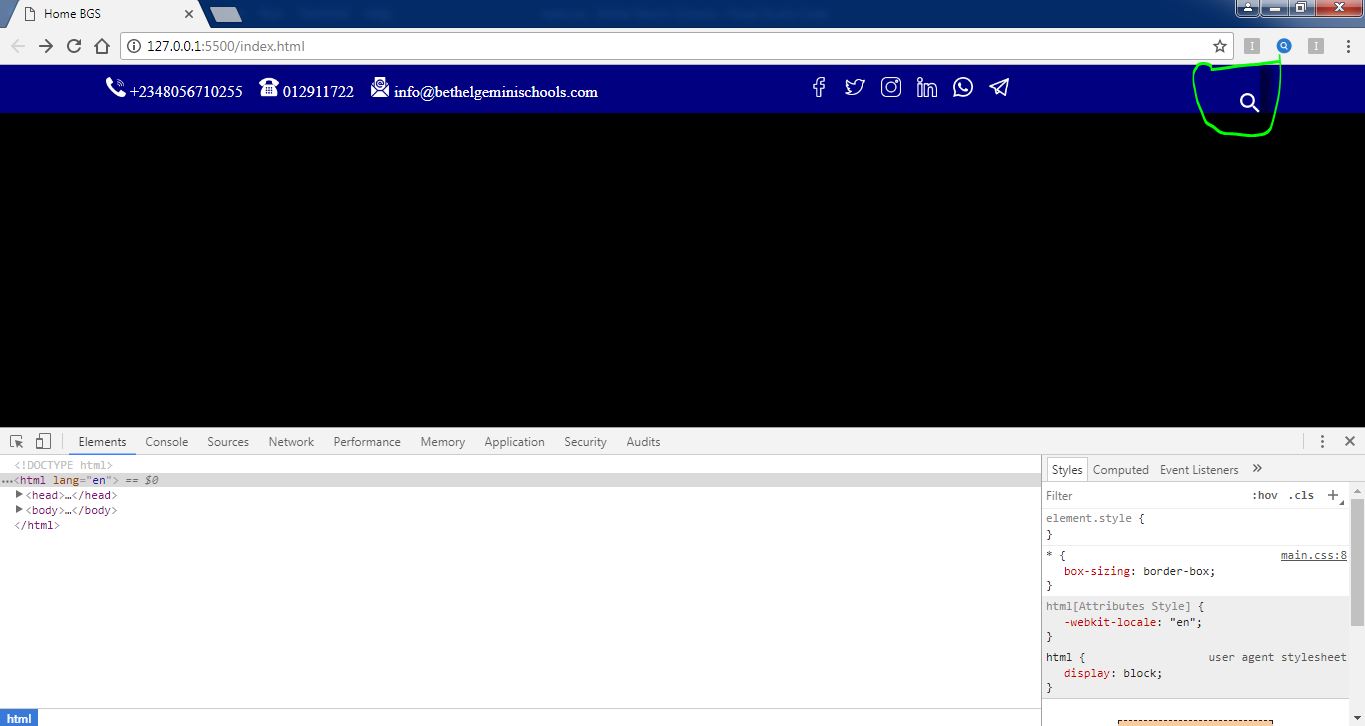
Problem 1: The input element (although not visible) in the figure below appears to be above the search icon before it is clicked (see green circle). How can I place both as inline? Note: The layout of the blue container was created using flexbox.

unwanted space above the search icon.

Problem 2: In the image below, on clicking the search icon, a space appears between the input element and the icon element (see green circle in section 3). Is it a result of the flexbox property? How can I get rid of it?

space between search box and search icon

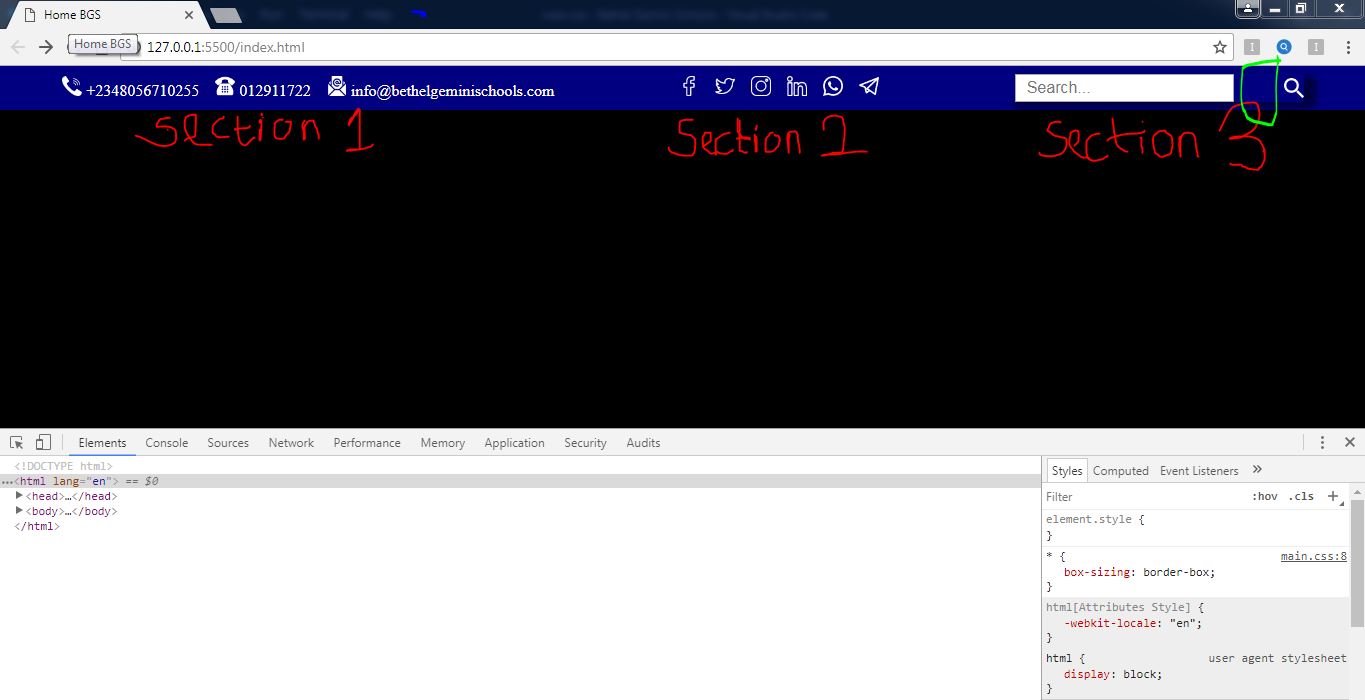
Problem 3: I need help in perfectly aligning the contact details in section 1 (see image in problem 2) with their corresponding icons. The phone numbers and email address appear to be at the bottom of the icons instead of center.

Thank you!

body {
  padding: 0 !important;
  margin: 0 !important;
  /* font-size: 1.2em; */
  background: black;
}

* {
  box-sizing: border-box;
}

/* PRE TOP NAVIGATION BAR */
.preTopNav {
  background-color: navy;
  display: flex;
  flex-flow: row wrap;
  justify-content: space-around;
  align-items: center;
  width: 100%;
}

.preTopNav-Items {
  display: flex;
  flex-flow: row wrap;
  padding-top: 10px;
  padding-bottom: 10px;
}

.preTopNav-Items img {
  width: 20px;
  height: 20px;
}

.preTopNav-Items a {
  text-decoration: none;
  color: white;
}

.preTopNav .contactDetails,
.preTopNav .socialDetails {
  align-items: center;
  justify-content: center;
}

.preTopNav .search {
  align-items: center;
  justify-content: flex-end;
  width: 40px;
  background-color: navy;
  border-radius: 4px;
  box-shadow: 10px 4px 10px 2px rgba(0, 0, 0, 0.5);
  transition: width 0.5s;
  padding: 0;
  overflow: hidden;
  border: mone;
}

.preTopNav .search img:hover {
  cursor: pointer;
}

.preTopNav .search.active {
  width: 300px;
}

.preTopNav .search input {
  /* margin-right: 50px; */
  position: relative;
  right: 50px;
  width: calc(100%-50px);
  padding: 3px 10px;
  font-size: 16px;
}

/* PHOTO SLIDESHOW */

/* MEDIA QUERIES */
<!DOCTYPE html>
<html lang="en">
  <head>
    <meta charset="UTF-8" />
    <meta name="viewport" content="width=device-width, initial-scale=1.0" />
    <title>Home BGS</title>
    <link rel="stylesheet" href="main.css" />
    <script
      src="https://kit.fontawesome.com/718022a53c.js"
      crossorigin="anonymous"
    ></script>
  </head>
  <body>
    <!-- PRE TOP NAVIGATION BAR -->
    <div class="preTopNav">
      <div class="preTopNav-Items contactDetails">
        <div class="contactDetails-Items">
          <img src="https://www.telegram.org/img/t_logo.png" alt="" />
          <a href="tel:+2348056710255">+2348056710255</a>
        </div>
        &nbsp;&nbsp;&nbsp;&nbsp;
        <div class="contactDetails-Items">
          <img src="https://www.telegram.org/img/t_logo.png" alt="" />
          <a href="tel:012911722">012911722</a>
        </div>
        &nbsp;&nbsp;&nbsp;&nbsp;
        <div class="contactDetails-Items">
          <img src="https://www.telegram.org/img/t_logo.png" alt="" />
          <a href="[email protected]"
            >[email protected]</a
          >
        </div>
      </div>
      <div class="preTopNav-Items socialDetails">
        <a href="https://www.facebook.com/bethelgeminischools"
          ><img
            src="/Icons/Facebook (Transparent - White Outline).png"
            alt=""
        /></a>
        &nbsp;&nbsp;&nbsp;&nbsp;
        <a href="https://www.twitter.com/bethelgeminischools"
          ><img
            src="/Icons/Twitter (Transparent - White Outline).png"
            alt=""
        /></a>
        &nbsp;&nbsp;&nbsp;&nbsp;
        <a href="https://www.instagram.com/bethelgeminischools"
          ><img
            src="/Icons/Instagram (Transparent - White Outline).png"
            alt=""
        /></a>
        &nbsp;&nbsp;&nbsp;&nbsp;
        <a href="https://www.linkedin.com/bethelgeminischools"
          ><img
            src="/Icons/LinkedIn (Transparent - White Outline).png"
            alt=""
        /></a>
        &nbsp;&nbsp;&nbsp;&nbsp;
        <a href="https://www.wa.me/2348056710255"
          ><img
            src="/Icons/Whatsapp (Transparent - White Outline).png"
            alt=""
        /></a>
        &nbsp;&nbsp;&nbsp;&nbsp;
        <a href="https://www.t.me/bethelgeminischools"
          ><img
            src="/Icons/Telegram (Transparent - White Outline).png"
            alt=""
        /></a>
      </div>
      <div class="preTopNav-Items search">
        <input type="text" class="searchBar" placeholder="Search..." />
        <img
          class="searchIcon"
          src="https://www.telegram.org/img/t_logo.png"
          alt=""
        />
      </div>
    </div>

    <script src="https://code.jquery.com/jquery-3.3.1.js"></script>
    <script type="text/javascript">
      $(document).ready(function () {
        $(".searchIcon").click(function () {
          $(".search").toggleClass("active");
        });
      });
    </script>
  </body>
</html>

2

Answers


  1. You can simplify your HTML and use the flexbox efficiently.

    Complete guide to CSS flexbox | Media Query for Responsive design

    $(".searchIcon").click(function() {
      $(".search").toggleClass("active");
    })
    * {
      margin: 0
    }
    
    .preTopNav {
      display: flex;
      padding: 15px 20px;
      align-items: center;
      background-color: navy;
      font-family: helvetica, arial, sans-serif;
    }
    
    .contactDetails {
      display: flex;
      flex: 1;
    }
    
    .contactDetails a {
      display: flex;
      text-decoration: none;
      color: white;
      margin-left: 20px;
      align-items: center;
    }
    
    .contactDetails a:first-child {
      margin-left: 0;
    }
    
    .contactDetails a img {
      margin-right: 10px;
    }
    
    .socialDetails {
      width: 30%;
      display: flex;
      justify-content: center;
    }
    
    .socialDetails a {
      margin: 0 5px;
      display: flex;
    }
    
    .search {
      width: 18%;
      display: flex;
      justify-content: flex-end;
      overflow: hidden;
    }
    
    .searchBar {
      display: none;
    }
    
    .search.active .searchBar {
      display: block;
      margin-right: 10px;
      box-sizing: border-box;
      width: 100%;
      transition: width 0.5s;
    }
    
    @media screen and (max-width: 991px) {
      .preTopNav {
        flex-direction: column
      }
      .socialDetails {
        margin-top: 20px;
        width: 100%;
        justify-content: center;
      }
      .search {
        width: 50%;
        margin-top: 20px;
        justify-content: center;
        text-align: center;
      }
    }
    
    @media screen and (max-width: 767px) {
      .contactDetails a {
        margin-bottom: 10px;
      }
      .contactDetails {
        flex-direction: column;
        align-items: center;
      }
    }
    <script src="https://cdnjs.cloudflare.com/ajax/libs/jquery/2.0.1/jquery.min.js"></script>
    <div class="preTopNav">
      <div class="preTopNav-Items contactDetails">
        <a href="tel:+2348056710255"><img src="https://placehold.it/24x24" alt="" /><span>+2348056710255M</span></a>
        <a href="tel:012911722"><img src="https://placehold.it/24x24" alt="" /><span>012911722</span></a>
        <a href="[email protected]"><img src="https://placehold.it/24x24" alt="" /><span>[email protected]</span></a>
      </div>
      <div class="preTopNav-Items socialDetails">
        <a href="https://www.facebook.com/bethelgeminischools"><img src="https://placehold.it/24x24" alt="" /></a>
        <a href="https://www.twitter.com/bethelgeminischools"><img src="https://placehold.it/24x24" alt="" /></a>
        <a href="https://www.instagram.com/bethelgeminischools"><img src="https://placehold.it/24x24" alt="" /></a>
        <a href="https://www.linkedin.com/bethelgeminischools"><img src="https://placehold.it/24x24" alt="" /></a>
        <a href="https://www.wa.me/2348056710255"><img src="https://placehold.it/24x24" alt="" /></a>
        <a href="https://www.t.me/bethelgeminischools"><img src="https://placehold.it/24x24" alt="" /></a>
      </div>
      <div class="preTopNav-Items search">
        <input type="text" class="searchBar" placeholder="Search..." />
        <img class="searchIcon" src="https://placehold.it/24x24" alt="" />
      </div>
    </div>
    Login or Signup to reply.
  2. Problem 1:
    If you add display: flex to the parent div container the items will displayed in a grid like view.

    Problem 2: The gap is caused by right css attribute. Also note that when using calc you need to add a space between the operator

    .preTopNav .search input {
      position: relative;
      right: 50px; <-- This is causing the space/gap between the search box and icon
      width: calc(100% - 50px); <-- Added space before and after minus 
      padding: 3px 10px;
      font-size: 16px;
    }
    

    Problem 3: Make the parent containers display flex and add align-items: center to align properly.

    .contactDetails-Items {
      display: flex;
      align-items: center;
      margin-right: 20px;
    }
    

    I’ve created a Sandbox where you can see the final result.

    Login or Signup to reply.
Please signup or login to give your own answer.
Back To Top
Search