skip to Main Content

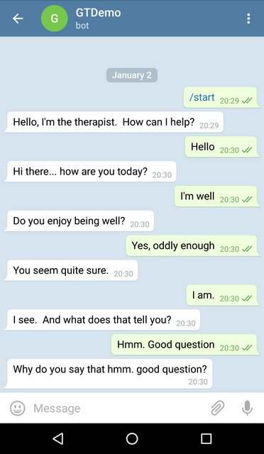
How can i create a chat bubble like telegram or whatsapp that has elevation and arrow on left or right side like in the image?

enter image description here

3

Answers


  1. Chosen as BEST ANSWER

    Building this with a shape, arrow, and shadow is quite complex. I created it using custom Modifier, remember, canvas and drawing path. Full implementation is available in this repo.

    enter image description here

    I can sum the process as

    Step1

    Create a state for wrapping properties

    class BubbleState internal constructor(
        var backgroundColor: Color = DefaultBubbleColor,
        var cornerRadius: BubbleCornerRadius = BubbleCornerRadius(
            topLeft = 8.dp,
            topRight = 8.dp,
            bottomLeft = 8.dp,
            bottomRight = 8.dp,
        ),
        var alignment: ArrowAlignment = ArrowAlignment.None,
        var arrowShape: ArrowShape = ArrowShape.TRIANGLE_RIGHT,
        var arrowOffsetX: Dp = 0.dp,
        var arrowOffsetY: Dp = 0.dp,
        var arrowWidth: Dp = 14.dp,
        var arrowHeight: Dp = 14.dp,
        var arrowRadius: Dp = 0.dp,
        var drawArrow: Boolean = true,
        var shadow: BubbleShadow? = null,
        var padding: BubblePadding? = null,
        var clickable: Boolean = false
    ) {
    
        /**
         * Top position of arrow. This is read-only for implementation. It's calculated when arrow
         * positions are calculated or adjusted based on width/height of bubble,
         * offsetX/y, arrow width/height.
         */
        var arrowTop: Float = 0f
            internal set
    
        /**
         * Bottom position of arrow.  This is read-only for implementation. It's calculated when arrow
         * positions are calculated or adjusted based on width/height of bubble,
         * offsetX/y, arrow width/height.
         */
    
        var arrowBottom: Float = 0f
            internal set
    
        /**
         * Right position of arrow.  This is read-only for implementation. It's calculated when arrow
         * positions are calculated or adjusted based on width/height of bubble,
         * offsetX/y, arrow width/height.
         */
        var arrowLeft: Float = 0f
            internal set
    
        /**
         * Right position of arrow.  This is read-only for implementation. It's calculated when arrow
         * positions are calculated or adjusted based on width/height of bubble,
         * offsetX/y, arrow width/height.
         */
        var arrowRight: Float = 0f
            internal set
    
    
        /**
         * Arrow is on left side of the bubble
         */
        fun isHorizontalLeftAligned(): Boolean =
            (alignment == ArrowAlignment.LeftTop
                    || alignment == ArrowAlignment.LeftBottom
                    || alignment == ArrowAlignment.LeftCenter)
    
    
        /**
         * Arrow is on right side of the bubble
         */
        fun isHorizontalRightAligned(): Boolean =
            (alignment == ArrowAlignment.RightTop
                    || alignment == ArrowAlignment.RightBottom
                    || alignment == ArrowAlignment.RightCenter)
    
    
        /**
         * Arrow is on top left or right side of the bubble
         */
        fun isHorizontalTopAligned(): Boolean =
            (alignment == ArrowAlignment.LeftTop || alignment == ArrowAlignment.RightTop)
    
    
        /**
         * Arrow is on top left or right side of the bubble
         */
        fun isHorizontalBottomAligned(): Boolean =
            (alignment == ArrowAlignment.LeftBottom || alignment == ArrowAlignment.RightBottom)
    
        /**
         * Check if arrow is horizontally positioned either on left or right side
         */
        fun isArrowHorizontallyPositioned(): Boolean =
            isHorizontalLeftAligned()
                    || isHorizontalRightAligned()
    
    
        /**
         * Arrow is at the bottom of the bubble
         */
        fun isVerticalBottomAligned(): Boolean =
            alignment == ArrowAlignment.BottomLeft ||
                    alignment == ArrowAlignment.BottomRight ||
                    alignment == ArrowAlignment.BottomCenter
    
        /**
         * Arrow is at the yop of the bubble
         */
        fun isVerticalTopAligned(): Boolean =
            alignment == ArrowAlignment.TopLeft ||
                    alignment == ArrowAlignment.TopRight ||
                    alignment == ArrowAlignment.TopCenter
    
        /**
         * Arrow is on left side of the bubble
         */
        fun isVerticalLeftAligned(): Boolean =
            (alignment == ArrowAlignment.BottomLeft) || (alignment == ArrowAlignment.TopLeft)
    
    
        /**
         * Arrow is on right side of the bubble
         */
        fun isVerticalRightAligned(): Boolean =
            (alignment == ArrowAlignment.BottomRight) || (alignment == ArrowAlignment.TopRight)
    
    
        /**
         * Check if arrow is vertically positioned either on top or at the bottom of bubble
         */
        fun isArrowVerticallyPositioned(): Boolean = isVerticalBottomAligned() || isVerticalTopAligned()
    }
    

    Step 2 Create function that returns remember to not create BubbleState at each recomposition.

    fun rememberBubbleState(
        backgroundColor: Color = DefaultBubbleColor,
        cornerRadius: BubbleCornerRadius = BubbleCornerRadius(
            topLeft = 8.dp,
            topRight = 8.dp,
            bottomLeft = 8.dp,
            bottomRight = 8.dp
        ),
        alignment: ArrowAlignment = ArrowAlignment.None,
        arrowShape: ArrowShape = ArrowShape.TRIANGLE_RIGHT,
        arrowOffsetX: Dp = 0.dp,
        arrowOffsetY: Dp = 0.dp,
        arrowWidth: Dp = 14.dp,
        arrowHeight: Dp = 14.dp,
        arrowRadius: Dp = 0.dp,
        drawArrow: Boolean = true,
        shadow: BubbleShadow? = null,
        padding: BubblePadding? = null,
        clickable:Boolean = false
    ): BubbleState {
    
        return remember {
            BubbleState(
                backgroundColor = backgroundColor,
                cornerRadius = cornerRadius,
                alignment = alignment,
                arrowShape = arrowShape,
                arrowOffsetX = arrowOffsetX,
                arrowOffsetY = arrowOffsetY,
                arrowWidth = arrowWidth,
                arrowHeight = arrowHeight,
                arrowRadius = arrowRadius,
                drawArrow = drawArrow,
                shadow = shadow,
                padding = padding,
                clickable = clickable
            )
        }
    } 
    

    Step 3 Measuring layout We need to calculate space for arrow tip based on it's location, use Constraints.offset to limit placeable dimensions when measuring for our content and constrain width/height to not overflow parent.

    internal fun MeasureScope.measureBubbleResult(
        bubbleState: BubbleState,
        measurable: Measurable,
        constraints: Constraints,
        rectContent: BubbleRect,
        path: Path
    ): MeasureResult {
    
        val arrowWidth = (bubbleState.arrowWidth.value * density).roundToInt()
        val arrowHeight = (bubbleState.arrowHeight.value * density).roundToInt()
    
        // Check arrow position
        val isHorizontalLeftAligned = bubbleState.isHorizontalLeftAligned()
        val isVerticalTopAligned = bubbleState.isVerticalTopAligned()
        val isHorizontallyPositioned = bubbleState.isArrowHorizontallyPositioned()
        val isVerticallyPositioned = bubbleState.isArrowVerticallyPositioned()
    
        // Offset to limit max width when arrow is horizontally placed
        // if we don't remove arrowWidth bubble will overflow from it's parent as much as arrow
        // width is. So we measure our placeable as content + arrow width
        val offsetX: Int = if (isHorizontallyPositioned) {
            arrowWidth
        } else 0
    
        // Offset to limit max height when arrow is vertically placed
    
        val offsetY: Int = if (isVerticallyPositioned) {
            arrowHeight
        } else 0
    
        val placeable = measurable.measure(constraints.offset(-offsetX, -offsetY))
    
        val desiredWidth = constraints.constrainWidth(placeable.width + offsetX)
        val desiredHeight: Int = constraints.constrainHeight(placeable.height + offsetY)
    
        setContentRect(
            bubbleState,
            rectContent,
            desiredWidth,
            desiredHeight,
            density = density
        )
    
        getBubbleClipPath(
            path = path,
            state = bubbleState,
            contentRect = rectContent,
            density = density
        )
    
    
        // Position of content(Text or Column/Row/Box for instance) in Bubble
        // These positions effect placeable area for our content
        // if xPos is greater than 0 it's required to translate background path(bubble) to match total
        // area since left of  xPos is not usable(reserved for arrowWidth) otherwise
        val xPos = if (isHorizontalLeftAligned) arrowWidth else 0
        val yPos = if (isVerticalTopAligned) arrowHeight else 0
    
    
        return layout(desiredWidth, desiredHeight) {
    
    
            placeable.place(xPos, yPos)
        }
    }
    

    Also we need a Rectangle to capture content position that does exclude arrow dimensions.

    Step 4 Create path using state that wraps arrow direction, offset in y or x axis and with draw option and rectangle we got from previous step is bit long, you can check it in source code here if you wish. Also still no rounded or curved paths, if you can help with it, it's more than welcome.

    Step 5 Create a composed(stateful) Modifier to layout, and draw our bubble behind our content.

    fun Modifier.drawBubble(bubbleState: BubbleState) = composed(
    
        // pass inspector information for debug
        inspectorInfo = debugInspectorInfo {
            // name should match the name of the modifier
            name = "drawBubble"
            // add name and value of each argument
            properties["bubbleState"] = bubbleState
        },
    
        factory = {
    
            val rectContent = remember { BubbleRect() }
            val path = remember { Path() }
            var pressed by remember { mutableStateOf(false) }
    
            Modifier
                .layout { measurable, constraints ->
    //                println("Modifier.drawBubble() LAYOUT align:${bubbleState.alignment}")
                    measureBubbleResult(bubbleState, measurable, constraints, rectContent, path)
                }
    
                .materialShadow(bubbleState, path, true)
                .drawBehind {
    //                println(
    //                    "✏️ Modifier.drawBubble() DRAWING align:${bubbleState.alignment}," +
    //                            " size: $size, path: $path, rectContent: $rectContent"
    //                )
                    val left = if (bubbleState.isHorizontalLeftAligned())
                        -bubbleState.arrowWidth.toPx() else 0f
    
                    translate(left = left) {
                        drawPath(
                            path = path,
                            color = if (pressed) bubbleState.backgroundColor.darkenColor(.9f)
                            else bubbleState.backgroundColor,
                        )
    
                    }
                }
                .then(
                    if (bubbleState.clickable) {
                        this.pointerInput(Unit) {
                            forEachGesture {
                                awaitPointerEventScope {
                                    val down: PointerInputChange = awaitFirstDown()
                                    pressed = down.pressed
                                    waitForUpOrCancellation()
                                    pressed = false
                                }
                            }
                        }
                    } else this
                )
                .then(
                    bubbleState.padding?.let { padding ->
                        this.padding(
                            padding.start,
                            padding.top,
                            padding.end,
                            padding.bottom
                        )
                    } ?: this
                )
        }
    )
    

  2. You can define your custom Shape.

    For example you can define a Triangle using:

    class TriangleEdgeShape(val offset: Int) : Shape {
    
        override fun createOutline(
            size: Size,
            layoutDirection: LayoutDirection,
            density: Density
        ): Outline {
            val trianglePath = Path().apply {
                moveTo(x = 0f, y = size.height-offset)
                lineTo(x = 0f, y = size.height)
                lineTo(x = 0f + offset, y = size.height)
            }
            return Outline.Generic(path = trianglePath)
        }
    }
    

    You can also extending the RoundedCornerShape adding the little triangle in the bottom right corner.

    Then you can define something like:

    Row(Modifier.height(IntrinsicSize.Max)) {
          Column(
              modifier = Modifier.background(
                  color = Color.xxx,
                  shape = RoundedCornerShape(4.dp,4.dp,0.dp,4.dp)
              ).width(xxxx)
          ) {
              Text("Chat")
          }
          Column(
              modifier = Modifier.background(
                            color = Color.xxx,
                            shape = TriangleEdgeShape(10))
                         .width(8.dp)
                         .fillMaxHeight()
                  ){
          }
    

    enter image description here

    Login or Signup to reply.
  3. Create a custom shape. This is a better solution than Gabriele’s because it lets you maintain an elevation around the entire border. Here’s a good article on creating custom shapes:

    Custom Shape with Jetpack Compose – Article

    and the source code:

    Custom Shape with Jetpack Compose – Source code

    Login or Signup to reply.
Please signup or login to give your own answer.
Back To Top
Search