skip to Main Content

I want to add a background image (having a full window sized width) just below the navigation bar. It should not cover the whole page length, but starts just below the navigation bar menu, and goes down till a particular specified height. (but the width is full).

I referred to the following but still no results:
Starting a background image below navbar in Twitter Bootstrap. I am also not using any Bootstrap.

This is what I have coded so far but no results:

HTML:

<!DOCTYPE html>
<html>
  <head>
    <title>Numberz</title>
    <link href="https://fonts.googleapis.com/css?family=Open+Sans:400italic,600italic,700italic,400,600,700" rel="stylesheet" type="text/css">
    <link rel="stylesheet" type="text/css" href="style.css">
    <meta http-equiv="content-type" content="text/html; charset=utf-8" />
  </head>

  <body>
    <nav>

       <img src="image2.png" alt="numberz" width="218px" height="38px" style="margin-left: 100px; margin-top: 15px; float: left; display: inline-block;">

       <section style="margin-right: 150px;">
         <ul id="menu">
            <li><a href="#"><b>SIGNUP</b></a></li>
            <li><a href="#"><b>LOGIN</b></a></li>   
            <li><a href="#"><b>ACCOUNTANTS</b></a></li>
            <li><a href="#"><b>BLOG</b></a></li>
            <li><a href="#"><b>FEATURES</b></a></li>
            <li><a href="#"><b>PRICING</b></a></li>
         </ul>
       </section>

    </nav>

    <div id="backgroundimage"></div> //this is the division created for the background image

  </body>
</html>

CSS:

ul#menu li {
display: inline-block;
float: right;
position: relative;
margin-top: 28px; 
margin-left: 10px;
margin-right: 35px;

}

ul#menu li a {

text-decoration: none;
color: #808080;
font-family: "Helvetica Neue";
font-size: 15px;
}

#backgroundimage {
background: url("image3.png");
width: 1024px;
height: 500px;
background-repeat: no-repeat;
display: block;
position: relative;
background-position: 0 500px;
} 

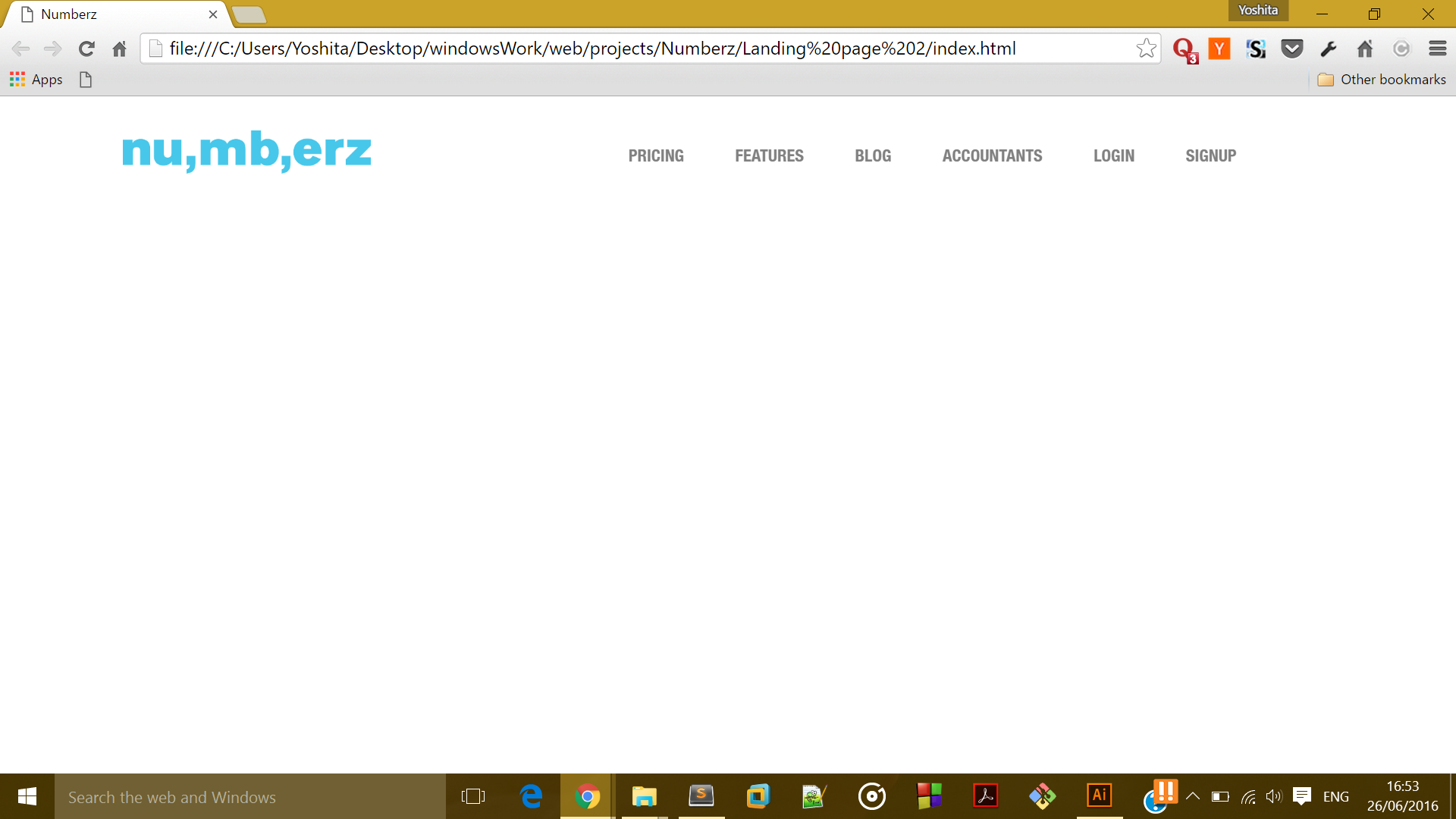
Right now It looks like this:

enter image description here

I want something like this:

enter image description here

Any help would be greatly appreciated.

4

Answers


  1. The main problem with floating content is, its parent doesn’t size with it.

    Set your nav to overflow: auto will solve that.

    But I recommend to skip the float: right in the ul#menu li rule (as in 2.nd sample below)

    ul#menu li {
      display: inline-block;
      position: relative;
      margin-top: 28px; 
      margin-left: 10px;
      margin-right: 35px;
    }
    
    ul#menu li a {
    
      text-decoration: none;
      color: #808080;
      font-family: "Helvetica Neue";
      font-size: 15px;
    }
    
    #backgroundimage {
      background: url("http://lorempixel.com/600/600/city");
      width: 1024px;
      height: 500px;
      background-repeat: no-repeat;
      background-position: cover;
    }
    <nav>
    
      <img src="image2.png" alt="numberz" width="218px" height="38px" style="margin-left: 100px; margin-top: 15px; float: left; display: inline-block;">
    
      <section style="margin-right: 150px;">
        <ul id="menu">
          <li><a href="#"><b>SIGNUP</b></a></li>
          <li><a href="#"><b>LOGIN</b></a></li>   
          <li><a href="#"><b>ACCOUNTANTS</b></a></li>
          <li><a href="#"><b>BLOG</b></a></li>
          <li><a href="#"><b>FEATURES</b></a></li>
          <li><a href="#"><b>PRICING</b></a></li>
        </ul>
      </section>
    
    </nav>
    
    <div id="backgroundimage"></div> //this is the division created for the background image

    Sample without float

    ul#menu li {
      display: inline-block;
      position: relative;
      margin-top: 28px; 
      margin-left: 10px;
      margin-right: 35px;
    }
    
    ul#menu li a {
    
      text-decoration: none;
      color: #808080;
      font-family: "Helvetica Neue";
      font-size: 15px;
    }
    
    #backgroundimage {
      background: url("http://lorempixel.com/600/600/city");
      width: 1024px;
      height: 500px;
      background-repeat: no-repeat;
      background-position: cover;
    }
    <nav>
    
      <img src="image2.png" alt="numberz" width="218px" height="38px" style="margin-left: 100px; margin-top: 15px; float: left; display: inline-block;">
    
      <section style="margin-right: 150px;">
        <ul id="menu">
          <li><a href="#"><b>SIGNUP</b></a></li>
          <li><a href="#"><b>LOGIN</b></a></li>   
          <li><a href="#"><b>ACCOUNTANTS</b></a></li>
          <li><a href="#"><b>BLOG</b></a></li>
          <li><a href="#"><b>FEATURES</b></a></li>
          <li><a href="#"><b>PRICING</b></a></li>
        </ul>
      </section>
    
    </nav>
    
    <div id="backgroundimage"></div> //this is the division created for the background image
    Login or Signup to reply.
  2. I think you should just put the nav in a div and the image in another div so they get separated

    Login or Signup to reply.
  3. Try this, there was a issue with background-position,

    #backgroundimage {
    background:url(1.jpg);
    margin-top:80px;
    margin-left:100px;
    width: 1024px;
    height: 500px;
    background-repeat: no-repeat;
    display: block;
    position: absolute;
    background-position:center;
    background-size:cover;
    } 
    
    Login or Signup to reply.
  4. I’ve tried your code. Try changing this line:

    #backgroundimage {
    background: url("image3.png");
    width: 1024px;
    height: 500px;
    background-repeat: no-repeat;
    display: block;
    position: relative;
    background-position: 0 500px;
    } 
    

    to this:

    #backgroundimage {
    background-image: url("image3.png");
    width: 100vw;
    height: 100vh; 
    background-size: 100% 100%;
    background-repeat: no-repeat;
    position: relative;
    } 
    

    and then add this to your css:

    nav
    {
    overflow: auto;
    }
    

    Here’s a proof that it works:
    enter image description here

    Login or Signup to reply.
Please signup or login to give your own answer.
Back To Top
Search