 Question posted in


How would I achieve this layout with Bootstrap?
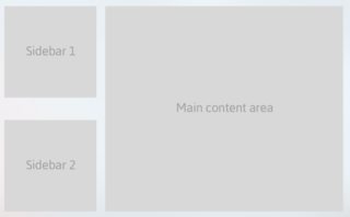
Box1 and Box2 should be stacked on the left and content Box3 should fill the remaining columns (width) and height of Box# should be equal to the total height of Box1 and Box2 (in other words I guess! height of Box3 should be equal to the row height…)
I am not sure what am I missing to get the layout!
My code:
.small-box {
  background-color: gray;
  border: 1px solid black;
 }

.content-box {
  background-color: lightgreen;
  border: 1px solid black;
 }
<link href="https://cdnjs.cloudflare.com/ajax/libs/twitter-bootstrap/4.0.0-beta/css/bootstrap.min.css" rel="stylesheet"/>
<div class="container">
<div class="row">
<div class="col-md-4 small-box">
<div class="row col-md-12">
<div class="col-md-12">
<h1>box1</h1>
</div>
<div class="col-md-12">
<h1>box2</h1>
</div>
</div>
</div>
<div class="col-md-8 content-box">
<h1>box3</h1>
</div>
</div>
</div>CSS
.small-box {
  background-color: gray;
  border: 1px solid black;
 }

.content-box {
  background-color: lightgreen;
  border: 1px solid black;
 }
2:
3
Answers
You have to fix height for box1 and box2. Generally, bootstrap row takes height based on the element of inside. If you fix height your layout will work as you want. Use different background-color for each box it will help you to understand.
I think the small-box class is applied to the wrong element.
In order to apply it to each left hand container, you should move it down a level like:
To get the height of the left side to match the content box, you can set it in the css:
Here is a forked version of the codepen.
I think this is what you’re looking for.
CSS
HTML
I think it’s important to think about the box model and how each one of the div’s fit into each other.