 Question posted in


My understanding is the new Boostrap (v4) uses flex to display elements on the box and is a lot more flexible for alignment. In my page I have three boxes which have equal heights, however the inner elements in white also need to have the same height.
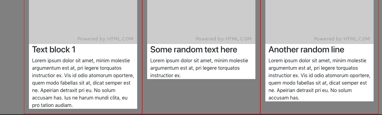
How can I achieve this? Setting the .tile to height:100% renders the boxes too long.
EDIT: I want to make clear this isn’t to make the columns marked in red equal height, this is already achieved using standard Bootstrap classes. It’s the boxes in white I need to be full height.
.col-md-4 {
  border: 1px solid red;
}

.tile {
  background: #fff;
}

body {
  background: grey
}

.img-fluid {
  width: 100%;
}

.padding {
  padding: 0 10px;
}
<link href="https://cdnjs.cloudflare.com/ajax/libs/twitter-bootstrap/4.1.2/css/bootstrap.min.css" rel="stylesheet" />
<div class="container">
<div class="row row-eq-height three-sections">
<div class="col-md-4 align-self-stretch tile-outer">
<div class="tile">
<a href="#" target="_blank"><img src="https://via.placeholder.com/300x300" alt="" class="img-fluid" /></a>
<div class="padding">
<h3>Text block 1</h3>
<p>Lorem ipsum dolor sit amet, minim molestie argumentum est at, pri legere torquatos instructior ex. Vis id odio atomorum oportere, quem modo fabellas sit at, dicat semper est ne. Apeirian detraxit pri eu. No solum accusam has. Ius ne harum mundi
clita, eu pro tation audiam.</p>
</div>
</div>
</div>
<div class="col-md-4 align-self-stretch tile-outer">
<div class="tile">
<a href="#" target="_blank"><img src="https://via.placeholder.com/300x300" alt="" class="img-fluid" /></a>
<div class="padding">
<h3>Some random text here</h3>
<p>Lorem ipsum dolor sit amet, minim molestie argumentum est at, pri legere torquatos instructior ex. </p>
</div>
</div>
</div>
<div class="col-md-4 align-self-stretch tile-outer">
<div class="tile">
<a href="#" target="_blank"><img src="https://via.placeholder.com/300x300" alt="" class="img-fluid" /></a>
<div class="padding">
<h3>Another random line</h3>
<p>Lorem ipsum dolor sit amet, minim molestie argumentum est at, pri legere torquatos instructior ex. Vis id odio atomorum oportere, quem modo fabellas sit at, dicat semper est ne. Apeirian detraxit pri eu. No solum accusam has.</p>
</div>
</div>
</div>
</div>
</div>
2
Answers
Just add
display: flexto thecol-md-4containers. That will automatically applyalign-self: stretchto the child elements. revised demoAlso it can be solved with this