 Question posted in


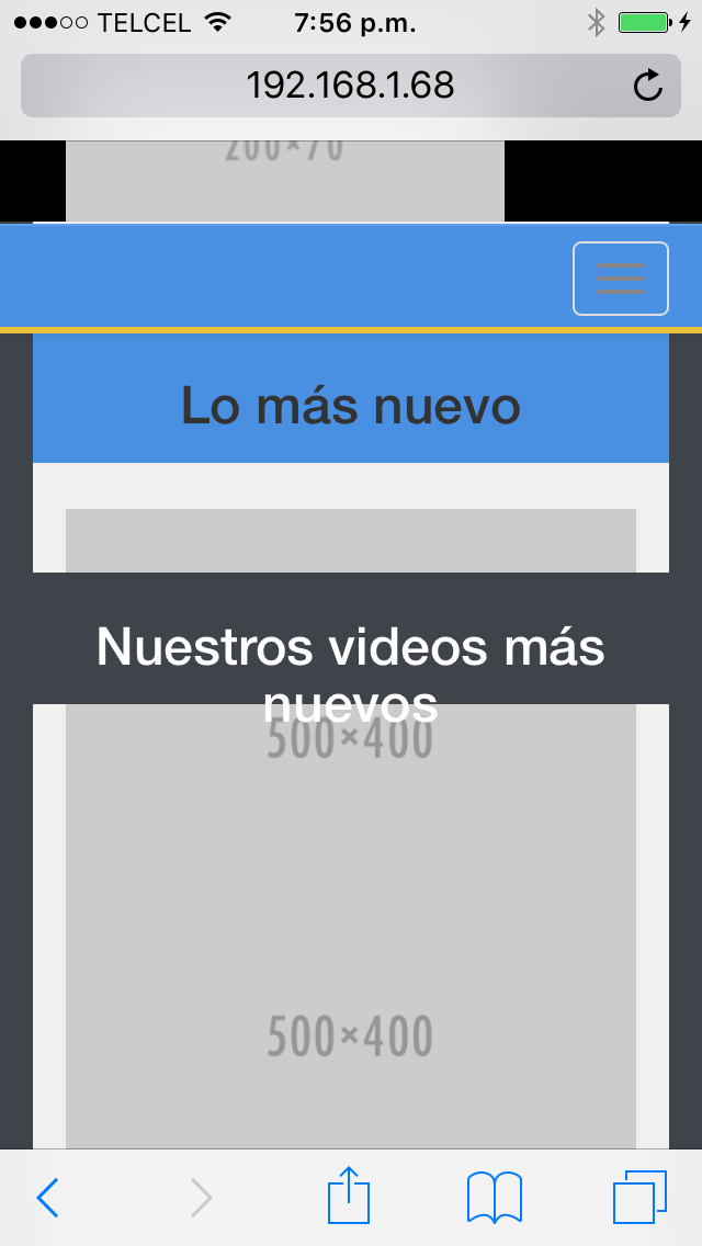
I have a problem with a div and images, they’re overlapping even when there is content inside the div. I’m using bootstrap for the grid system.
This picture demonstrates the problem:
Here’s my code in JSFiddle
.news-section {
	height: 500px;
	background-color: #F1EFEF;
}
.news-title {
	margin-top: 50px;
	height: 60px;
	background-color: #4A90E2;
	display: inline-block;
	text-align: center;

}
.news-title > h3 {
	vertical-align: middle;

}
.videos-title {
	margin-top: 50px;
	height: 60px;

	background-color: #3F444A;
	color: #fff;
	display: inline-block;
	text-align: center;
}
.videos-title > h3 {
	vertical-align: middle;
}
.news-content {
	margin-top: 25px;
	display: inline-block;
}
.videos-content {
	margin-top: 25px;
	display: inline-block;
}
<link href="https://cdnjs.cloudflare.com/ajax/libs/twitter-bootstrap/4.0.0-alpha.5/css/bootstrap-flex.css" rel="stylesheet"/>
<section>
<div class="container">
<div class="row">
<div class="news-section">
<div class="col-md-6 col-xs-12 news-title">
<h3>Lo más nuevo</h3>
<div class="news-content">
<img class="img-responsive" src="http://placehold.it/500x400" alt="" >
</div>
</div>
<div class="col-md-6 col-xs-12 videos-title">
<h3>Nuestros videos más nuevos</h3>
<div class="news-content">
<img class="img-responsive" src="http://placehold.it/500x400" alt="" >
</div>
</div>
</div>
</div>
</div>
</section>
2
Answers
Well it’s hard to tell what exactly is causing it without knowing what the container and row classes look like, but I’m guessing you’re using bootstrap? At any rate you’re news-content class is inline-block and your h3 element class is a block element so the block element will not be inline with you’re inline element. You’ll need to make both of your elements inline in order for them to line up. It also looks like you’re viewport size is fairly small, so if you don’t specify a width on your .news-content class then the div will resize to fit the image.
Since it looks like you’re using Bootstrap, you should avoid using inline styles and make use of the Bootstrap grid classes. You can nest rows with-in rows, so long as the columns equal to 12.
check this fiddle