 Question posted in


As a learning exercise, I would like to use only Bootstrap Flex (or CSS3 flexbox) to vertically left-align and horizontally stretch the input fields. I know about Bootstrap Grid (and CSS3 grid layout) but I do not want to use that.
Here’s the code (also on codepen.io)
<link href="https://cdnjs.cloudflare.com/ajax/libs/twitter-bootstrap/4.1.3/css/bootstrap.min.css" rel="stylesheet"/>

<div class="d-flex flex-wrap flex-column">
      <div class="d-flex flex-row">
		  <div class="flex-fill"><label>Field ABC 1</label></div>
		  <div class="flex-fill"><input   type="text" /></div>
      </div>
      <div class="d-flex flex-row">
		  <div class="flex-fill"><label>Field Long DEF 123 </label></div>
		  <div class="flex-fill align-self-stretch"><input type="text" /></div>
      </div>
      <div class="d-flex flex-row">
		  <div class="flex-fill"><label>Field3</label></div>
		  <div class="flex-fill align-self-stretch"><input type="text" /></div>
      </div>
    </div>
And that looks something like this
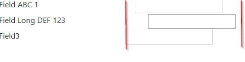
I’ve tried align-self-* on the item divs but without any luck. I also tried putting the class directly on the input.
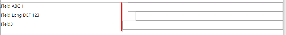
Then I removed the div’s around the labels and inputs. Now they stretch horizontally but still no vertical alignment.
And now the result looks like this
As a sub-question, I’ve wrapped each input (and each label) in a div. Is that correct / good / recommended (in terms of how Html / CSS is meant to work technically) or is it overkill?
2
Answers
just removed some classes!
So I couldn’t solve it using only Bootstrap Flex, but I did it partially with help of CSS3 Flexbox.
I basically removed
.flex-fill(Bootstrap sets it to haveflex: auto 1 1which we do not want) and usedflex-basis: <size>property instead. And I usedjustify-content-betweento align inputs to the right.Codepen
Code:
And about your second question: avoid unnecesary divs, they make your DOM bigger and slow the performance.