


I have a bunch of cards on my html page. The container that holds all the cards are left aligned so that when the screen is a smaller size it overflows onto the next row and starts from the far left. However I want to possibly wrap this container around another container that will centre it to the screen. Would appreciate any guidance.
        * {
            padding: 0;
            margin: 0;
            box-sizing: border-box;
        }

        body {
            background-color: #0D192B;
            background-size: cover;
            display: flex;
            justify-content: center;
            align-items: center;
            flex-direction: column;
            font-family: "Poppins", sans-serif;
        }

        .header {
            margin-top: 20px;
            margin-bottom: 40px;
            color: #ffffff;
            font-size: 42px;
            font-family: "Montserrat", -apple-system, BlinkMacSystemFont, "Segoe UI", "Roboto", "Oxygen", "Ubuntu", "Cantarell", "Fira Sans", "Droid Sans", "Helvetica Neue", sans-serif;
        }

        .center-wrapper {
            display: flex;
            justify-content: center;
            align-items: center;
        }

        .card-container {
            display: flex;
            gap: 60px;
            flex-wrap: wrap;
            justify-content: flex-start;
            /* justify-content: center; */
            align-items: center;
            margin-bottom: 20px;
        }

        .card {
            height: 323px;
            width: 320px;
            background-color: rgba(255, 255, 255, 0.06);
            -webkit-backdrop-filter: blur(20px);
            backdrop-filter: blur(20px);
            border-radius: 8px;
            box-shadow: 20px 20px 22px rgba(0, 0, 0, 0.2);
            text-align: center;
            transition: transform 0.3s ease;
        }

        .card:hover {
            transform: translateY(-10px);
        }

        .card-img {
            height: 120px;
            width: 120px;
            background-color: rgba(255, 255, 255, 0.06);
            -webkit-backdrop-filter: blur(20px);
            backdrop-filter: blur(20px);
            border-radius: 50%;
            margin: 30px auto 20px auto;
            transition: transform 0.3s ease;
        }

        .card-img:hover {
            transform: translateY(-10px);
        }

        .card-img img {
            height: 80%;
            border-radius: 100%;
            margin-top: 12px;
        }

        h6 {
            margin: 0;
        }

        .desc {
            text-align: center;
            margin-top: 20px;
        }

        .primary-text {
            color: #d5d5d5;
            font-size: 16px;
            font-weight: 600;
            letter-spacing: 0.7px;
            margin: 5px 0;
        }

        .secondary-text {
            color: #c0c0c0;
            font-weight: 400;
            font-size: 14px;
            letter-spacing: 1px;
            margin: 5px 0;
        }

        button {
            background-color: rgba(255, 255, 255, 0.06);
            -webkit-backdrop-filter: blur(20px);
            backdrop-filter: blur(20px);
            border: none;
            width: 80%;
            padding: 15px 0;
            border-radius: 5px;
            outline: none;
            transition: background-color 0.3s ease;
        }

        button:hover {
            background-color: rgba(192, 136, 18, 1);
            color: black;
        }

        footer {
            color: white;
            font-size: 14px;
            text-align: center;
            padding: 10px;
        }
<!DOCTYPE html>
<html lang="en">
<head>
<meta charset="UTF-8">
<meta name="viewport" content="width=device-width, initial-scale=1.0">
<title>Test</title>
<link rel="stylesheet" href="https://cdnjs.cloudflare.com/ajax/libs/font-awesome/4.7.0/css/font-awesome.min.css">
<link rel="stylesheet" href="https://fonts.googleapis.com/css2?family=Poppins:wght@400;600&display=swap">
</head>
<body>
<div class="header">
<h1>Welcome!</h1>
</div>
<div class="center-wrapper">
<div class="card-container">
<div class="card">
<div class="card-img">
<img src="1.png" alt="1">
</div>
<div class="desc">
<h6 class="primary-text">Card 1</h6>
<h6 class="secondary-text">Software Company 1</h6>
</div>
<button class="primary-text" onclick="window.location.href = '/';">Launch</button>
</div>
<div class="card">
<div class="card-img">
<img src="2.jpg" alt="2">
</div>
<div class="desc">
<h6 class="primary-text">Card 2</h6>
<h6 class="secondary-text">Software Company 2</h6>
</div>
<button class="primary-text" onclick="window.location.href = '/';">Launch</button>
</div>
<div class="card">
<div class="card-img">
<img src="3.png" alt="3">
</div>
<div class="desc">
<h6 class="primary-text">Card 3</h6>
<h6 class="secondary-text">Software Company 3</h6>
</div>
<button class="primary-text" onclick="window.location.href = '/';">Launch</button>
</div>
</div>
</div>
<footer>
<p>© Testing Footer</p>
</footer>
</body>
</html>This currently gives me this output:
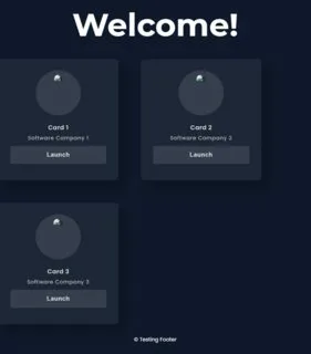
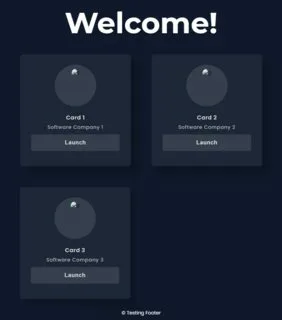
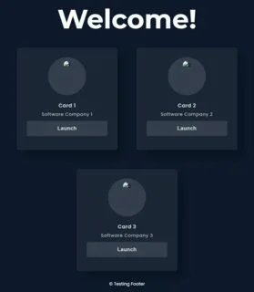
My expected output:
I did try justify-content: flex-start and centre on the center-wrapper container but it didn’t work
Just to be clear I DON’T want the output to be like this:
3
Answers
One option is to just center it out
This is the best I can do. I don’t know how many cards you will have in the end, but maybe this approach will help you somehow.
You doesn’t need any wrapper just change the layout.