


I make a WordPress theme, but I added a CSS burger menu icon to appear on the mobile screen
I want it to disappear on the desktop screen but it doesn’t
WordPress header code
<!DOCTYPE html>
<html <?php language_attributes();?>>
<head>
    <meta charset = "<?php bloginfo('charset') ?>">
    <meta name = "viewport" content = "width= device-width, initial-scale =1">
    <?php wp_head(); ?>

</head>
<body <?php body_class() ?>>
    <header class="site-header">
        <div class="container">
            <h1 class="school-logo-text float-left">
            <a href="<?php echo site_url() ?>"><strong>Fictional</strong> University</a>
            </h1>
            <span class="js-search-trigger site-header__search-trigger"><i class="fa fa-search" aria-hidden="true"></i></span>
            <i class="site-header__menu-trigger fa fa-bars" aria-hidden="true"></i>
            <div class="site-header__menu group">
            <nav class="main-navigation">
                <?php
                    wp_nav_menu(array(
                        'theme_location' => 'headerMenuLocation'
                    ));
                ?>
                <!-- <ul>
                <li><a href="<?php echo site_url('/about-us'); ?>">About Us</a></li>
                <li><a href="#">Programs</a></li>
                <li><a href="#">Events</a></li>
                <li><a href="#">Campuses</a></li>
                <li><a href="#">Blog</a></li>
                </ul> -->
            </nav>
            <div class="site-header__util">
                <a href="#" class="btn btn--small btn--orange float-left push-right">Login</a>
                <a href="#" class="btn btn--small btn--dark-orange float-left">Sign Up</a>
                <span class="search-trigger js-search-trigger"><i class="fa fa-search" aria-hidden="true"></i></span>
            </div>
            </div>
        </div>
        </header>
CSS Code :
body {
  color: #333;
  font-family: "Roboto", sans-serif;
  overflow-x: hidden;
  position: relative;
}
img {
  max-width: 100%;
  height: auto;
}
a {
  color: #0d3b66;
}
a:hover {
  text-decoration: none;
}
p,
ul,
ol {
  margin: 0 0 1.65em 0;
}
p,
li {
  line-height: 1.65;
}
.container {
  max-width: 1300px;
  margin: 0 auto;
  padding: 0 16px;
  position: relative;
}
.container--narrow {
  max-width: 960px;
}
.section-break {
  border: none;
  border-top: 1px solid #ddd;
  margin: 2.5rem 0;
}
.min-list {
  padding: 0;
  margin: 0;
}
.min-list li {
  list-style: none;
}
.p-top-small {
  padding-top: 1rem;
}
.p-top-large {
  padding-top: 1.6rem;
}
.p-bottom-large {
  padding-bottom: 1.6rem;
}
@media (min-width: 530px) {
  .p-top-large {
    padding-top: 3.5rem;
  }
  .p-bottom-large {
    padding-bottom: 3.5rem;
  }
}
.no-margin {
  margin: 0;
}
.nu {
  text-decoration: none;
}
.nu:hover {
  text-decoration: underline;
}
.t-left {
  text-align: left;
}
.t-right {
  text-align: right;
}
.t-center {
  text-align: center;
}
.t-small {
  font-size: 0.85rem;
}
.float-left {
  float: left;
}
.float-right {
  float: right;
}
.push-right {
  margin-right: 20px;
}
.container:before,
.container:after,
.group:before,
.group:after {
  content: " ";
  display: table;
}
.container:after,
.group:after {
  clear: both;
}
.hide {
  display: none;
}
.remove-favorite {
  display: inline-block;
  transition: all 0.3s;
  color: #999;
  font-size: 0.9rem;
  cursor: pointer;
  padding: 4px 6px;
  border-radius: 3px;
}
.remove-favorite:hover {
  background-color: #dedede;
}
.page-section {
  padding-top: 1.6rem;
  padding-bottom: 1.6rem;
}
@media (min-width: 530px) {
  .page-section {
    padding-top: 3.5rem;
    padding-bottom: 3.5rem;
  }
}
.page-section--white {
  background-color: #fff;
}
.page-section--beige {
  background-color: #faf0ca;
}
.page-section p:last-of-type {
  margin-bottom: 0;
}
.school-logo-text {
  position: relative;
  z-index: 20;
  margin: 0;
  font-size: 1.75rem;
  font-weight: 100;
}
.school-logo-text strong {
  font-weight: 400;
}
.school-logo-text a {
  color: #fff;
  text-decoration: none;
}
.school-logo-text--alt-color a {
  color: #666;
}
.school-logo-text--alt-color a:hover {
  color: #0d3b66;
  text-decoration: underline;
}
@-webkit-keyframes spin {
  0% {
    transform: rotate(0deg);
  }
  100% {
    transform: rotate(360deg);
  }
}
@keyframes spin {
  0% {
    transform: rotate(0deg);
  }
  100% {
    transform: rotate(360deg);
  }
}
.spinner-loader {
  margin-top: 45px;
  border-radius: 50%;
  width: 24px;
  height: 24px;
  border: 0.25rem solid rgba(0, 0, 0, 0.2);
  border-top-color: #000;
  -webkit-animation: spin 1s infinite linear;
  animation: spin 1s infinite linear;
}
.c-orange {
  color: #f95738;
}
.c-blue {
  color: #0d3b66;
}
.c-white {
  color: #fff;
}
.c-dark {
  color: #333;
}
.gray {
  color: #999;
}
.search-trigger {
  display: none;
  color: #fff;
  position: relative;
  cursor: pointer;
  top: 1px;
  margin-left: 20px;
}
@media (min-width: 960px) {
  .search-trigger {
    display: inline-block;
    top: 6px;
  }
}
.search-trigger:hover {
  opacity: 0.65;
}
.social-icons-list {
  display: flex;
  margin: 0 -8px;
}
.social-icons-list li {
  flex: 1;
  margin: 0 8px;
}
.social-icons-list li a {
  display: block;
  text-align: center;
  color: #fff;
  font-size: 1.25rem;
}
.social-icons-list li a:hover {
  opacity: 0.75;
}
.social-color-facebook {
  background-color: #4862a3;
}
.social-color-twitter {
  background-color: #55acee;
}
.social-color-youtube {
  background-color: #cc1e1f;
}
.social-color-linkedin {
  background-color: #0077b5;
}
.social-color-instagram {
  background-color: #d8226b;
}
.nav-list ul {
  padding: 0;
  margin: 0;
}
.nav-list li {
  list-style: none;
}
.nav-list a {
  font-size: 0.9rem;
  color: #999;
  text-decoration: none;
}
.nav-list a:hover {
  color: #0d3b66;
  text-decoration: underline;
}
.one-half,
.one-third,
.one-fourth,
.one-fifth,
.one-sixth {
  padding-bottom: 1.6rem;
}
@media (min-width: 960px) {
  .row {
    margin-right: -50px;
  }
  .one-half,
  .one-third,
  .two-thirds,
  .one-fourth,
  .one-fifth,
  .one-sixth {
    padding-bottom: 0;
    float: left;
    box-sizing: border-box;
    padding-right: 50px;
  }
  .two-thirds {
    width: 66.66%;
  }
  .one-half {
    width: 50%;
  }
  .one-third {
    width: 33.33%;
  }
  .one-quarter {
    width: 25%;
  }
  .one-fifth {
    width: 20%;
  }
  .one-sixth {
    width: 16.66%;
  }
}
@media screen and (max-width: 600px) {
  #wpadminbar {
    position: fixed;
  }
}
.search-form {
  background-color: #dedede;
  padding: 20px;
  text-align: center;
}
.search-form label {
  display: block;
}
.search-form-row {
  display: flex;
}
.search-form .s {
  min-width: 20px;
  flex-basis: auto;
  flex-grow: 1;
  border: none;
  font-family: "Roboto", sans-serif;
  padding: 10px;
}
@media (min-width: 530px) {
  .search-form .s {
    font-size: 1.4rem;
  }
}
.search-submit {
  color: #fff;
  border: none;
  border-radius: 4px;
  outline: none;
  background-color: #0d3b66;
  font-family: "Roboto", sans-serif;
  padding: 0 20px;
  margin-left: 10px;
}
.note-limit-message {
  visibility: hidden;
  opacity: 0;
  transition: all 0.3s ease-out;
  color: #c32929;
  font-weight: bold;
}
.note-limit-message.active {
  visibility: visible;
  opacity: 1;
}
.generic-content .like-box {
  float: right;
  font-size: 1rem;
  background-color: #ededed;
  box-shadow: 1px 1px 1px rgba(0, 0, 0, 0.25);
  color: red;
  padding: 10px 10px 10px 25px;
  border-radius: 4px;
  cursor: pointer;
  margin: 0 0 30px 30px;
  position: relative;
}
.generic-content .like-box:hover {
  background-color: #dedede;
}
.like-count {
  padding-left: 10px;
}
.like-box .fa-heart-o {
  transition: all 0.35s ease-out;
  position: absolute;
  left: 10px;
}
.like-box .fa-heart {
  left: 10px;
  transition: all 0.4s ease-out;
  position: absolute;
  visibility: hidden;
  transform: scale(0.2);
  opacity: 0;
}
.like-box[data-exists="yes"] .fa-heart {
  transform: scale(1);
  visibility: visible;
  opacity: 1;
}
.like-box[data-exists="yes"] .fa-heart-o {
  visibility: hidden;
  opacity: 0;
}
body.login .button-primary {
  background-color: #f95738;
  border-color: #f83e1a;
  text-shadow: 0 -1px 1px #f8320c, 1px 0 1px #f8320c, 0 1px 1px #f8320c, -1px 0 1px #f8320c;
  box-shadow: 0 1px 0 #ed2c07;
}
body.login .button-primary:active,
body.login .button-primary:focus,
body.login .button-primary:hover {
  background-color: #f8411d;
  border-color: #f95738;
  text-shadow: 0 -1px 1px #ed2c07, 1px 0 1px #ed2c07, 0 1px 1px #ed2c07, -1px 0 1px #ed2c07;
  box-shadow: 0 1px 0 #de2907;
}
body.login {
  background-color: #faf0ca;
}
.login h1 a {
  color: #0d3b66;
  font-size: 30px;
  font-weight: 300;
  background-image: none;
  width: auto;
  height: auto;
  text-indent: 0;
}
.btn {
  display: inline-block;
  cursor: pointer;
  border-radius: 4px;
  overflow: hidden;
  text-decoration: none;
  color: #fff;
  font-size: 1.19rem;
  padding: 12px 24px;
  border: none;
  outline: none;
}
.btn--small {
  font-size: 0.88rem;
  padding: 7px 13px;
  font-weight: 300;
}
.btn--with-photo {
  padding-left: 40px;
  position: relative;
}
.btn--orange {
  background-color: #ee964b;
}
.btn--orange:hover {
  background: linear-gradient(#ee964b, #eb6c00);
}
.btn--dark-orange {
  background-color: #f95738;
}
.btn--dark-orange:hover {
  background: linear-gradient(#f95738, #c62000);
}
.btn--blue {
  background-color: #0d3b66;
}
.btn--blue:hover {
  background: linear-gradient(#12518d, #0d3b66);
}
.btn--yellow {
  background-color: #f4d35e;
  text-shadow: 1px 1px 1px rgba(0, 0, 0, 0.22);
}
.btn--yellow:hover {
  background: linear-gradient(#f4d35e, #f0bb00);
}
.btn--beige {
  background-color: #faf0ca;
  color: #173f58;
}
.btn--beige:hover {
  background-color: #f4d35e;
}
.btn--gray {
  background-color: #222;
}
.btn--white {
  background-color: #fff;
  color: #173f58;
}
.btn--white:hover {
  background-color: #ddd;
}
.btn--large {
  font-size: 1.3rem;
  padding: 16px 34px;
  border-radius: 7px;
}
@media (min-width: 530px) {
  .btn--large {
    font-size: 1.9rem;
  }
}
.btn--inactive {
  background-color: transparent;
  cursor: default;
  color: #333;
}
.edit-note,
.delete-note,
.submit-note {
  font-size: 0.9rem;
  background-color: #eee;
  padding: 8px 16px;
  display: inline-block;
  margin-right: 7px;
  border-radius: 4px;
  cursor: pointer;
}
.submit-note {
  color: #fff;
  border: none;
  background-color: #f95738;
  line-height: 1.65;
}
.submit-note:hover {
  background-color: #dd3f21;
}
@media (min-width: 635px) {
  .edit-note,
  .delete-note {
    position: relative;
    top: -12px;
  }
}
.edit-note:hover,
.delete-note:hover {
  background-color: #ddd;
}
.delete-note {
  color: red;
}
.update-note {
  visibility: hidden;
}
.update-note--visible {
  visibility: visible;
}
.note-title-field {
  width: 40%;
  font-size: 1.85rem;
  font-family: "Roboto Condensed", sans-serif;
  font-weight: 300;
  color: #0d3b66;
  border: 1px solid transparent;
  padding: 7px;
  outline: none;
  position: relative;
  top: 1px;
}
@media (max-width: 400px) {
  .note-title-field {
    width: 100%;
  }
}
@media (min-width: 635px) {
  .note-title-field {
    width: 65%;
    font-size: 3.125rem;
  }
}
.note-body-field {
  color: #333;
  font-family: "Roboto", sans-serif;
  resize: none;
  display: block;
  width: 100%;
  line-height: 1.65;
  font-size: 1.15rem;
  padding: 7px;
  border: 1px solid transparent;
  height: 175px;
  outline: none;
}
.note-active-field {
  border: 1px solid #ddd;
  -webkit-animation: pulseBorder 0.75s alternate infinite;
  animation: pulseBorder 0.75s alternate infinite;
}
@-webkit-keyframes pulseBorder {
  0% {
    border: 1px solid #fff;
  }
  100% {
    border: 1px solid #ccc;
  }
}
@keyframes pulseBorder {
  0% {
    border: 1px solid #fff;
  }
  100% {
    border: 1px solid #ccc;
  }
}
.create-note {
  background-color: #ddd;
  padding: 20px;
  margin-bottom: 20px;
}
.new-note-title {
  width: 100%;
  padding: 10px;
  font-family: "Roboto", sans-serif;
  border: none;
  margin-bottom: 10px;
  font-size: 1.15rem;
  box-sizing: border-box;
}
.new-note-body {
  width: 100%;
  box-sizing: border-box;
  resize: none;
  padding: 10px;
  font-family: "Roboto", sans-serif;
  border: none;
  margin-bottom: 10px;
  height: 170px;
  font-size: 1.15rem;
  line-height: 1.65;
}
#my-notes {
  position: relative;
}
#my-notes li {
  transition: all 0.4s ease-out;
  opacity: 1;
}
#my-notes li.fade-out {
  height: 0px !important;
  overflow: hidden !important;
  padding: 0 !important;
  margin: 0 !important;
  opacity: 0.5;
}
#my-notes li.fade-in-calc {
  padding: 0 !important;
  margin: 0 !important;
  border: none !important;
  position: absolute;
  left: 0;
  right: 0;
  opacity: 0;
}
.site-header {
  z-index: 3;
  position: absolute;
  top: 0;
  left: 0;
  right: 0;
  padding: 20px 0;
}
.site-header__avatar {
  position: absolute;
  top: 0;
  left: 0;
}
.site-header__avatar img {
  display: block;
  width: 30px;
  height: 30px;
}
.site-header__menu {
  visibility: hidden;
  position: absolute;
  background-color: rgba(12, 56, 97, 0.89);
  left: 0;
  right: 0;
  top: -20px;
  padding-top: 58px;
  opacity: 0;
  transform: translateY(-20%);
  transition: opacity 0.3s ease-out, visibility 0.3s ease-out, transform 0.3s ease-out;
  padding-bottom: 20px;
}
.site-header__menu--active {
  opacity: 1;
  transform: translateY(0);
  visibility: visible;
}
@media (min-width: 960px) {
  .site-header__menu {
    visibility: visible;
    opacity: 1;
    transform: translateY(0) scale(1);
    position: static;
    background-color: transparent;
    float: right;
    padding-top: 0;
    padding-bottom: 0;
    top: 0;
  }
}
.site-header__search-trigger {
  cursor: pointer;
  color: #fff;
  font-size: 1.2rem;
  position: absolute;
  top: 6px;
  right: 16px;
}
@media (min-width: 530px) {
  .site-header__search-trigger {
    top: 4px;
    font-size: 1.4rem;
  }
}
@media (min-width: 960px) {
  .site-header__search-trigger {
    display: none;
  }
}
.site-header__menu-trigger {
  color: #fff;
  cursor: pointer;
  font-size: 1.2rem;
  position: absolute;
  z-index: 10;
  top: 7px;
  right: 46px;
}
@media (min-width: 530px) {
  .site-header__menu-trigger {
    top: 5px;
    font-size: 1.4rem;
  }
}
@media (min-width: 960px) {
  .site-header__menu-trigger {
    display: none ;
  }
}
.site-header__util {
  padding: 0 0 0 20px;
}
@media (min-width: 960px) {
  .site-header__util {
    padding: 0;
    float: right;
  }
}
.site-header__btn {
  margin-right: 20px;
}
@media (min-width: 960px) {
  .site-header__btn {
    float: left;
  }
}
.site-header .btn--with-photo {
  margin-right: 0;
}
.site-footer {
  padding: 2rem 0 3.5rem 0;
  background-image: linear-gradient(#fff, #ececec);
}
.site-footer p {
  font-size: 0.9rem;
}
.site-footer .headline {
  color: #666;
  margin-bottom: 0.33rem;
}
.site-footer__link {
  color: #999;
  text-decoration: none;
}
.site-footer__link:hover {
  color: #0d3b66;
  text-decoration: underline;
}
.site-footer__inner {
  border-top: 1px dotted #dedede;
  padding-top: 3.5rem;
}
.site-footer__col-one {
  text-align: center;
}
@media (min-width: 960px) {
  .site-footer__col-one {
    text-align: left;
    width: 33%;
    float: left;
  }
}
.site-footer__col-two-three-group {
  text-align: center;
  width: 85%;
  margin: 0 auto;
}
@media (min-width: 960px) {
  .site-footer__col-two-three-group {
    text-align: left;
    float: left;
    width: 42%;
    margin: 0;
  }
}
.site-footer__col-two {
  width: 50%;
  float: left;
}
.site-footer__col-three {
  width: 50%;
  float: left;
}
.site-footer__col-four {
  padding-top: 20px;
  width: 85%;
  margin: 0 auto;
  clear: both;
  text-align: center;
}
@media (min-width: 960px) {
  .site-footer__col-four {
    padding-top: 0;
    margin: 0;
    clear: none;
    text-align: left;
    width: 25%;
    float: right;
  }
}
.main-navigation {
  padding-top: 2px;
}
.main-navigation ul {
  padding: 0;
  margin: 0;
}
.main-navigation ul:before,
.main-navigation ul:after {
  content: " ";
  display: table;
}
.main-navigation ul:after {
  clear: both;
}
@media (min-width: 960px) {
  .main-navigation {
    float: left;
    margin-right: 20px;
  }
}
.main-navigation li {
  list-style: none;
}
@media (min-width: 960px) {
  .main-navigation li {
    float: left;
    padding-left: 20px;
  }
}
.main-navigation a {
  display: block;
  padding: 10px 20px;
  color: #fff;
  text-decoration: none;
  font-weight: 300;
}
@media (min-width: 960px) {
  .main-navigation a {
    display: inline-block;
    padding: 0;
  }
}
.main-navigation .current-menu-item a,
.main-navigation a:hover {
  color: #faf0ca;
}
.page-banner {
  background-color: #000;
  padding: 80px 0 40px 0;
  position: relative;
}
@media (min-width: 530px) {
  .page-banner {
    padding: 130px 0 60px 0;
  }
}
.page-banner__content {
  position: relative;
  z-index: 2;
}
.page-banner__title {
  font-family: "Roboto Condensed", sans-serif;
  font-weight: 300;
  font-size: 3.6rem;
  margin: 0 0 1rem 0;
  color: #fff;
}
@media (min-width: 530px) {
  .page-banner__title {
    font-size: 5rem;
  }
}
.page-banner__bg-image {
  opacity: 0.33;
  background-size: cover;
  position: absolute;
  top: 0;
  bottom: 0;
  left: 0;
  right: 0;
}
.page-banner__intro {
  font-weight: 300;
  font-size: 1.2rem;
  line-height: 1.3;
  color: #ededed;
}
@media (min-width: 530px) {
  .page-banner__intro {
    font-size: 1.65rem;
  }
}
.page-banner__intro p {
  margin: 0;
}
.hero-slider {
  position: relative;
}
.hero-slider div {
  outline: none;
}
.hero-slider__interior {
  padding-top: 60px;
  padding-bottom: 60px;
}
@media (min-width: 960px) {
  .hero-slider__interior {
    padding-top: 130px;
    padding-bottom: 130px;
  }
}
.hero-slider__slide {
  background-size: cover;
  background-repeat: no-repeat;
}
.hero-slider__overlay {
  margin: 0 auto;
  background-color: rgba(0, 0, 0, 0.68);
  padding: 40px;
  color: #fff;
}
@media (min-width: 960px) {
  .hero-slider__overlay {
    width: 50%;
  }
}
.slick-dots {
  z-index: 100;
  position: absolute;
  left: 0;
  right: 0;
  padding: 0;
  margin: 0;
  text-align: center;
  top: 15px;
}
@media (min-width: 960px) {
  .slick-dots {
    top: 50px;
  }
}
.slick-dots li {
  list-style: none;
  display: inline;
}
.slick-dots li button {
  display: inline-block;
  text-indent: -9999px;
  font-size: 0;
  line-height: 0;
  width: 10px;
  height: 10px;
  background-color: rgba(255, 255, 255, 0.5);
  box-shadow: 1px 1px 1px rgba(0, 0, 0, 0.25);
  border-radius: 50%;
  border: none;
  margin: 0 4px;
  padding: 0;
  outline: none;
  transition: background-color 0.3s ease-out;
  cursor: pointer;
}
.slick-dots .slick-active button {
  background-color: #fff;
}
.glide__bullets {
  z-index: 100;
  position: absolute;
  left: 0;
  right: 0;
  padding: 0;
  margin: 0;
  text-align: center;
  top: 15px;
}
@media (min-width: 960px) {
  .glide__bullets {
    top: 50px;
  }
}
.glide__bullets button {
  display: inline-block;
  text-indent: -9999px;
  font-size: 0;
  line-height: 0;
  width: 10px;
  height: 10px;
  background-color: rgba(255, 255, 255, 0.5);
  box-shadow: 1px 1px 1px rgba(0, 0, 0, 0.25);
  border-radius: 50%;
  border: none;
  margin: 0 3px;
  padding: 0;
  outline: none;
  transition: background-color 0.3s ease-out;
  cursor: pointer;
}
.glide__bullets button.glide__bullet--active {
  background-color: #fff;
}
.search-overlay {
  overflow-y: auto;
  overflow-x: hidden;
  z-index: 110;
  position: fixed;
  top: 0;
  left: 0;
  right: 0;
  bottom: 0;
  background-color: rgba(255, 255, 255, 0.96);
  visibility: hidden;
  opacity: 0;
  transform: scale(1.09);
  transition: opacity 0.3s, transform 0.3s, visibility 0.3s;
  box-sizing: border-box;
}
.search-overlay p {
  padding-top: 15px;
}
.search-overlay .event-summary p {
  padding-top: 0;
}
.search-overlay .event-summary {
  margin-bottom: 0;
  margin-top: 20px;
}
body.admin-bar .search-overlay {
  top: 32px;
}
.search-overlay__top {
  background-color: rgba(0, 0, 0, 0.12);
}
.search-overlay__icon {
  margin-right: 10px;
  font-size: 1.8rem;
  color: #f95738;
}
@media (min-width: 960px) {
  .search-overlay__icon {
    font-size: 2.5rem;
  }
}
.search-overlay--active {
  visibility: visible;
  opacity: 1;
  transform: scale(1);
}
.search-overlay__section-title {
  margin: 30px 0 1px 0;
  font-weight: 400;
  color: #0d3b66;
  font-size: 2rem;
  padding: 15px 0;
  border-bottom: 1px solid #ccc;
}
.search-overlay__close {
  position: absolute;
  top: 13px;
  right: 16px;
  font-size: 2.1rem;
  cursor: pointer;
  transition: all 0.3s;
  background-color: #fff;
  color: #f95738;
  line-height: 0.7;
}
@media (min-width: 530px) {
  .search-overlay__close {
    top: 18px;
    font-size: 2.1rem;
  }
}
@media (min-width: 960px) {
  .search-overlay__close {
    top: 26px;
    font-size: 2.8rem;
  }
}
.search-overlay__close:hover {
  opacity: 1;
}
.search-overlay .one-half {
  padding-bottom: 0;
}
.search-term {
  width: 75%;
  box-sizing: border-box;
  border: none;
  padding: 15px 0;
  margin: 0;
  background-color: transparent;
  font-size: 1rem;
  font-weight: 300;
  outline: none;
  color: #f95738;
}
@media (min-width: 530px) {
  .search-term {
    font-size: 1.5rem;
  }
}
@media (min-width: 960px) {
  .search-term {
    width: 80%;
    font-size: 3rem;
  }
}
.body-no-scroll {
  overflow: hidden;
}
.professor-cards {
  margin: 0;
  padding: 0;
}
.search-overlay .professor-cards {
  padding-top: 21px;
}
.professor-card {
  position: relative;
  display: inline-block;
  width: 200px;
  margin-right: 15px;
  background-color: #f95738;
  overflow: hidden;
}
.search-overlay .professor-card {
  width: 180px;
}
.professor-card__image {
  display: block;
  transition: opacity 0.3s ease-out, transform 0.3s ease-out;
}
.professor-card:hover .professor-card__image {
  opacity: 0.8;
  transform: scale(1.1) rotate(4deg);
}
.professor-card__name {
  font-weight: 300;
  font-size: 0.9rem;
  position: absolute;
  bottom: 0;
  color: #fff;
  left: 0;
  right: 0;
  padding: 3px 10px;
  background-color: rgba(240, 54, 19, 0.85);
}
.professor-card:hover .professor-card__name {
  background-color: rgba(215, 46, 14, 0.85);
}
.professor-card__list-item {
  display: inline-block;
  list-style: none;
}
.headline {
  margin: 0;
  font-family: "Roboto Condensed", sans-serif;
  font-weight: 300;
}
.headline--large {
  font-size: 3.6rem;
}
@media (min-width: 530px) {
  .headline--large {
    font-size: 6.25rem;
  }
}
.headline--large-medium {
  font-size: 5rem;
  margin: 0 0 1rem 0;
}
.headline--medium {
  font-size: 1.9rem;
  margin-bottom: 0.75rem;
}
@media (min-width: 530px) {
  .headline--medium {
    font-size: 3.125rem;
  }
}
.headline--small-plus {
  font-family: "Roboto", sans-serif;
  font-size: 1.6875rem;
  font-weight: 400;
  margin-bottom: 1.9rem;
}
.headline--small {
  font-size: 1.2rem;
  margin-bottom: 1.9rem;
}
@media (min-width: 530px) {
  .headline--small {
    font-size: 1.6875rem;
  }
}
.headline--smaller {
  font-size: 1.5rem;
}
.headline--tiny {
  font-family: "Roboto", sans-serif;
  font-size: 1.3875rem;
  margin-bottom: 0.25rem;
}
.headline--post-title a {
  color: #0d3b66;
  text-decoration: none;
}
.headline--post-title a:hover {
  text-decoration: underline;
}
.generic-content p,
.generic-content li {
  font-size: 1.15rem;
}
.generic-content blockquote,
.generic-content blockquote p {
  font-size: 1.5rem;
  font-style: italic;
}
.generic-content h1,
.generic-content h2,
.generic-content h3,
.generic-content h4,
.generic-content h5,
.generic-content h6 {
  font-family: "Roboto Condensed", sans-serif;
  font-weight: 300;
  margin-top: 0;
  margin-bottom: 1rem;
}
.generic-content h1 {
  font-size: 3.6rem;
}
.generic-content h2 {
  font-size: 3.1rem;
}
.generic-content h3 {
  font-size: 2.6rem;
}
.generic-content h4 {
  font-size: 2.1rem;
}
.generic-content h5 {
  font-size: 1.6rem;
}
.generic-content h6 {
  font-size: 1.15rem;
}
@media (min-width: 530px) {
  .generic-content h1 {
    font-size: 6.25rem;
  }
  .generic-content h2 {
    font-size: 5rem;
  }
  .generic-content h3 {
    font-size: 3.125rem;
  }
  .generic-content h4 {
    font-size: 2.4rem;
  }
  .generic-content h5 {
    font-size: 1.9rem;
  }
  .generic-content h6 {
    font-size: 1.15rem;
  }
}
@media (min-width: 960px) {
  .full-width-split {
    display: flex;
  }
}
.full-width-split__one {
  flex: 1;
  padding: 1.6rem 16px;
}
@media (min-width: 960px) {
  .full-width-split__one {
    padding: 40px;
  }
}
@media (min-width: 960px) {
  .full-width-split__one .full-width-split__inner {
    float: right;
  }
}
.full-width-split__two {
  flex: 1;
  background-color: #faf0ca;
  padding: 1.6rem 16px;
}
@media (min-width: 960px) {
  .full-width-split__two {
    padding: 40px;
  }
}
@media (min-width: 1350px) {
  .full-width-split__inner {
    width: 610px;
  }
}
.event-summary {
  position: relative;
  padding-left: 107px;
  min-height: 77px;
  padding-bottom: 1px;
  margin-bottom: 20px;
}
.event-summary__title a {
  color: #173f58;
}
.event-summary__date {
  text-decoration: none;
  display: block;
  top: 0;
  left: 0;
  position: absolute;
  padding: 14px 0 11px 0;
  color: #fff;
  border-radius: 50%;
  background-color: #0d3b66;
  width: 80px;
  line-height: 1;
  transition: opacity 0.33s;
  text-shadow: 1px 1px 1px rgba(0, 0, 0, 0.22);
}
.event-summary__date:hover {
  opacity: 0.75;
}
.event-summary__date--beige {
  background-color: #f4d35e;
}
.event-summary__month {
  display: block;
  font-size: 1.5rem;
  font-weight: 300;
  text-transform: uppercase;
}
.event-summary__day {
  display: block;
  font-size: 2.02rem;
  font-weight: 700;
}
.page-links {
  position: relative;
  z-index: 1;
  background-color: #faf0ca;
  margin: 0 0 40px 0;
}
@media (min-width: 767px) {
  .page-links {
    margin: 0 0 40px 20px;
    width: 300px;
    float: right;
  }
}
.page-links__title {
  margin: 0;
  font-weight: normal;
  text-align: center;
  padding: 20px 0;
  background-color: #0d3b66;
  color: #fff;
}
.page-links__title a {
  color: #fff;
  text-decoration: none;
  background-color: #0d3b66;
}
.page-links li {
  border-top: 1px solid #f4de89;
}
.page-links li:first-child {
  border-top: none;
}
.page-links__active,
.page-links .current_page_item {
  text-align: center;
  background-color: #f4e6b1;
  color: #0d3b66;
  font-weight: bold;
}
.page-links li a {
  display: block;
  text-align: center;
  padding: 17px 10px;
  text-decoration: none;
  color: #0d3b66;
  transition: all 0.3s;
}
.page-links li a:hover {
  color: #0a2b4b;
  background-color: #f2e3aa;
}
.acf-map {
  width: 100%;
  height: 400px;
  border: #ccc solid 1px;
  margin: 20px 0;
}
.acf-map img {
  max-width: inherit !important;
}
.link-list li {
  padding: 1rem 0;
  font-size: 1.5rem;
  border-bottom: 1px dotted #dedede;
}
.search-overlay .link-list li {
  font-size: 1.3rem;
}
.link-list li:last-child {
  border-bottom: none;
}
.link-list a {
  color: #f95738;
}
.metabox {
  background-color: #faf0ca;
  border-radius: 3px;
  padding: 10px 15px;
  display: inline-block;
  margin-bottom: 30px;
  box-shadow: 2px 2px 1px rgba(0, 0, 0, 0.07);
}
.metabox--position-up {
  position: absolute;
  top: 0;
  transform: translateY(-50%);
}
.metabox--with-home-link {
  padding: 0;
}
.metabox__main {
  padding: 10px 15px 10px 11px;
}
.metabox p {
  margin: 0;
  font-size: 0.9rem;
  color: #a79038;
}
.metabox a {
  color: #a79038;
  text-decoration: none;
  font-weight: bold;
}
.metabox a:hover {
  text-decoration: underline;
}
.metabox .metabox__blog-home-link {
  background-color: #0d3b66;
  color: #fff;
  display: inline-block;
  padding: 10px 15px;
  border-radius: 3px 0 0 3px;
  font-weight: normal;
}
.metabox .metabox__blog-home-link:hover {
  text-decoration: none;
  background-color: #0a2e4f;
}
.post-item {
  border-bottom: 1px dotted #dedede;
  padding-bottom: 1.7rem;
  margin-bottom: 1.7rem;
}
.post-item:last-of-type {
  border-bottom: none;
  margin-bottom: 0;
}
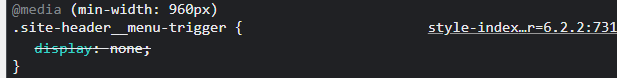
WordPress can see the file
CSS on browser
I tried to change it from none to anything else but nothing happen
it works when I add display: none in the developer tool on Chrome
2
Answers
try to add important after that property for eg: display: block !important;
Your hamburger menu icon class
site-header__menu-triggeris attached to fontawesome classesfa fa-barswhich is overriding yourdisplay:nonecss.In order to fix this I have created a code below:
Just replace your Code from this:
to this: