

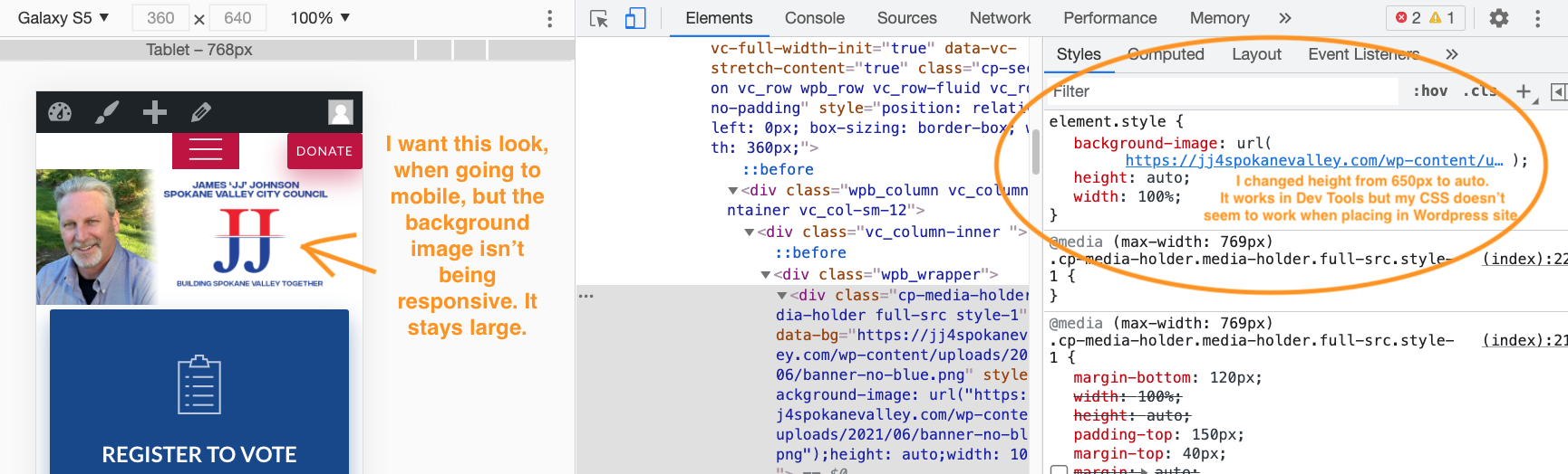
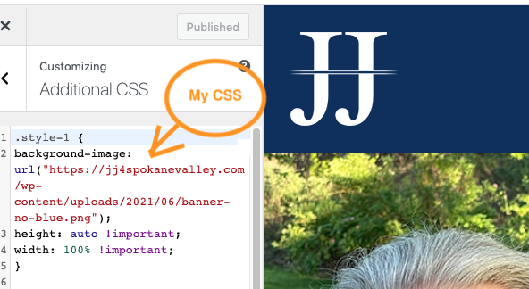
I am new to CSS and am trying to edit a WordPress site. It has a background image that may be inserted with Javascript. The background image I can get to be responsive when working in Dev Tools but I’m not able to make it responsive once I add CSS to this WordPress site. I’m not sure that I’m using the right Selector, or if there’s anything I can do in CSS to change the image to being responsive. Maybe my CSS is wrong. I know that inline styles take precedence over other type of styles so I tried using the !Important keyword, but still not able to transfer what I see in Dev Tools to this WordPress site. The height of the image was set to 650px, so I changed that to "auto" and that made things look right in Dev Tools, but I can’t seem to figure out how to make it happen on this site. Any help would be appreciated.
how it looks in dev tools
my CSS code that I added in WordPress

2
Answers
you can try to use
background-size:cover;orbackground-size:100% auto;in cssAll I can say is that I had such problem a couple of times, however, I had to solved the issue in different ways all every time.
One time was the theme that it had a preset setting to the background image in the CSS file.
Solution: Get to the CSS configuration file of the theme and change it there; then save it and fixed.
Another time it was a CSS conflict between my CSS and the CSS from an plugin.
Solution: Deleted all the plugins, set the CSS commands and add back all the plugins. Issue fixed.
The last time it was an error on my theme installation.
Solution: reinstall theme then set CSS rule, and fixed.
Good luck. I hope it helped.