skip to Main Content

Hello!

Perhaps someone will be able to help me.
I built a website based on WordPress Sage and Tailwind CSS.
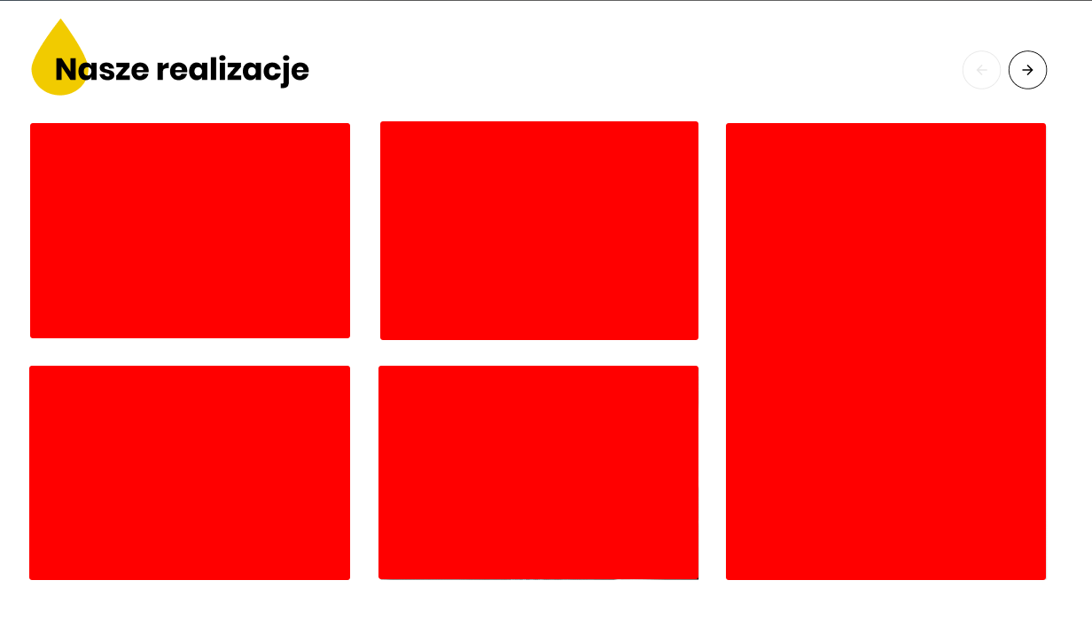
There is a carousel module in the project, which looks like that:
Carousel
The problem is that the last photo in the carousel block takes up two rows. I am not able to dynamically generate such content in the carousel, which would simultaneously change (scrolling right/left) and adjust responsively to the width of the screen (another attachment).
Have any of you encountered a similar challenge on Sage?
I found a component that perfectly reflects the effect I want to achieve: https://splidejs.com/extensions/grid
The problem is that the documentation is basically zero and I am unable to recreate the example in the link.
If anyone has an idea how to solve this, I would be grateful for a hint or direction. 🙂

2

Answers


  1. Install Splide.js:
    Start by installing the Splide.js library into your project. You can use npm or yarn for this:
    npm install @splidejs/splide
    After installation, make sure to include the Splide.js CSS and JavaScript files in your project.

    Create HTML Structure:
    In your WordPress template file, create an HTML structure that resembles the grid carousel structure. This can be a simple unordered list () with list items (

  2. ) for each carousel item.
  3. <div class="splide">
        <div class="splide__track">
            <ul class="splide__list">
                <li class="splide__slide">Slide 1</li>
                <li class="splide__slide">Slide 2</li>
                <!-- Add more slides -->
            </ul>
        </div>
    </div>
    

    Initialize Splide.js:
    In your JavaScript file, initialize Splide.js on the element with the .splide class:

    import Splide from '@splidejs/splide';
    
    document.addEventListener('DOMContentLoaded', function () {
        new Splide('.splide', {
            perPage: 1, // Number of slides per view
            type: 'loop', // Infinite loop
            breakpoints: {
                640: {
                    perPage: 2, // Number of slides per view on smaller screens
                },
                768: {
                    perPage: 3, // Number of slides per view on medium screens
                },
                // Define more breakpoints as needed
            },
        }).mount();
    });
    

    Adjust the perPage option and breakpoints according to your design’s requirements.

    Style Your Carousel:

    Use your CSS to style the carousel as you need, adjusting the slide widths, paddings, margins, and other styles to create the grid effect.

Login or Signup to reply.
  • if you want to use splide with the splide grid extension, you can try something like this:

    Install the splide and splide grid extension via npm:

    npm install @splidejs/splide

    npm install @splidejs/splide-extension-grid

    Create your HTML markup for the slides:

    <section class="splide" id="example" aria-label="Splide Basic GRID Example">
          <div class="splide__track">
                <ul class="splide__list">
                    <li class="splide__slide">Slide 01</li>
                    <li class="splide__slide">Slide 02</li>
                    <li class="splide__slide">Slide 03</li>
                    <li class="splide__slide">Slide 04</li>
                    <li class="splide__slide">Slide 05</li>
                    <li class="splide__slide">Slide 06</li>
                </ul>
          </div>
    </section>
    

    Import splide and splide grid extension, configure your splide instance and mount it, like this:

     <script>
            import Splide from '@splidejs/splide';
            import { Grid } from '@splidejs/splide-extension-grid';
    
            document.addEventListener('DOMContentLoaded', function () {
                new Splide('#example', {
                    arrows: false,
                    pagination: true,
                    label: 'My GRID example',
                    grid: {
                        rows: 2,
                        cols: 1,
                        gap: {
                            row: '12px',
                            col: '12px',
                        },
                    },
                }).mount({ Grid });
            });
        </script>
    

    Note, you need to use .mount({ Grid }). There are other ways to do this too. Additionally, you could consider Swiper JS, which can also be used for grid-sliders.

    Login or Signup to reply.
  • Please signup or login to give your own answer.
    Back To Top
    Search