


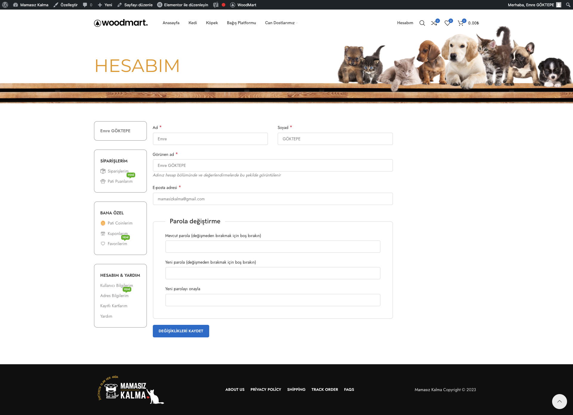
I have a wordpress e-commerce website. I have created a custom woocommerce my account page. It does really works perfect on desktop as you can see on photos.
But I am having the layout problem on mobile view. The menu comes on top and the page right below the menus which is normal. But to prevent this I want to show the pages with a sliding effect from right to left and come on top of the current page as you can see on this video from different e-commerce app. How can I do this on wordpress? I am using elementor on my website and woocommerce my account.
Video Of My Account Page on Mobile And Other App
I have searched about this a lot on internet and found some solutions with css and lightboxes too but they are not working like this does.
So if there is any 3rd party ready to use plugin or any customizable codes for this to work out, I will be glad to read and try to apply them. I also read that it can be done with ajax or javascript but couldnt find the codes for this and also I dont know how to apply these codes to wordpress if I can find them.
Thank you
2
Answers
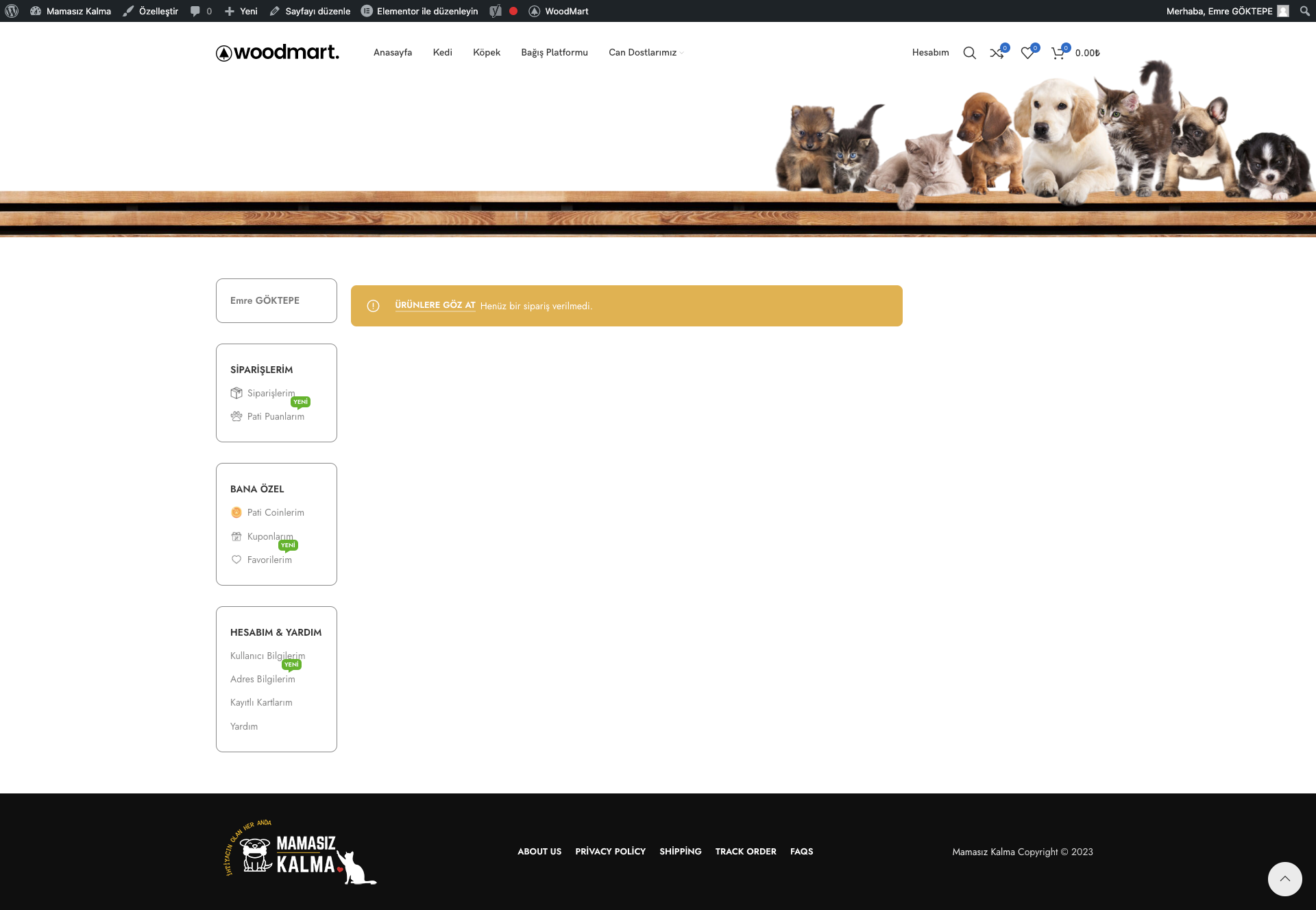
@AdeyemiOlusegun what I am trying to mean is on current mobile page od my account page it is coming like this; current my account page on my website down at the bottom of whole page after the menu. But what I am want to do is something like this app; Example Page My account page when you click on “Tüm Siparişlerim” link there then than the page linked to slides in from the right side of the screen as you can see on this screenshot; “Tüm Siparişlerim” pages slides from right and this is the result of that page after you click on “Tüm Siparişlerim” link on my account page; “Siparişlerim” page slides in from right after clicked on “Tüm Siparişlerim” link And when that page slides in you can click on back arrow there to get back to the account page. This is what I want to do. I hope now it is more clear to understand.
I don’t understand your question correctly but what I think you mean is that you want to hide a show a section based on responsiveness.
This can be done easily as you use Elementor
Under Column > Advanced > Responsive:
Hide On Desktop: Show or Hide
Hide On Tablet: Show or Hide
Hide On Mobile: Show or Hide