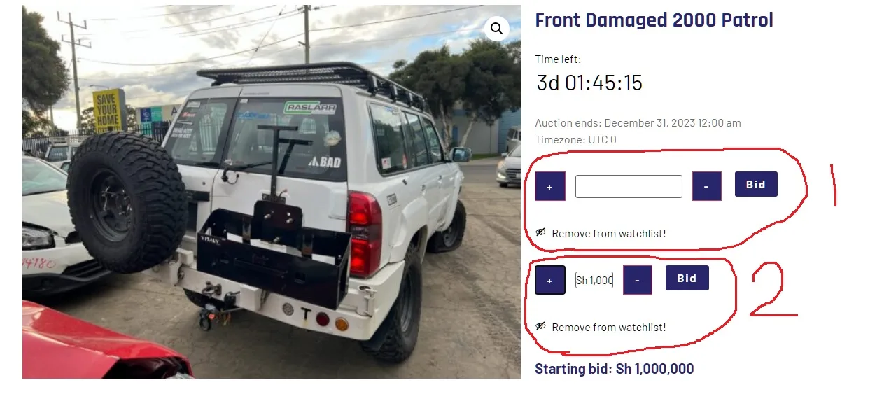
I need CSS help on formatting this BID VALUE text box (input element) (See in Picture 1)
Picture 1
Product link is here
When I make text box wider via Padding the text value inside the box is disappearing (Get hidden probably) I can’t find where I’m doing wrong.
I have duplicated them so you can understand my problem, If you look on the photo above I have labeled Number 1 & 2, they both have same ID and other properties BUT
BID VALUE Number 1 have the following custom CSS
input[name="bid_value"]
{
  width:auto;
  padding: 4px 120px 5px 31px;
  margin: 2px 11px;
  box-sizing: border-box;
 text-align: left;

}
BID VALUE Number 2 doesn’t have any custom CSS its by default that way, It does not show the current BID VALUES clear (all value figures) that’s why I want it to be a little big but if i do that (referring BID VALUE 1) the value is disappearing, Any advice on where I’m doing wrong?
I wish my BID VALUE text box above to be like this format here in Picture 2
Its link is here
Looking forward to hear from you guys on what I am doing wrong.

 Question posted in


2
Answers
If the L/R (width) padding leaves no room for the text at the chosen font size, the text will not be displayed.
Solution: Use font-size instead of padding to make the text easier to see. If the input field is not growing with the text, then change the
widthand/ormax-widthvalues on the input (text) box to be either "auto" or "unset".If you insist on using
width: auto, add!importantto overwrite existing CSS (i.e.width: 3.631em;in a rule for.woocommerce .quantity .qty), otherwise your padding will fill the whole input field.