


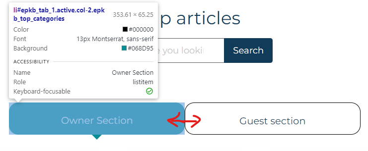
I want to make the two text items inside the tabs to be centred vertically but I’m struggling. If I alter the line height they look better but not when I shrink the window (not responsive). The webpage in question: https://uk.outdore.co.uk/help/
If you can also add some spacing between the tabs (red arrow) without causing the tabs to go onto 2 rows that would be a bonus.
I can’t replicate the issue in a sample of code here – other styles are overriding my efforts within the website, it’s far to complex of an environment to produce a minimal reproducible example.
3
Answers
In order to centre vertically a div’s content, I would style its class as follows:
hey i kind of solved your problem
see the width of both the container is 50px so reduce it to 40 px
and then add margin of 10 px to both the element
and you will get the desired gap between the buttons.see i changed it to 40 pixels and added 10 px of margin give margin to both the element of 10px and reduce the width of both element from 50 to 40px
i also changed the border radius to 29% just so it looks better.
Hope it helps 🙂
Look into CSS
flexboxorgrid, it will alleviate a few things.You’re using the classic
floatquite a bit however if instead you simply use more modernflexboxyou can get positioning, wrapping and centering all with a few simple rules and without a media query. Or alternatively you can usegridwhich can deliver this too, with more control over spacing between the items, but no auto-wrapping power so you’d need a media query.Firstly, in the
ulwrapper, get rid offloatand usedisplay:flex:Secondly, in the
liclass, get rid offloatanddisplay:block; useflexand it’s centering rules:As well, I don’t know why you have this, but either eliminate it or make this
display: flex(and!importantshould have a space in front of it):Thirdly, for the tab content, I think at this point disable
paddingand see where you stand; it may be unnecessary. In any case, it’s strange to use percentages here and/or have a bunch of 1%’s; were you nudging pixels? You shouldn’t have to, assuming higher-level things are proper.