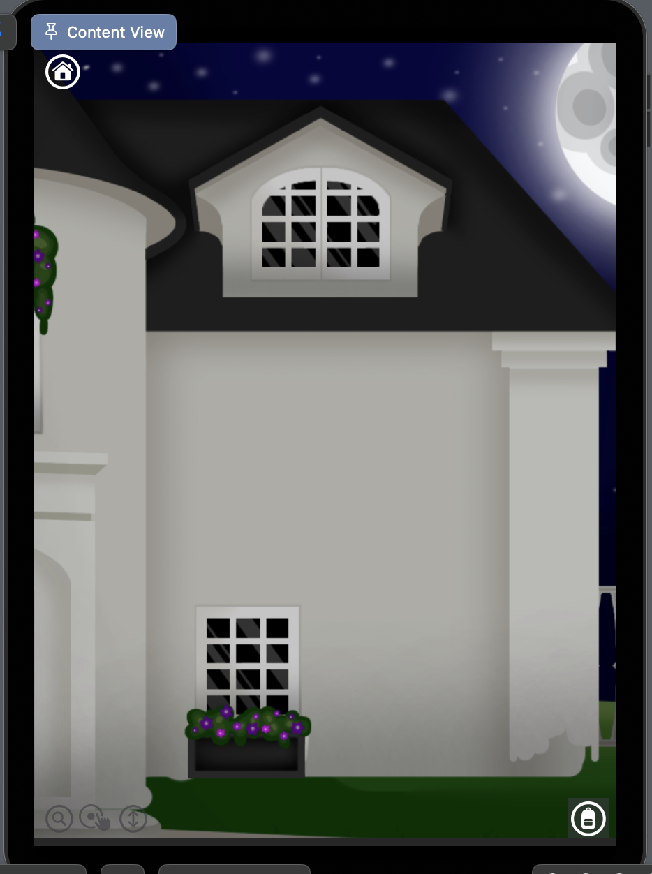
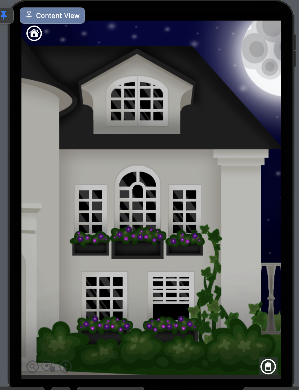
I’ve got an Xcode project set up with SwiftUI. The screen I’m working on has a scroll view:
The background looks odd because I have several full-screen images with transparent backgrounds that are meant to be layered on top:
By making the images full screen, they will always line up with the background if all images and the background are set to scaledToFill. The problem comes with the fact that these images are meant to act as buttons.
By adding these images as labels to buttons, I can make them function without looking odd. But of course, these images are full-screen, and so the content area of the button is full screen as well. I was able to get around this by making custom shapes using paths and using them for the content shape:
Button {
    runFunction()
} label: {
    Image(imageName)
        .resizable()
        .scaledToFill()
}
    .contentShape(tappableArea)
Now we get to the actual reason why I’ve made this post. Because the images are full screen, and the opaque parts of each image is never centered and always different, I can’t find a way to make the content shape of each image align correctly. I can make it line up properly if I add offset and scale to each shape, but these hard coded changes only work for one device. If I were to run this app on another device, things would be out of alignment again.
Is there a way to automatically align the content shape of each button with the opaque parts of the image, regardless of screen dimensions? Maybe an equation I could apply to the scale and offset of each shape?
Keep in mind that because this is all wrapped in a scroll view, the view will always be the same ratio.


2
Answers
After fiddling for a few days, I've come up with a solution! For each of my buttons, I did the following:
1. Add an overlay of the background in the scroll view with a geometry reader:
Visual result:
2. Add the full-screen image of the button:
Visual result:
3. Add a rectangle behind the image, sizing it to line up with your image's visible section. I did this using padding and the geometry reader to measure the size of this rectangle in relation to the background image. It's important that you ONLY use multiplication (*) or division (/) when inputing hard numbers. Otherwise, the values you end up with won't be proportional to the screen size.
Visual result:
4. If your button's content shape is a custom shape, then add it on top, using the same measurements of the rectangle to line it up. I added a stroke to my shape so I could see it, but adding a fill color works just as well.
Visual result:
You'll find that this shape will scale correctly regardless of screen size, just as the image does! I haven't tested landscape mode, as my app doesn't support it, but I did test two different types of iPad and iPhone in my canvas.
Now all that's left is:
5. Add your content shape to your button. Applying the padding to the shape and then trying to use it as a content shape for your button poses many problems, but you can get around this by moving the rectangle inside the button's label, applying the padding to it, overlaying and clipping your image to it, giving it a clear background, and applying your custom shape to the button. Like so:
Visual result:
I'm not sure how efficient computationally this is, but it is functional and that's all I could ask for.
It's important to note that while setting up the custom shape, I used paths in a function like so:
All calculations using hard coded numbers have to be either multiplication or division. By using the min, mid, and max values of the shape's rectangle 'bounding box' for these calculations, you're able to ensure your shape will stay proportionate to its image. If you don't know what that means, look into using paths to make custom shapes in swift. I used this guide: https://medium.com/@amosgyamfi/using-calculated-geometric-properties-how-to-draw-complex-shapes-in-swiftui-7c6beccdbedf though it is important to note that the
var** controlPoint: Doublethey have you add as part of the tutorial isn't actually used for anything. I just left it out of my code.Finally, setting this up in a scroll view means that every time you change a value in your code, the view reloads, which snaps the scroll view back to its default position. If you're trying to edit something off-screen, this gets old FAST. To counter this, I usually use this method: SwiftUI how to prevent view to reload whole body However, this doesn't always seem to work when making complicated views for some reason I can't fathom, so another trick I used was using
.scaleEffect(x: -1, y: 1)on every view in the body in order to flip it. This makes it so the shape's min, mid, and max values are now flipped, which gets confusing, but the values that you input will still be correct when you implement them unflipped into your app.Good luck out there, fellow programmers!
You could move the button (or tappable area) to an overlay and use a
GeometryReaderto measure the size of the underlying image. Then you can position and size the tappable area using relative sizes.Like this:
You could have multiple tappable areas in the same overlay (in which case, you could use a
ZStackto contain them). You could also use different shapes to define a tappable area.I think the
GeometryReaderwill give you the size of the full image, not just the visible part. This is convenient, because otherwise you would probably have to compute the actual image size from the sizes delivered by theGeometryReaderand the (known) image aspect ratio.