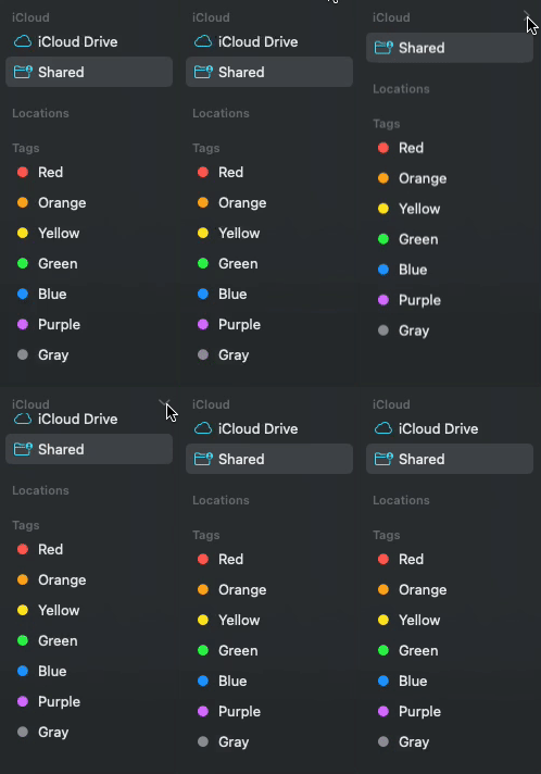
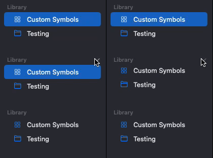
When attempting to replicate the behaviour of Finder and SF Symbols in a macOS application using SwiftUI, I encountered difficulties with DisclosureGroup.
Here is my current code:
import SwiftUI

struct SidebarView: View {
    @State private var companiesExpanded = false

    var body: some View {
        VStack{
            DisclosureGroup(isExpanded: $companiesExpanded) {
                NavigationLink(destination: CompaniesLibraryView()) {
                    Label("Water", systemImage: "drop")
                }
                NavigationLink(destination: CompaniesLibraryView()) {
                    Label("Sewage", systemImage: "toilet")
                }
                NavigationLink(destination: CompaniesLibraryView()) {
                    Label("Electricity", systemImage: "bolt")
                }
            } label: {
                Text("Companies")
                    .font(.subheadline)
                    .fontWeight(.semibold)
            }
        }
    }
}
In this code, I attempted to use the DisclosureGroup to create collapsible sections in the sidebar, similar to what is seen in Finder and SF Symbols. However, the result is not the same. The DisclosureGroup does collapse the items, but it lacks the visual appearance and behaviour of Finder’s sidebar.
I would greatly appreciate any help to achieve the desired behaviour. Thank you in advance for your assistance.


2
Answers
Here’s a proposal to fix some of the issues.
align
Labelleft with a.frame(..),.infinitywill make all Labels take the space of the whole sidebar.Labelcolor.primarygive a little padding for the
labellabelcolor.secondarystabilize the animation with a
Spacerat the bottomYou can have more control with a custom DisclosureGroupStyle.
For example:
How to make a custom DisclosureGroup (drop down) in SwiftUI?
By adding
.framewithalignment: .topto theDisclosureGroup(), theDisclosureGroup()will always be pushed to the top and won’t be centred again after closing.