For a Carousel custom component we are using a TabView with the following modifier:
.tabViewStyle(.page(indexDisplayMode: .never))
Everything is working quite well, except that during rotation handling, a strange bottom inset appear on the bottom:
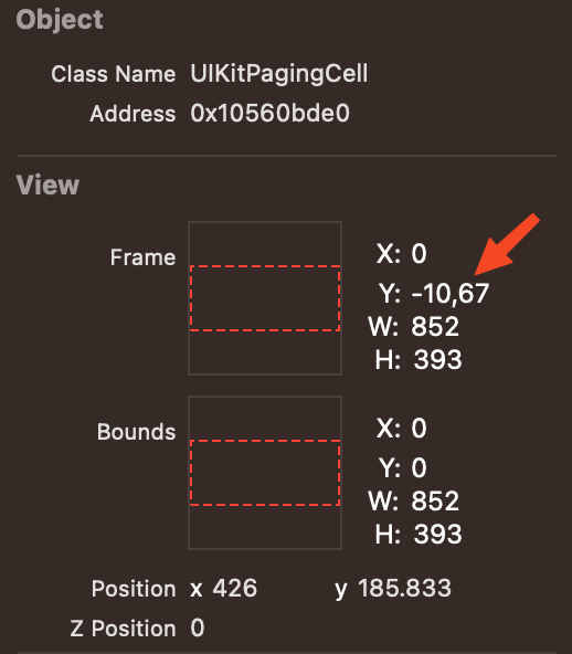
Looking more in deep with the Debug view, we found that top origin is wrongly translated by about 10px.
Attached a snip of code that reproduce the problem, running Xcode15.2 and iOS17.2:
import SwiftUI

@main
struct TabViewDemoIssueApp: App {
    var body: some Scene {
        WindowGroup {
            ContentView()
                .ignoresSafeArea(.all, edges: .all)
        }
    }
}

struct ContentView: View {
    var body: some View {
        TabView {
            Rectangle().foregroundColor(.red)
                .ignoresSafeArea(.all, edges: .all)
            Rectangle().foregroundColor(.yellow)
            .ignoresSafeArea(.all, edges: .all)
        }
        .ignoresSafeArea(.all, edges: .all)
        .background(.green)
        .frame(maxWidth: .infinity, maxHeight: .infinity)
        .tabViewStyle(.page(indexDisplayMode: .never))
    }
}

#Preview {
    ContentView()
}
UPDATE: We opened a bug to Apple: FB13526097


2
Answers
I’ve give it a look and came up with a solution. It’s a workaround really, it was the best I could come up with in a short amount of time. It’s a mistery to me too why your view behaves like that. So, what I’ve done is I’m detecting the device rotations and apply a small scale bump if it is not in portrait mode. Here’s the code:
And you edit your view like this:
Let me know if that could work for you, I know it’s a workaround.
Using the overlay, any view inside won’t be affected be the small resizing of the undelying view.
Here’s the result:
This appears to be a similar problem to the one reported in iOS 17 SwiftUI: Color Views in ScrollView Using containerRelativeFrame Overlap When Scrolling.
The gap at the bottom depends on the bottom insets. If you try it on a device without bottom insets (such as an iPhone SE) then there is no gap.
As a workaround, you could try measuring the safe-area insets and adding negative bottom padding equal to half the botom insets. However, this isn’t necessary on first launch, so you could use an
.onChangehandler to detect a change of screen size and only apply the padding after a change of screen size.