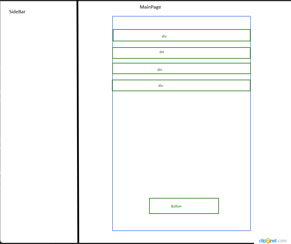
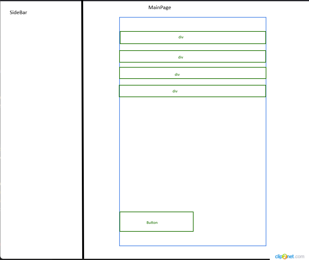
Below is a schematic layout of one of the pages of my site.
And also code
FirstPage.tsx
 export function FirstPage() {
  return (
    <div>
      <div>
        <Sidebar />
      </div>

      <div className="w-[100vw]">
        <MainPage />
      </div>
    </div>
  );
}
And also code for MainPage.tsx
MainPage.tsx
 export function MainPage() {
  return (
    <div className="m-auto flex h-full w-[43vw] flex-col">
      <div>
        <SomeComponent1 />
      </div>

      <div>
        <SomeComponent2 />
      </div>

      <div>
        <SomeComponent3 />
      </div>

      <div>
        <SomeComponent4 />
      </div>

      <div className="flex h-[45px] items-start justify-center">
        <Button />
      </div>
    </div>
  );
}
The current behavior for MainPage is such that if all the content does not fit into the view (due to reducing the page height or applying zoom), then a scroll appears.
However, I would like the Button component to be always visible when the scroll appears. To do this, I added fixed and bottom-0 to className, that is, the className in the bottom div began to look like className="fixed bottom-0 flex h-[45px] items-start justify-center"
This way I got the desired result, but now the Button component is not horizontally centered relative to the MainPage component
Please tell me how I can ensure that the Button component is centered as before.
Perhaps you can advise me to implement my functionality without using fixed. I am open to advice and discussions

 Question posted in


2
Answers
Try setting the margin of the parent element to 0 auto:
I tried to simulate it in tailwind playground. I added a parent div to the menu items and set the flex to 1.
https://play.tailwindcss.com/MjLminsTVJ