 Question posted in


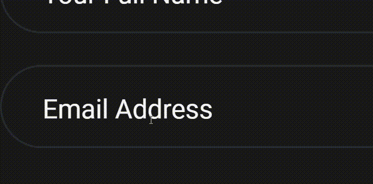
I have an input element and a sibling label element. Upon page load, the label overlaps the input element, serving as a placeholder. When the input is focused and contains a valid value, the label moves to the top of the input.
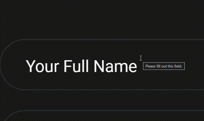
However, this behavior doesn’t apply to email type inputs because the label should only leave when a valid email value is entered and the input loses focus.
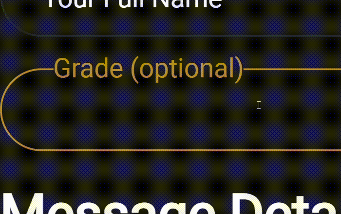
Additionally, if an input is not required, the style will be applied even if it not focused.
I want to prevent that.
Below is my current CSS for achieving this:
.label-animated {
    position: absolute;
    left: 1.6rem;
    top: 1rem;
    cursor: text;
    font-size: medium;
    transition: .5s ease;
    background-color: var(--bg-100) !important;
}

.input.input-form {
    width: 100%;
    font-size: medium;
    padding: 1rem;
    padding-bottom: .5rem;
    border: .0625rem solid var(--border-200);
    border-radius: 30rem; /*max border*/
    outline: none;
    background-color: transparent;
}

.input.input-form:focus~.label-animated,
.input.input-form:valid~.label-animated {
    top: -.72rem !important;
    left: 2rem;
    color: var(--accent-500);
}
Despite extensive searching for a solution, I have been unable to find any resources or guidance regarding this issue. It appears that there is currently no available information or solutions that address this specific problem. I can select an input that has no value input[value=""] but that has value, I don’t really know. Can I fix this problem by just only using CSS?
2
Answers
You can apply styles to an input field based on whether it is empty or not using CSS alone by utilizing the :placeholder-shown pseudo-class along with the adjacent sibling combinator (+). Here’s an The input:not(:placeholder-shown) selector applies styles to the input field when it’s not empty. You can modify these styles as needed.
The input:placeholder-shown + .error-message selector targets the adjacent .error-message element when the input field is empty. You can use this to display an error message or apply any other styling as needed.
You do not provide your html code, so fair enough if I use mine for the answer. But the point line is that, as already rejoiced, you should use pseudo-class
:placeholder-shown.And you also need to consider
:autofill.Here is a simple example: