skip to Main Content

I use Tailwind CSS to style cards within a flex container. Initially, I centered the cards horizontally and vertically using items-center and justify-center. However, I encountered an issue where when there are only a few cards, they leave ample space between them. To address this, I tried using justify-start, which resolved the spacing problem, but it caused the cards not to be centered correctly within the container.

My current setup:

<main className="max-w-[1200px] mx-auto my-20 flex flex-wrap items-center justify-start gap-5">
  {series &&
    series.map(
      (serie) =>
        serie.backdrop_path &&
        serie.overview &&
        !("success" in serie) && (
          <div
            className="w-[170px] max-w-sm lg:w-[220px] rounded text-slate-200 p-2 flex-shrink-0"
            key={serie.id}
          >
            <DataCard dataType={serie} />
          </div>
        )
    )}
</main>

And here is the current result:

enter image description here

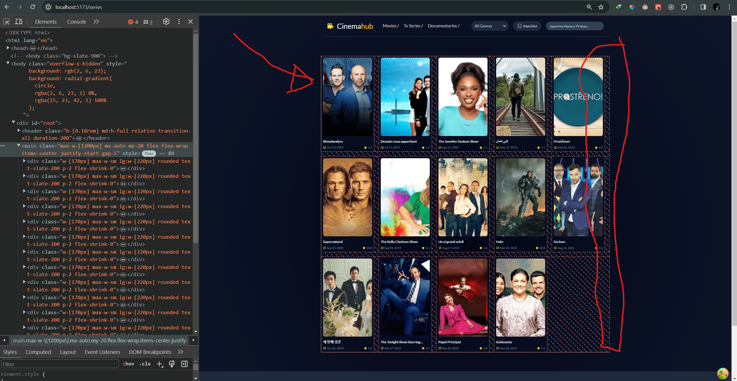
What I want it to be:

enter image description here

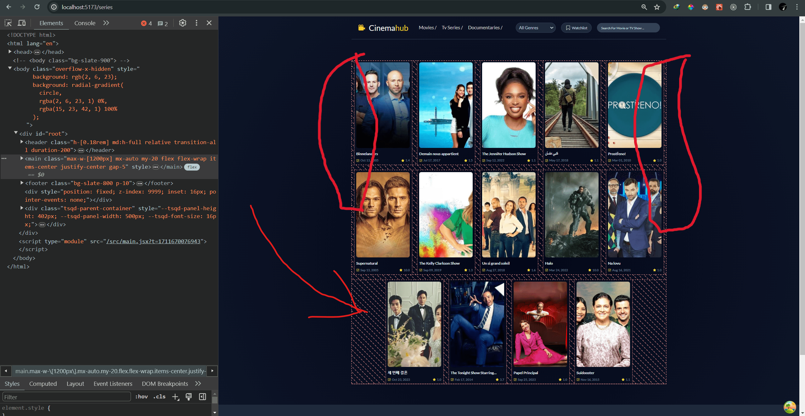
I would like to know how I can maintain the alignment of the cards to the start of the container while ensuring they are centered horizontally within it. Any suggestions or insights on how to achieve this would be greatly appreciated.

2

Answers


  1. Using flex-wrap would help you out

    Example:

    <div class="flex flex-wrap w-full items-center justify-center gap-4">
      <div class="flex h-auto w-[170px] max-w-sm flex-shrink-0 items-start justify-center rounded p-2 text-slate-200 lg:w-[220px]">
        <div class="flex h-[12rem] w-[10rem] items-center justify-center bg-yellow-100"></div>
      </div>
      <div class="flex h-auto w-[170px] max-w-sm flex-shrink-0 items-start justify-center rounded p-2 text-slate-200 lg:w-[220px]">
        <div class="flex h-[12rem] w-[10rem] items-center justify-center bg-red-100"></div>
      </div>
      <div class="flex h-auto w-[170px] max-w-sm flex-shrink-0 items-start justify-center rounded p-2 text-slate-200 lg:w-[220px]">
        <div class="flex h-[12rem] w-[10rem] items-center justify-center bg-green-100"></div>
      </div>
      <div class="flex h-auto w-[170px] max-w-sm flex-shrink-0 items-start justify-center rounded p-2 text-slate-200 lg:w-[220px]">
        <div class="flex h-[12rem] w-[10rem] items-center justify-center bg-yellow-100"></div>
      </div>
      <div class="flex h-auto w-[170px] max-w-sm flex-shrink-0 items-start justify-center rounded p-2 text-slate-200 lg:w-[220px]">
        <div class="flex h-[12rem] w-[10rem] items-center justify-center bg-red-100"></div>
      </div>
    </div>
    

    Result:

    enter image description here

    Here I’ve used flex-wrap in the parent. You can use the same method to fix your problem.

    Login or Signup to reply.
  2. You cannot achieve that with just flex box, you have to give max-width to container, here you can learn more.
    By the way I recommends you to use grid layout in this case

    Login or Signup to reply.
Please signup or login to give your own answer.
Back To Top
Search