skip to Main Content

I’m contributing to a project and i’m creating a footer for a landing page. The red box is the dimension of the container i’m having trouble with.

enter image description here

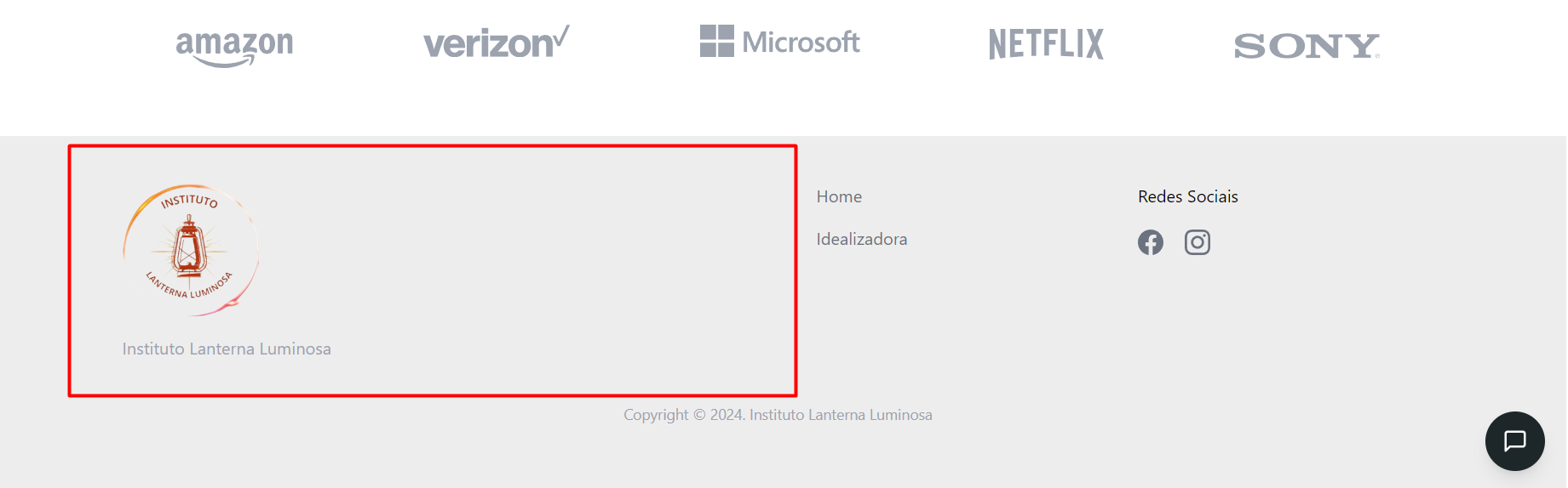
I don’t want to center the entire div, because i like the current position of things, but the fact that the logo is not aligned with the text is really bothering me. Is there a way to align the center of the image with the center of the text while keep everything else exactly as it is?

Here’s the code for this div:

          <div className="lg:col-span-2">
            <div>
              {" "}
              <Link
                href="/"
                className="flex items-center space-x-2 text-2xl font-medium text-indigo-500 dark:text-gray-100"
              >
                <Image
                  src="/img/logo.png"
                  alt="N"
                  width="128"
                  height="128"
                  className="w-22"
                />
              </Link>
            </div>

            <div className="max-w-md mt-4 text-gray-500 dark:text-gray-400">
              Instituto Lanterna Luminosa
            </div>
          </div>

2

Answers


  1. Chosen as BEST ANSWER

    Just in case anyone else has this problem, i was really hoping there was a simple CSS or Tailwind property to fix the bug seamlessly, but i ended up having to create another container inside of the initial container and centering the items inside it, which made the code a little more verbose, but fixed the issue.

    Here's the fix:

           <div className="lg:col-span-2 flex items-start">
            <div className="inline-block flex flex-col items-center">
              <div>
                {" "}
                <Link
                  href="/"
                  className="flex items-center space-x-2 text-2xl font-medium text-indigo-500 dark:text-gray-100"
                >
                  <Image
                    src="/img/logo.png"
                    alt="N"
                    width="128"
                    height="128"
                    className="w-22"
                  />
                </Link>
              </div>
    
    
              <div className="max-w-md mt-4 text-gray-500 dark:text-gray-400">
                Instituto Lanterna Luminosa
              </div>
            </div>
          </div>
    

    Here's the result, working as expected:

    enter image description here


  2. You should consider simplifying the elements and optimizing the use of Tailwind classes, within the same div, you can put the link with the image inside and the paragraph:

    <div class="grid">
      <div class="col-span-2 flex items-center flex-col">
        <a href="#" class="block">
          <img src="https://via.placeholder.com/300" />
        </a>
        <p class="text-center">Lorem ipsum dolor sit amet</p>
      </div>
      <!-- Your others cols -->
    </div>

    Remember to adapt this example to your React component (I assume you use Next JS), you can check this pen

    Login or Signup to reply.
Please signup or login to give your own answer.
Back To Top
Search