 Question posted in


How is it possible to restrict the width of the .form-text based on the width of the above input?
I’d like to layout an <input> in a Bootstrap application with a .form-text for some additional information. The <input> and .form-text are part of a grid layout (spanning multiple columns). The text that is shown inside the .form-text-styled <div> is dynamically changing which can, depending on its size, extend the grid’s column.
Following this example (https://getbootstrap.com/docs/5.3/forms/overview/#overview)
<form class='ref-table'>
  <div class="mb-3">
    <label for="exampleInputEmail1" class="form-label">Email address</label>
    <input type="email" class="form-control" id="exampleInputEmail1" aria-describedby="emailHelp">
    <div id="emailHelp" class="form-text">We'll never share your email with anyone else. We'll never share your email with anyone else. We'll never share your email with anyone else.</div>
  </div>
</form>
I noticed that the .form-text and the <input> are both kept at the same width. When I add style='width: auto' to the <input>, the form-text spans beyond the input, but ideally, the text should wrap under the input (using the input’s width as its width).
Update
Here’s an actual example (I realised that it’s difficult to describe or reproduce the issue).
<!DOCTYPE html>
<html lang="en">
<head>
<meta charset="UTF-8">
<meta name="viewport" content="width=device-width, initial-scale=1.0">
<link rel="stylesheet" href="src/style.css">
<link href="https://cdn.jsdelivr.net/npm/[email protected]/dist/css/bootstrap.min.css" rel="stylesheet" integrity="sha384-QWTKZyjpPEjISv5WaRU9OFeRpok6YctnYmDr5pNlyT2bRjXh0JMhjY6hW+ALEwIH" crossorigin="anonymous">
<style>
body {
background: #6e28d9;
padding: 0 24px;
color: white;
margin: 0;
height: 100vh;
display: flex;
justify-content: center;
align-items: center;
}
.grid {
display: grid;
grid-template-columns: 2rem max-content max-content min-content minmax(2rem, min-content) min-content auto;
gap: 1rem;
overflow-x: hidden;
}
.grid-span {
grid-column: 4 / span 4;
overflow: hidden;
}
</style>
</head>
<body>
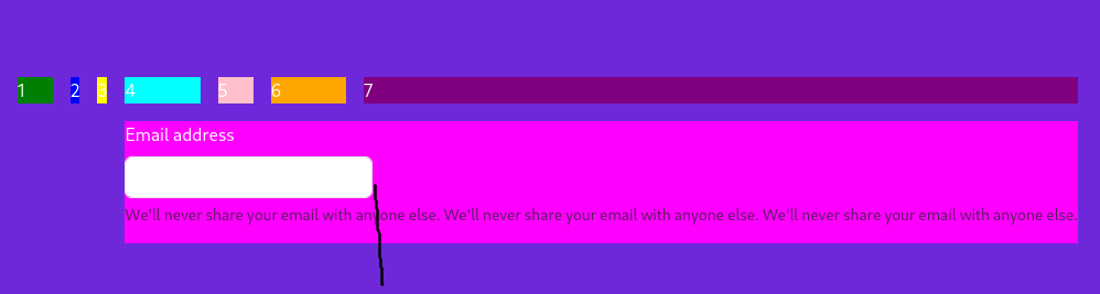
<div class='grid'>
<div style='background-color: green'>1</div>
<div style='background-color: blue'>2</div>
<div style='background-color: yellow'>3</div>
<div style='background-color: cyan'>4</div>
<div style='background-color: pink'>5</div>
<div style='background-color: orange'>6</div>
<div style='background-color: purple'>7</div>
<div class='grid-span' style='background-color: fuchsia'>
<form>
<div class="mb-3">
<label for="exampleInputEmail1" class="form-label">Email address</label>
<input type="email" class="form-control" id="exampleInputEmail1" aria-describedby="emailHelp" style='width: auto'>
<div id="emailHelp" class="form-text">We'll never share your email with anyone else. We'll never share your email with anyone else. We'll never share your email with anyone else.</div>
</div>
</form>
</div>
</div>
</body>
</html>
I’d like the text to get broken where I drew the black line, so it doesn’t unnecessarily extend the above columns (namely "7") which does for some awkward repositioning of elements in that column when the form-text changes dynamically.
2
Answers
Set the form to
width: min-content;