skip to Main Content

enter image description here
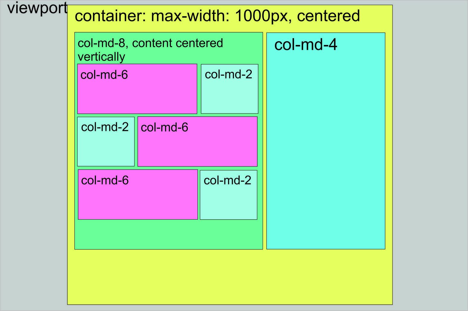
I tried making the html layout on the picture. The light blue col-md-2 divs contain images, the darker blue col-md-4 is an image too. The pink divs contain text. Please give a simple html layout which does what’s on the picture.

3

Answers


  1. All columns in Twitter Bootstrap are floating elements. So you can’t get content centre aligned just by Twitter Bootstrap classes. You can try styles like display: table-cell; vertical-align: middle; on the blocks: col-md-8 and col-md-4.

    Check http://jsfiddle.net/rajesh14mar/qc9zfpo6/

    Login or Signup to reply.
  2. Yes it is possible but each ‘.row’ has to have columns inside of it equal to 12 columns. So the parent column divs equal 12 col-md-8 and col-md-4. But the child divs inside the col-md-8 div does not equal 12. So those would have to be 8 and 4 also. Or 9 and 3… as long as it equals 12. It just depends on what the content will be. Also you can contain all that in a div and center that div to the view port.

    But that layout is possible. Below I focused on and made an example on the grid system layout you should be using.

    I’ve colored the columns so you can see the grids layout. Hope this helps!

    <link href="https://maxcdn.bootstrapcdn.com/bootstrap/3.3.6/css/bootstrap.min.css" rel="stylesheet"/>
    <script src="https://maxcdn.bootstrapcdn.com/bootstrap/3.3.6/js/bootstrap.min.js"></script>
    
    <div class='main-container'>
      <div class='row'>
        <div class='col-xs-8' style='Background-color: red; height: 300px;'>
          col-8
          <div class='row'>
            <div class='col-xs-8' style='background-color: blue; height: 80px;'>col8</div>
            <div class='col-xs-4' style='background-color: black; height: 80px;'>col4</div>
          </div>
          <div class='row'>
            <div class='col-xs-4' style='background-color: black; height: 80px;'>col4</div>
            <div class='col-xs-8' style='background-color: blue; height: 80px;'>col8</div>
          </div>
          <div class='row'>
            <div class='col-xs-8' style='background-color: blue; height: 80px;'>col8</div>
            <div class='col-xs-4' style='background-color: black; height: 80px;'>col4</div>
          </div>
        </div>
        <div class='col-xs-4' style='background-color: blue; height: 300px;'>col-4</div>
      </div>
    </div>
    Login or Signup to reply.
  3. of course it’s possible. Here is a totally functional example:

    Example in Codepen.io

    body {
      height: 100%;
      width: 100%;
    }
    .container {
      width: 1000px;
      max-width: 100%;
      height: 100%;
      background: #E5FF5E;
      padding: 100px 100px 100px 100px !important;
    }
    .row {
       min-height: 1000px;
       background: red;
    }
    .vertical {
      display: table-cell;
      vertical-align: middle;
    }
    .rows {
      height: 200px;
      margin-bottom: 10px;
    }
    #left-container {
      background: #6AFF98;
      height: 1000px;
      display: table;
    }
    #right-container {
      background: #6FFFE9;
      height: 1000px;
    }
    @media (max-width: 767px) {
      #left-container {
        width: 100%;
      }
    }
    @media (max-width: 991px) and (min-width: 767px) {
      #left-container {
        width: 100%;
      }
    }
    @media (max-width: 991px) {
    
    }
    #r1c1 {
      height: inherit;
      background: #FF76FD;
    }
    #r1c2 {
      height: inherit;
      background: #A1FFE8;
    }
    <link href="http://maxcdn.bootstrapcdn.com/bootstrap/3.3.5/css/bootstrap.min.css" rel="stylesheet"/>
    <script src="https://ajax.googleapis.com/ajax/libs/jquery/2.1.1/jquery.min.js"></script>
    <body>
      <div class="container">
        <div class="row">
          <div id="left-container" class="col-md-8">
            <div class="vertical">
              <div class="rows">
                <div id="r1c1" class="col-md-8"></div>
                <div id="r1c2" class="col-md-4"></div>
              </div>
              <div class="rows">
                <div id="r1c1" class="col-md-4"></div>
                <div id="r1c2" class="col-md-8"></div>
              </div>
              <div class="rows">
                <div id="r1c1" class="col-md-8"></div>
                <div id="r1c2" class="col-md-4"></div>
              </div>
            </div>
          </div>
          <div id="right-container" class="col-md-4"></div>
        </div>
      </div>
    </body>
    Login or Signup to reply.
Please signup or login to give your own answer.
Back To Top
Search