 Question posted in


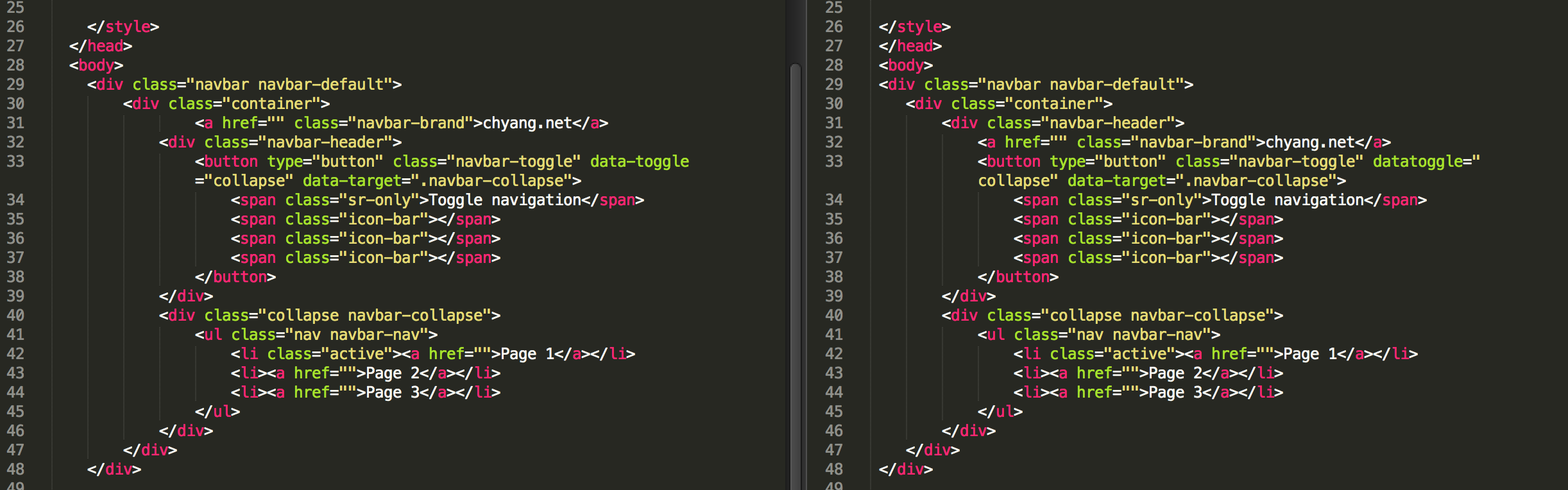
I was trying to make a Twitter Bootstrap website. And this wrapping relationship confused me. I list what’s the main difference between two demos.
    <div class="navbar navbar-default">
    <div class="container">
            <a href="" class="navbar-brand">chyang.net</a>
        <div class="navbar-header">
            <button type="button" class="navbar-toggle" data-toggle="collapse" data-target=".navbar-collapse">
                <span class="sr-only">Toggle navigation</span>
                <span class="icon-bar"></span>
                <span class="icon-bar"></span>
                <span class="icon-bar"></span>
            </button>
        </div>
        <div class="collapse navbar-collapse">
            <ul class="nav navbar-nav">
                <li class="active"><a href="">Page 1</a></li>
                <li><a href="">Page 2</a></li>
                <li><a href="">Page 3</a></li>
            </ul>
        </div>
    </div>
    </div>
Second one:
Demo site / JS Bin
    <div class="navbar navbar-default">
    <div class="container">
        <div class="navbar-header">
            <a href="" class="navbar-brand">chyang.net</a>
            <button type="button" class="navbar-toggle" datatoggle="collapse" data-target=".navbar-collapse">
                <span class="sr-only">Toggle navigation</span>
                <span class="icon-bar"></span>
                <span class="icon-bar"></span>
                <span class="icon-bar"></span>
            </button>
        </div>
        <div class="collapse navbar-collapse">
            <ul class="nav navbar-nav">
                <li class="active"><a href="">Page 1</a></li>
                <li><a href="">Page 2</a></li>
                <li><a href="">Page 3</a></li>
            </ul>
        </div>
    </div>
    </div>
The main difference is whether <div class="navbar-header"> should wrap <a href="" class="navbar-brand">chyang.net</a> or not. Both work well in the same result, and I have no idea the difference of two demos. In my point of view, the navbar-brand should be inside the navbar-header… but why the first one works?
Reference screenshot:
2
Answers
According to docs on getbootstrap.com, yes you should wrap them, for consistency with bootstrap layout. The first example you give works because it’s still valid HTML+CSS and renders similarly; it’s not wrong, just against the implementation of the navbar elements outlined by the bootstrap docs.
While you can functionally display it outside of the navbar-header div, as the docs explain in the “Default navbar” section, there’s a comment which explains that the “brand and toggle get grouped for better mobile display”, implicitly under the navbar-header. Wrap your brand inside the navbar-header div f you want to keep consistent with it implementing a bootstrap layout.
Excerpt:
This is also reflected under the Bootstrap starter template, found first under the Examples section on the Getting Started page.
Yes
<div class="navbar-header">should wrap<a href="" class="navbar-brand">chyang.net</a>and take a closer look at both on a mobile (xs screen) site you will realize the difference in design. Theleft-margin/paddingfor both is different onmobile.It is a slight difference that people wouldn’t probably realize. The alignment of the unwrapped one is slightly off on mobile, hence the reason why you should wrap it.
the alignment is slightly different on mobile. it takes a closer look to spot this.