skip to Main Content

I am brand new to Bootstrap 3 and am trying to achieve a header that looks like the following:

enter image description here

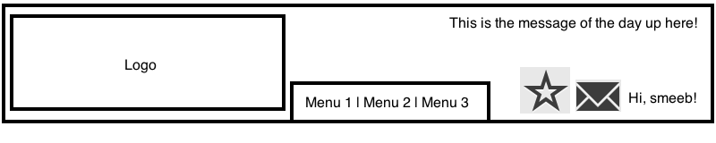
As you can see there are several components here:

  • Logo; left-aligned
  • Menu items to the right of the logo
  • Message of the day (MOTD) in the top-right
  • Hi, username!“, right-aligned
  • “Envelope” Glyphicon to the left of the Username
  • “Heart” Glyphicon to the left of the Envelope Glyphicon (in the picture above it is a star but it should be a heart)

Here is my jsFiddle representing my best attempt, and here is the main <body> element of that fiddle:

<!DOCTYPE html>
<html>
<head>
    <!-- Stuff goes here -->
</head>
<body>
    <nav class="navbar navbar-inverse navbar-fixed-top">
        <div class="container">
            <div class="navbar-header">
                <a class="navbar-brand" href="#">Logo</a>
            </div>
            <div id="navbar" class="collapse navbar-collapse">
                <ul class="nav navbar-nav">
                    <li class="active"><a href="#">Menu 1 | Menu 2 | Menu 3</a></li>
                    <li class="active"><a href="#">This is the message of the day up here!</a></li>
                    <li class="active"><a href="#"><span class="glyphicon glyphicon-heart"></span></a></li>
                    <li class="active"><a href="#"><span class="glyphicon glyphicon-envelope"></span></a></li>
                    <li class="active"><a href="#">Hi, smeeb!</a></li>
                </ul>
            </div>
        </div>
    </nav>
</body>
</html>

When I run this in jsFiddle, nothing is laid out properly and I can’t even see most of the <li> elements. Any idea as to where I’m going awry?

3

Answers


  1. You can use this markup and style it according to your css. Make menus to left and others name and icons to right menu. then seperate the top message and position absolute it to the parent nav bar relative.

    <div id="navbar" class="collapse navbar-collapse">
              <ul class="nav navbar-nav">
                  <li class="active"><a href="#">Menu 1 </a></li>
                  <li class="active"><a href="#">Menu 2</a></li>
                  <li class="active"><a href="#">Menu </a></li>           
              </ul>
              <ul class="nav navbar-nav navbar-right">
                    <li class="active"><a href="#"><span class="glyphicon glyphicon-heart"></span></a></li>
                  <li class="active"><a href="#"><span class="glyphicon glyphicon-envelope"></span></a></li>
                  <li class="active"><a href="#">Hi, smeeb!</a></li>
              </ul>
          </div>
          <div><a href="#">This is the message of the day up here!</a></div>
    
    Login or Signup to reply.
  2. Put the class “in” after the class “navbar-collapse” in the div with the id property “navbar”.
    With the class “in”, your navbar will begin visible.

    <!DOCTYPE html>
    <html>
    <head>
        <!-- Stuff goes here -->
    </head>
    <body>
        <nav class="navbar navbar-inverse navbar-fixed-top">
            <div class="container">
                <div class="navbar-header">
                    <a class="navbar-brand" href="#">Logo</a>
                </div>
                <div id="navbar" class="collapse navbar-collapse in">
                    <ul class="nav navbar-nav">
                        <li class="active"><a href="#">Menu 1 | Menu 2 | Menu 3</a></li>
                        <li class="active"><a href="#">This is the message of the day up here!</a></li>
                        <li class="active"><a href="#"><span class="glyphicon glyphicon-heart"></span></a></li>
                        <li class="active"><a href="#"><span class="glyphicon glyphicon-envelope"></span></a></li>
                        <li class="active"><a href="#">Hi, smeeb!</a></li>
                    </ul>
                </div>
            </div>
        </nav>
    </body>
    </html>
    
    Login or Signup to reply.
  3. Ok, I run the risk of getting down voted here, but from a design perspective you could run into issues with the “quote of the day” in the navbar, especially when on smaller devices as things “scoot in”.

    Might I suggest having a top bar right above the nav?

    <div class="top-bar-wrap">
         <div class="container">
             <div class="top-bar">
                <div class="pull-right"> <!-- This will keep your quote to the right. Just change it to pull-left if if you want it to start from the left. -->
                   <p>Quote of the day</p>
                </div>
             </div>
         </div>
    </div>

    Then you will be freed up to have your nav and icons next to the links. Just make sure to add “navbar-right” to your navbar holding your li items. You can add these gliphs in as li items if you’d like, or you can add them following the li with a — display:inline — property in your CSS and that should work. ALTHOUGH, might I suggest one more thing?

    As a designer first that came to the dark side of development… the icons and code to display the username might also be best served in a bar just below your nav. You can duplicate the code for the “top-bar” section and place it just under your nav.

    /* For the topbar above the nav */
    .top-bar-wrap {
      padding: 6px 0;
      background-color: #333; }
    
    .top-bar {
      min-height: 20px;
      line-height: 20px; }
    
    /* For the bar just below the nav "Member-bar" */
    .member-bar-wrap {
      padding: 6px 0;
      background-color: #333; }
    
    .member-bar {
      min-height: 20px;
      line-height: 20px; }
    <div class="member-bar-wrap">
       <div class="container">
           <div class="member-bar">
              <div class="pull-right">
               
                <!-- Gliphs and code for your member name display -->
                
              </div>
           </div>
       </div>
    </div>


    That will keep everything nice and tidy… and you won’t run into issues for smaller screens.

    Login or Signup to reply.
Please signup or login to give your own answer.
Back To Top
Search