 Question posted in


Question Background:
I’m using Twitter Bootstrap on my site and have incorporated a collpasing navbar for my sites menu.
The Issue:
The NavBarcollapses to a button as expected but when the screen hits a certain width the logo I have within the NavBarand the menu items split onto two separate lines. The following shows the issue:
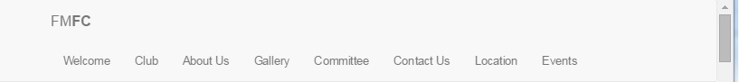
This is the navbar with the page fully expanded and working as desired:

This is with the page slightly minimized and response, notice the NavBar has now split into two lines. This is not the desired behavior I want. I ideally I want the option to stay on the same line or collapse to a button:
This shows the NavBar fully collapsed:

The Code:
This is my NavBar markup. I cannot see why I’m seeing the above unwanted behavior with the NavBarseparating into two lines:
<div class="navbar navbar-fixed-top">
    <nav class="navbar navbar-default" role="navigation" id="nav">
        <div class="container">
            <div class="navbar-header">
                <button type="button" class="navbar-toggle" data-toggle="collapse" data-target="#bs-example-navbar-collapse-1">
                    <span class="sr-only">Toggle navigation</span>
                    <span class="icon-bar"></span>
                    <span class="icon-bar"></span>
                    <span class="icon-bar"></span>
                </button>
                <a class="navbar-brand">FM<b>FC</b></a>
            </div>
            <div class="collapse navbar-collapse" id="bs-example-navbar-collapse-1">
                <ul class="nav navbar-nav">
                    <li><a href="#" class="scroll-link" data-id="Welcome">Welcome</a></li>
                    <li><a href="#" class="scroll-link" data-id="features">Club</a></li>
                    <li><a href="#" class="scroll-link" data-id="About">About Us</a></li>
                    <li><a href="#" class="scroll-link" data-id="Gallery">Gallery</a></li>
                    <li><a href="#" class="scroll-link" data-id="Committee">Committee</a></li>
                    <li><a href="#" class="scroll-link" data-id="Contact">Contact Us</a></li>
                    <li><a href="#" class="scroll-link" data-id="Location">Location</a></li>
                    <li><a href='@Url.Action("FutureEvents", "Events", new { pageNo = 1 })'>Events</a></li>
                </ul>
            </div>
        </div>
    </nav>
</div>
Any help in working out this issue would be appreciated.
2
Answers
The nav is wrapping in to 2 lines because you have many menu items and the Bootstrap
containerswitches to 750px as the screen width shrinks. You have 2 options..One option is to use the full width
container-fluid(this may not work for your design):http://codeply.com/go/TfbwIivilI
Another option is to decrease the point at which the navbar collapses. This requires CSS to override the default navbar collapse point. In your case around 1000px seems to work best:
http://codeply.com/go/kcaXYh7ARB
It happenes because you have so many
lielements, so what you need is to change the collapse break point. Just add the following to your cssbootply.