 Question posted in


I am using Twitter Bootstrap and need to convert this vertical navigation to something horizontal and smaller:

I would like to achieve this by using two NAVs each with the section text prepended. Basically, like this:
Training: Become Certified, Train Staff, Learn to Pack, Mentoring and Hands-on Training, NASMM FrontDoor Training
Grow Your Business: Public Speaking 2.0, Presentations in a Box
I am using this code:
<ul class="nav nav-pills">
  <li>HELLO</li>
  <li><a href="#">Home</a></li>
  <li><a href="#">Profile</a></li>
  <li><a href="#">Messages</a></li>
</ul>
But get this result:
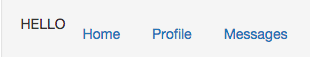
Is there a way to do this while having the HELLO (the section topic) show up properly?
2
Answers
Set your list items to display inline-block like this they are being shown horizontally instead of vertically, you might want to add some additional margins and/or paddings to them.
jsfiddle
Seems like you put correct CSS code on
nav li a. {
}
But you need to put this code on
nav li {
}