skip to Main Content

I am working with Twitter Bootstrap v2.3.2 and I am trying to achieve this
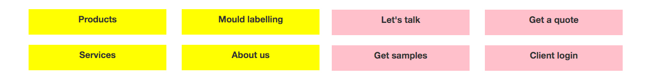
enter image description here

Now I have this

enter image description here

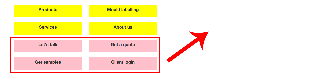
For the love of god I can’t get it the way I want with the grid system.

When you minimise the screen then the view should be grouped like this

enter image description here

This happens now with the code that I have

HMTL code:

<div class="content_wrapper_2">
        <!-- First row -->
        <div class="row">
            <div class="span3 box1">
                <h4 class="padding">Products</h4>
            </div>

            <div class="span3 box2">
                <h4 class="padding">Mould labelling</h4>
            </div>
        </div>

        <div class="row">
            <br>
        </div>

        <div class="row">
            <div class="span3 box5">
                <h4 class="padding">Services</h4>
            </div>

            <div class="span3 box6">
                <h4 class="padding">About us</h4>
            </div>
        </div>

        <div class="row">
            <br>
        </div>

        <!-- Second row -->
        <div class="row">
            <div class="span3 box3">
                <h4 class="padding">Let's talk</h4>
            </div>

            <div class="span3 box4">
                <h4 class="padding">Get a quote</h4>
            </div>
        </div><!-- end row -->

        <div class="row">
            <br>
        </div>

        <div class="row">
            <div class="span3 box7">
                <h4 class="padding">Get samples</h4>
            </div>

            <div class="span3 box8">
                <h4 class="padding">Client login</h4>
            </div>
        </div><!-- end row -->

    </div><!-- end content_wrapper_2 -->

CSS code:

.box1{
  background-color: yellow;
  height: 50px
}

.box2{
  background-color: yellow;
  height: 50px
}

.box3{
  background-color: pink;
  height: 50px
}

.box4{
  background-color: pink;
  height: 50px
}

.box5{
  background-color: yellow;
  height: 50px
}

.box6{
  background-color: yellow;
  height: 50px
}

.box7{
  background-color: pink;
  height: 50px
}

.box8{
  background-color: pink;
  height: 50px
}

2

Answers


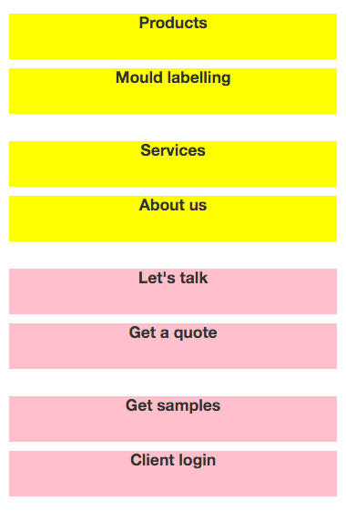
  1. Try putting the yellow and red groups in separate ‘span6’ blocks.

    These should show up side by side when viewed full screen, and expand to take up entire width when viewed on small screen.

    See below:

    <div class="row">
    
        <!-- yellow items -->
        <div class="span6">
            <div class="span3 box1">
                <h4 class="padding">Products</h4>
            </div>
    
            <div class="span3 box2">
                <h4 class="padding">Mould labelling</h4>
            </div>
    
            <div class="span3 box5">
                <h4 class="padding">Services</h4>
            </div>
    
            <div class="span3 box6">
                <h4 class="padding">About us</h4>
            </div>
         </div>
         <!-- end yellow items -->
    
        <!-- red items -->
        <div class="span6>
            <div class="span3 box3">
                <h4 class="padding">Let's talk</h4>
            </div>
    
            <div class="span3 box4">
                <h4 class="padding">Get a quote</h4>
            </div>
    
            <div class="span3 box7">
                <h4 class="padding">Get samples</h4>
            </div>
    
            <div class="span3 box8">
                <h4 class="padding">Client login</h4>
            </div>
        </div>
        <!-- end red items -->
    
    </div>
    
    Login or Signup to reply.
  2. The other answer is close, but missing another row in each of the span6

    JsFiddle

    <div class=" container">
      <div class="row">
        <div class="span6">
          <div class="row">
            <!-- Yellow Items -->
          </div>
        </div>
        <div class="span6">
          <div class="row">
            <!-- Pink Items -->
          </div>
        </div>
      </div>
    </div>
    
    Login or Signup to reply.
Please signup or login to give your own answer.
Back To Top
Search