skip to Main Content

I will let the picture talk by it self.
thedream.png
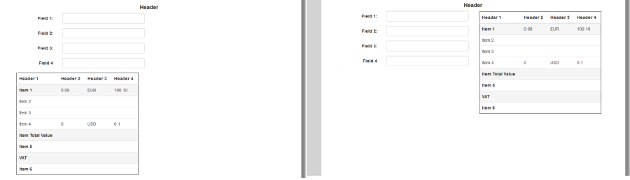
The left one is how it looks like now.
The right one is how I would like it to look like assuming the resolution is enough to fit the table. Else the table should be under the fields.

Here is the jsfiddle

.table {
  border: 1px solid black;
  max-width: 400px;
}
<link href="https://cdnjs.cloudflare.com/ajax/libs/twitter-bootstrap/3.3.4/css/bootstrap-theme.min.css" rel="stylesheet" />
<link href="https://cdnjs.cloudflare.com/ajax/libs/twitter-bootstrap/3.3.4/css/bootstrap.min.css" rel="stylesheet" />
<script src="https://cdnjs.cloudflare.com/ajax/libs/twitter-bootstrap/3.3.4/js/bootstrap.min.js"></script>
<script src="https://ajax.googleapis.com/ajax/libs/jquery/2.1.1/jquery.min.js"></script>
<div class="container">
  <div>
    <h4 class="text-center"><strong>Header</strong></h4>

    <form class="form-horizontal">
      <div class="form-group">
        <label for="f1" class="col-sm-2 control-label">Field 1:</label>
        <div class="col-sm-4">
          <input type="text" id="f1" class="form-control" />
        </div>
      </div>
      <div class="form-group">
        <label for="f2" class="col-sm-2 control-label">Field 2:</label>
        <div class="col-sm-4">
          <input type="text" id="f2" class="form-control">
        </div>
      </div>
      <div class="form-group">
        <label for="f3" class="col-sm-2 control-label">Field 3:</label>
        <div class="col-sm-4">
          <input type="text" id="f3" class="form-control">
        </div>
      </div>
      <div class="form-group">
        <label for="f4" class="col-sm-2 control-label">Field 4</label>
        <div class="col-sm-4">
          <input type="text" id="f4" class="form-control">
        </div>
      </div>
      <div class="table-responsive">
        <table class="table">
          <thead>
            <tr>
              <th>Header 1</th>
              <th>Header 2</th>
              <th>Header 3</th>
              <th>Header 4</th>
            </tr>
          </thead>
          <tbody>
            <tr class="active">
              <th>Item 1</th>
              <td>0.08</td>
              <td>EUR</td>
              <td>100.10</td>
            </tr>
            <tr>
              <td>Item 2</td>
              <td></td>
              <td></td>
              <td></td>
            </tr>
            <tr>
              <td>Item 3</td>
              <td></td>
              <td></td>
              <td></td>
            </tr>
            <tr>
              <td>Item 4</td>
              <td>0</td>
              <td>USD</td>
              <td>0.1</td>
            </tr>
            <tr class="active">
              <th>Item Total Value</th>
              <td></td>
              <td></td>
              <td></td>
            </tr>
            <tr>
              <th>Item 5</th>
              <td></td>
              <td></td>
              <td></td>
            </tr>
            <tr class="active">
              <th>VAT</th>
              <td></td>
              <td></td>
              <td></td>
            </tr>
            <tr>
              <th>Item 6</th>
              <td></td>
              <td></td>
              <td></td>
            </tr>
          </tbody>
        </table>
      </div>
    </form>
  </div>
</div>

4

Answers


  1. UPDATED ANSWER

    I would wrap your .form-group DIVs and your .table-responsive DIV in their own DIV with the appropriate col-*-* class.

    <div class="col-md-6">
        <div class="form-group></div>
        <div class="form-group></div>
        <div class="form-group></div>
        <div class="form-group></div>
    </div>
    <div class="col-md-6">
        <div class="table-responsive"></div>
    </div>
    

    See your updated jsFiddle: https://jsfiddle.net/a4hn9dgb/3/

    Note that I adjusted the classes on the DIV wrappers of the <input>s to col-md-10 so that the label and DIV wrapper total 12 columns. This will ensure that they take up the full width of their parent .col-md-6 DIV.

    There might be some fine-tuning but this looks like what you need.

    Login or Signup to reply.
  2. This is a styling issue, you will have to edit the CSS in order to fix this.

    Login or Signup to reply.
  3. First of all you have to create a container div which contains .form-group then add float:left to your new container div.

     .your-new-container{
        float:left;
     }
    
    Login or Signup to reply.
  4. I just added <div class="col-md-8"> this tag DEMO

    <div class="container">
    
                 <h4 class="text-center"><strong>Header</strong></h4>
         <div class="col-md-8"> 
                <form class="form-horizontal">
                    <div class="form-group">
                        <label for="f1" class="col-sm-2 control-label">Field 1:</label>
                        <div class="col-sm-4">
                            <input type="text" id="f1" class="form-control" />
                        </div>
                    </div>
                    <div class="form-group">
                        <label for="f2" class="col-sm-2 control-label">Field 2:</label>
                        <div class="col-sm-4">
                            <input type="text" id="f2" class="form-control">
                        </div>
                    </div>
                    <div class="form-group">
                        <label for="f3" class="col-sm-2 control-label">Field 3:</label>
                        <div class="col-sm-4">
                            <input type="text" id="f3" class="form-control">
                        </div>
                    </div>
                    <div class="form-group">
                        <label for="f4" class="col-sm-2 control-label">Field 4</label>
                        <div class="col-sm-4">
                            <input type="text" id="f4" class="form-control">
                        </div>
                    </div>
                        </div>
                         <div class="col-md-4"> 
                    <div class="table-responsive">
                        <table class="table">
                            <thead>
                                <tr>
                                    <th>Header 1</th>
                                    <th>Header 2</th>
                                    <th>Header 3</th>
                                    <th>Header 4</th>
                                </tr>
                            </thead>
                            <tbody>
                                <tr class="active">
                                    <th>Item 1</th>
                                    <td>0.08</td>
                                    <td>EUR</td>
                                    <td>100.10</td>
                                </tr>
                                <tr>
                                    <td>Item 2</td>
                                    <td></td>
                                    <td></td>
                                    <td></td>
                                </tr>
                                <tr>
                                    <td>Item 3</td>
                                    <td></td>
                                    <td></td>
                                    <td></td>
                                </tr>
                                <tr>
                                    <td>Item 4</td>
                                    <td>0</td>
                                    <td>USD</td>
                                    <td>0.1</td>
                                </tr>
                                <tr class="active">
                                    <th>Item Total Value</th>
                                    <td></td>
                                    <td></td>
                                    <td></td>
                                </tr>
                                <tr>
                                    <th>Item 5</th>
                                    <td></td>
                                    <td></td>
                                    <td></td>
                                </tr>
                                <tr class="active">
                                    <th>VAT</th>
                                    <td></td>
                                    <td></td>
                                    <td></td>
                                </tr>
                                <tr>
                                    <th>Item 6</th>
                                    <td></td>
                                    <td></td>
                                    <td></td>
                                </tr>
                            </tbody>
                        </table>
                    </div>
                        </div>
                </form>
    
        </div>
    
    Login or Signup to reply.
Please signup or login to give your own answer.
Back To Top
Search