skip to Main Content

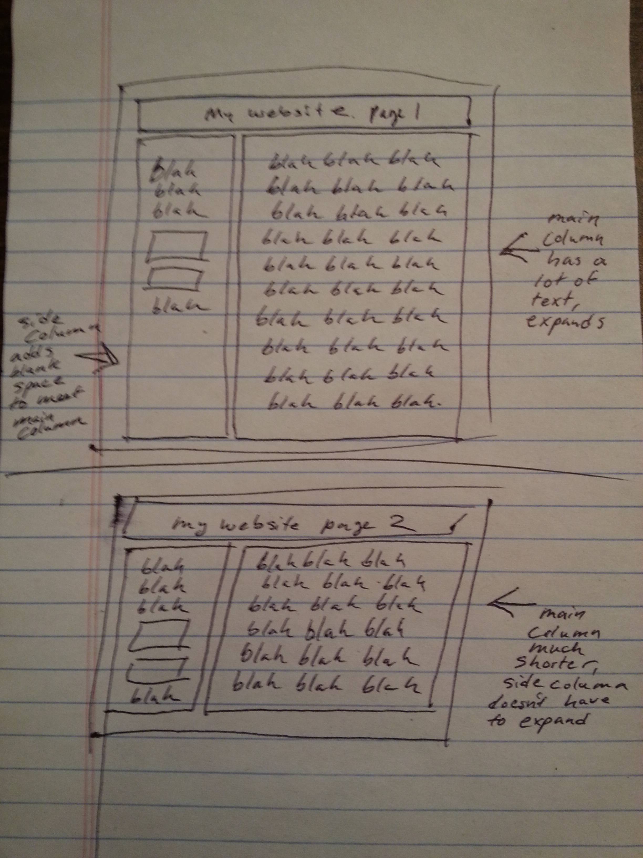
I’m building a Twitter-Bootstrap site that has two columns: a narrow side column and a main article column. On each page, the widths of the columns are fixed and the heights depend on how much is inside them. The side column’s height always must match the main column’s, but the main column’s height is variable. On some pages, the main column is short because there aren’t many articles inside while on other pages its height is much longer. When the main column’s height is taller than the side column’s, the side column’s increases.

My question is, what are the best methods/technologies to implement this, without using a CMS? I’m thinking classes, maybe something along the lines of masonry CSS…but not quite sure where to start. For the smaller-screen version, I’m planning to align them as just one column, so this won’t need to be fully responsive.

I’ve prepared a crude drawing of what I’m trying to accomplish:

enter image description here

3

Answers


  1. So, you can use flex-box for this. Your HTML would look something like this:

    <div class="flex-container">
        <div class="flex-column">
            <!-- Left column content goes here -->
        </div>
        <div class="flex-column">
            <!-- Longer right column content goes here -->
        </div>
    </div>
    

    And your CSS:

    .flex-container {
        display: -webkit-flex;
        display: -ms-flexbox;
        display: flex;
    
        -webkit-flex-wrap: wrap;
        -ms-flex-wrap: wrap;
        flex-wrap: wrap;
    }
    
    .flex-container > .flex-column {
        display: -webkit-flex;
        display: -ms-flexbox;
        display: flex;
        width: 50%;
    }
    

    Support for flexbox is limited, but it is the best solution for you here. http://caniuse.com/#feat=flexbox

    UPDATE:

    Here is a JSFiddle showing the implementation in action.

    Login or Signup to reply.
  2. If you can get away with it, I would recommend using flex box. If not, here is a CSS solution http://plnkr.co/edit/geevZTdUy4PDEJqvNHmp?p=preview

    HTML:

    <body>
      <div class="container">
        <div class="row eq-row">
          <div class="col-xs-4 eq-col red">This is the first col</div>
          <div class="col-xs-8 eq-col blue">
            This is the main col<br />
            This is the main col<br />
            This is the main col<br />
            This is the main col<br />
            This is the main col<br />
            This is the main col<br />
            This is the main col<br />
            This is the main col<br />
            This is the main col<br />
          </div>
        </div>
      </div>
    </body>
    

    Here’s the CSS.

    .red
    {
      background-color: red;
    }
    
    .blue
    {
      background-color: blue;
    }
    
    .eq-row
    {
      overflow: hidden;
    }
    
    .eq-col
    {
      margin-bottom: -99999px;
      padding-bottom: 99999px;
    }
    
    Login or Signup to reply.
  3. In addition to the flexbox option – which I’d definitely go for it if I wouldn’t want full cross-browser compatibility -, you can use some JavaScript or jQuery to set the side height if it’s smaller than the content height.

    See it in action here! You can try it by removing dummy text from the content etc.

    JavaScript:

    var contentHeight = document.getElementById('content').offsetHeight;
    var sideHeight = document.getElementById('side').offsetHeight;
    
    if (contentHeight > sideHeight) {
      document.getElementById('side').style.height=contentHeight+'px';
    }
    

    The HTMLElement.offsetHeight read-only property is the height of the element including vertical padding and borders, in pixels, as an integer.

    There is also clientHeight, which you could use depending on the case, which is:

    The Element.clientHeight read-only property returns the inner height of an element in pixels, including padding but not the horizontal scrollbar height, border, or margin.

    jQuery:

    var contentHeight = $(".content").height();
    var sideHeight = $(".side").height();
    var side = $(".side");
    if (contentHeight > sideHeight) {
      side.height(contentHeight);
    }
    
    Login or Signup to reply.
Please signup or login to give your own answer.
Back To Top
Search