 Question posted in


I’ve been using the grid system in Twitter Bootstrap on several projects – but can’t seem to crack this nut.
I want to place a blue promotion cell in the upper right corner of the grid like this:
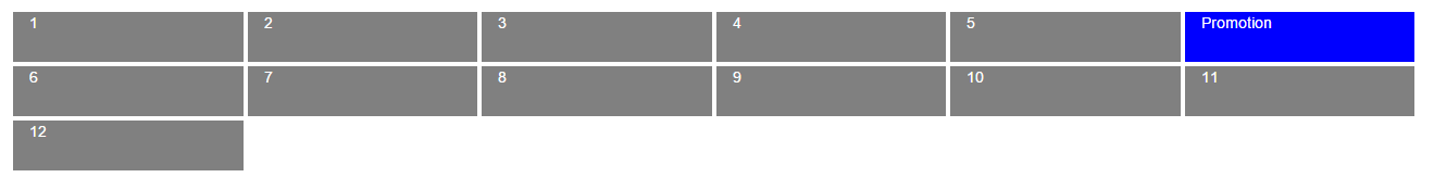
Sample code
<div class="row">
    <div class="col-xs-6 col-sm-4 col-md-3 col-lg-2">1</div>
    <div class="col-xs-6 col-sm-4 col-md-3 col-lg-2">2</div>
    <div class="col-xs-6 col-sm-4 col-md-3 col-lg-2">3</div>
    <div class="col-xs-6 col-sm-4 col-md-3 col-lg-2 big">Promotion</div>
    <div class="col-xs-6 col-sm-4 col-md-3 col-lg-2">4</div>
    <div class="col-xs-6 col-sm-4 col-md-3 col-lg-2">5</div>
    <div class="col-xs-6 col-sm-4 col-md-3 col-lg-2">6</div>
    <div class="col-xs-6 col-sm-4 col-md-3 col-lg-2">7</div>
    <div class="col-xs-6 col-sm-4 col-md-3 col-lg-2">8</div>
    <div class="col-xs-6 col-sm-4 col-md-3 col-lg-2">9</div>
    <div class="col-xs-6 col-sm-4 col-md-3 col-lg-2">10</div>
    <div class="col-xs-6 col-sm-4 col-md-3 col-lg-2">11</div>
    <div class="col-xs-6 col-sm-4 col-md-3 col-lg-2">12</div>
</div>
Playground: http://jsfiddle.net/3fr3rsL3/
Any help is appreciate
2
Answers
Here it is using Bootstrap’s
pushandpullordering classes:Demo
…
…
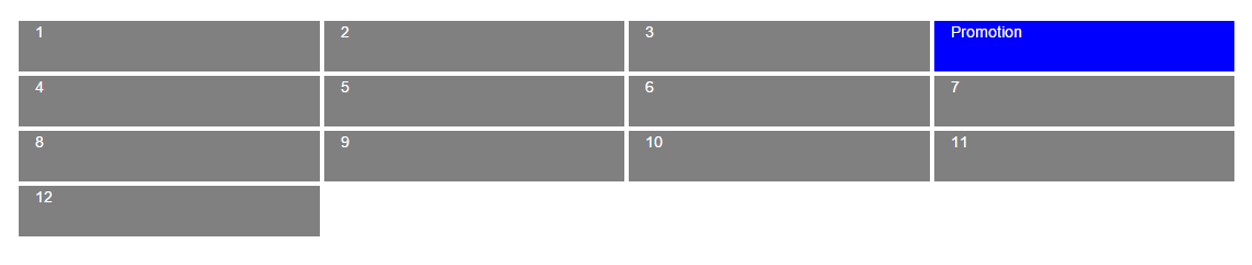
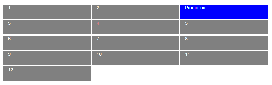
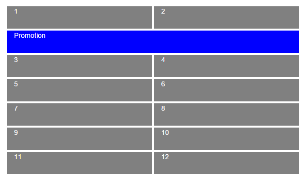
Forcing float on the column at all sizes resolves the issue of overlap for mobile:
It seems to me the simplest answer would be to place it third in order in the row. This will keep it ordered correctly on the narrowest viewports. Next, use .col-xs-12 just on the .promotion
<div>to achieve the full width on narrow viewports. Finally, use .pull-right to correct the ordering on wider viewports. Your original code is almost there, and with the example you’ve given I don’t see a need to complicate it much.Check this fork of your fiddle for what I mean: https://jsfiddle.net/rrt22y5p/