 Question posted in


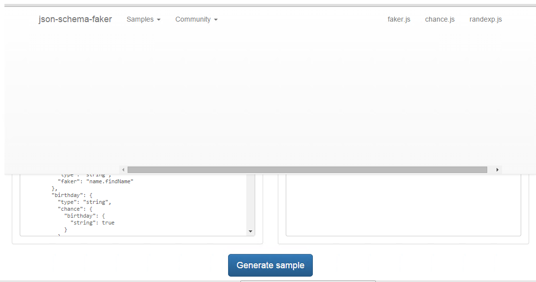
I’m using Twitter Bootstrap and I’m having a problem with the top-bar menu. When I choose an item from the dropdowns, all the events are fired correctly, JavaScript is OK, but there is a visual something (a div probably?) that slides down and then disappears. It looks like this:
I’m not a Twitter Bootstrap expert, but I expect I’ve got some invalid HTML put there. Entire HTML code is available here: https://github.com/pateketrueke/json-schema-faker/blob/gh-pages/src/index.html, but probably the most important part is this:
<body>
    <!-- Fixed navbar -->
    <nav class="navbar navbar-default navbar-fixed-top">
        <div class="container">
            [...]
            <div id="navbar" class="navbar-collapse collapse">
                <ul class="nav navbar-nav">
                    <li class="dropdown">
                        <a href="#" class="dropdown-toggle" data-toggle="dropdown" role="button" aria-expanded="false">Samples <span class="caret"></span></a>
                        <ul class="dropdown-menu" role="menu">
                            <li class="dropdown-header">faker.js</li>
                            <li><a href="#" id="example_faker" data-toggle="collapse" data-target=".navbar-collapse">faker example</a></li>
                            <li class="divider"></li>
                            <li class="dropdown-header">chance.js</li>
                            <li><a href="#" id="example_chance" data-toggle="collapse" data-target=".navbar-collapse">chance example</a></li>
                            <li class="divider"></li>
                            <li class="dropdown-header">other</li>
                            <li><a href="#" id="example_boolean" data-toggle="collapse" data-target=".navbar-collapse">boolean</a></li>
                            <li><a href="#" id="example_integer" data-toggle="collapse" data-target=".navbar-collapse">integer</a></li>
                            <li><a href="#" id="example_array" data-toggle="collapse" data-target=".navbar-collapse">array</a></li>
                        </ul>
                    </li>
- Twitter Bootstrap version is v3.3.4 (from bower.json).
- The code of this page is kept here: https://github.com/pateketrueke/json-schema-faker/tree/gh-pages.
- The site is available online at: http://json-schema-faker.js.org/. Try to click “Samples” in the top-bar menu and then choose any option to see this strange thing sliding down and disappearing afterwards…
The question is: what can I do to remove the “sliding-down-and-disappearing-thing” bug?
EDIT
This app supports the mobile version as well. It looks like this:

When you touch the top right hand nav button, the menu appears:
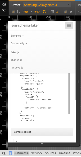
Now when I click samples, the submenu appears:

And when I click any of the options, I would like all menus to hide (collapse), just to see the demo immediately.
Now the mobile works as intended :). And I’d like the non-mobile-sliding-bug solution not ot break the mobile version.
2
Answers
Remove the 2 css classes.
This 2 classes are supposed to works with the dropdown system. So the dropdown system try to do something weird with this div and it doesn’t really works.
Bootstrap menu is not designed to work like this.
Take a look at http://getbootstrap.com/javascript/#dropdowns and preview it as a mobile device as well.
A simple workaround for what you want to do would be to have JS that will do the hiding, like:
And the JS:
Note that I also removed the
data-toggle="collapse" data-target=".navbar-collapse"from the links.