skip to Main Content

I am trying to create a "perspective mockup" using CSS. There are a fair amount of tutorials on how to achieve this with 3D layers in Photoshop, but I would like to do it with CSS. Here is an example of what I am trying to achieve:
enter image description here

And here is the code (using the raw image, https://i.imgur.com/foDEYpB.png):

#perspective {
  width: 400px;
  height: 500px;
  position: absolute;
  background-image: url("https://i.imgur.com/foDEYpB.png");
  background-repeat: no-repeat;
  background-size: cover;
  top: 50%;
  left: 50%;
  margin-left: -200px;
  margin-top: -250px;
  transform: rotate3d(360, 120, -90, 60deg) rotateZ(-30deg);
  box-shadow: -15px 15px 20px rgba(0, 0, 0, 0.5);
}
<div id='perspective'></div>

I am pretty close, but am unsure how to achieve the "depth" or "height" where the image looks raised. Zoomed in version of said "depth" where the image is repeated onto the sides:
enter image description here

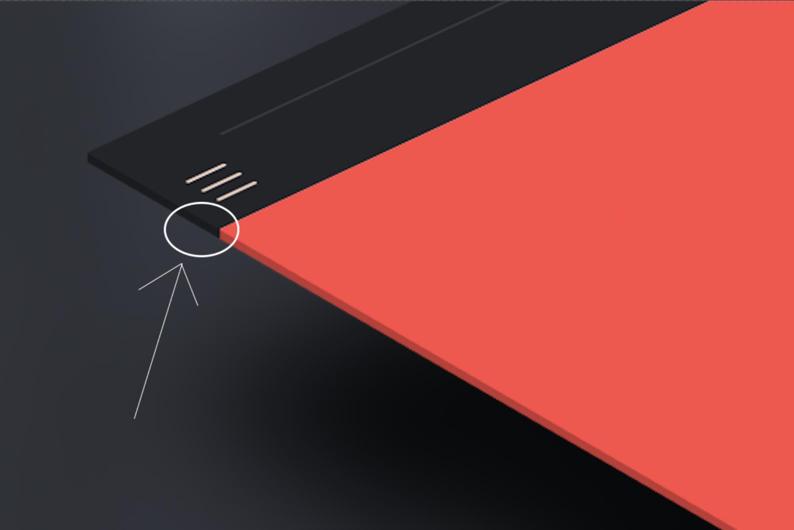
P.S. if anyone knows the correct name for what I’m referring to as "depth", I’d love to know!

2

Answers


  1. Try adding three type of images to make 3D effects. Use transform property with rotation for images to get the desired result.

    Answer reference here.

    .perspective {
        position: relative;
        width: 400px;
        height: 500px;
        transform-style: preserve-3d;
        transition: all 500ms ease-in;
        transform: rotateY(20deg) rotateX(60deg) rotateZ(-10deg);
        transform: rotateY(15deg) rotateX(50deg) rotateZ(-15deg);
        box-shadow: -40px 80px 80px -10px rgba(0, 0, 0, 0.7);
        cursor: pointer;
        margin-right: 30px;
        display: inline-block;
        margin-left: 30%;
    }
    
    .perspective img {
        position: absolute;
        top: 0px;
        left: 0px;
        width: 400px;
        height: 500px;
        transform: translateZ(16px);
    }
    
    .bottom,
    .left {
        position: absolute;
        width: 400px;
        height: 500px;
        display: block;
        transition: all 1s linear;
        overflow: hidden;
        border-radius: 3px;
        transform: translateZ(16px);
        filter: brightness(80%)
    }
    
    .left {
        transform: rotateY(270deg) translateX(-1px);
        transform-origin: center left;
        width: 18px;
    }
    
    .bottom {
        transform: rotateX(90deg) translateY(15px) translateZ(-480px);
        transform-origin: bottom center;
        height: 18px;
    }
    
    .bottom img {
        transform: rotateX(180deg);
        width: 100%;
        height: 500px;
        left: 0px;
    }
    <div class="perspective">
        <img src="https://i.imgur.com/foDEYpB.png">
        <div class="bottom"><img src="https://i.imgur.com/foDEYpB.png"></div>
        <div class="left"><img src="https://i.imgur.com/foDEYpB.png"></div>
    </div>
    Login or Signup to reply.
  2. Here is a hacky idea using multiple background to simulate such effect. The trick is to add 2 semi-transparent gradients to create the shadow effect then 2 other gradient to cut a small part of the corner to obtain the 3D shape.

    The result may not be perfect for all the images:

    .wrapper {
      display:inline-block;
      perspective:1000px;
    }
    .box {
      margin: 50px;
      width:200px;
      height:200px;
      transform: rotate3d(360, 120, -90, 60deg) rotateZ(-30deg);
      background:
      linear-gradient(to bottom right,transparent 49%,#fff 52%) bottom right/14px 10px,
      linear-gradient(to top left,transparent 49%,#fff 52%) top left /10px 14px,
      
      linear-gradient(rgba(0,0,0,0.5),rgba(0,0,0,0.5)) 0 0px/10px 100%,   
      linear-gradient(rgba(0,0,0,0.5),rgba(0,0,0,0.5)) 100% 100%/calc(100% - 10px) 10px,   
      url(https://picsum.photos/id/1061/1000/800) center/cover;
      background-repeat:no-repeat;
    }
    <div class="wrapper" >
    <div class="box" >
    </div>
    </div>

    With your image you can have a specific gradient like below:

    body {
      background:#ccc;
      
    }
    .wrapper {
      display:inline-block;
      perspective:1000px;
    }
    .box {
      margin: 50px;
      width:200px;
      height:250px;
      transform: rotate3d(360, 120, -90, 60deg) rotateZ(-30deg);
      background:
      linear-gradient(to bottom right,transparent 49%,#ccc 52%) bottom right/16px 10px,
      linear-gradient(to top left,transparent 49%,#ccc 52%) top left /10px 12px,
      
      linear-gradient(#efefef,#efefef) 100% 100%/calc(100% - 10px) 10px, 
      linear-gradient(-226deg,#222428 13px,#ff4946 13px,#ff4946 77px,#592D30 77px,#592D30 100px,#222428 100px,#222428 108px,#efefef 108px,#efefef 161px) 0 0px/10px 100%,      
      
      url(https://i.imgur.com/foDEYpB.png) center/cover;
      background-repeat:no-repeat;
    }
    <div class="wrapper">
      <div class="box">
      </div>
    </div>
    Login or Signup to reply.
Please signup or login to give your own answer.
Back To Top
Search