 Question posted in


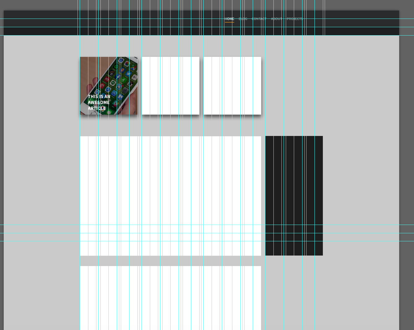
I have a design I have mocked up in photoshop using a Bootstrap 12-column guide. Whenever I try to mock this up in Bootstrap, the results are NOTHING like what I want.
My HTML Code:
<!DOCTYPE html>
<html lang="en">
<head>
<title>Bootstrap Example</title>
<meta charset="utf-8">
<meta name="viewport" content="width=device-width, initial-scale=1">
<link rel="stylesheet" href="http://maxcdn.bootstrapcdn.com/bootstrap/3.3.6/css/bootstrap.min.css">
<script src="https://ajax.googleapis.com/ajax/libs/jquery/1.12.0/jquery.min.js"></script>
<script src="http://maxcdn.bootstrapcdn.com/bootstrap/3.3.6/js/bootstrap.min.js"></script>
<style>
body {
background-color: #cacaca;
}
.container{
}
/* Remove the navbar's default margin-bottom and rounded borders */
.navbar {
margin-bottom: 0;
border: 0px solid black;
border-radius: 0;
b ackground-color: #2a2b2d;
}
.bottom-nav {
background-color: #1d1e20;
border: 0px solid black;
margin-top: 0;
}
/* Set height of the grid so .sidenav can be 100% (adjust as needed) */
.row.content {
height: 100px
}
/* Set gray background color and 100% height */
.sidenav {
padding-top: 20px;
background-color: #f1f1f1;
height: 100%;
}
/* Set black background color, white text and some padding */
footer {
background-color: #555;
color: white;
padding: 15px;
}
.text-left{
margin-top: 105px;
border:1px solid black;
background-color:white;
}
.blog{
border:1px solid black;
background-color:white;
margin-right: 10px;
}
.sidebar{
margin-left: 10px;
border:1px solid black;
background-color:white;
}
/* On small screens, set height to 'auto' for sidenav and grid */
@media screen and (max-width: 767px) {
.sidenav {
height: 280;
width:280;
margin:20px;
}
.row.content {height:auto;}
}
</style>
</head>
<body>
<nav class="navbar navbar-inverse">
<div class="container-fluid">
<div class="navbar-header">
<button type="button" class="navbar-toggle" data-toggle="collapse" data-target="#myNavbar">
<span class="icon-bar"></span>
<span class="icon-bar"></span>
<span class="icon-bar"></span>
</button>
<a class="navbar-brand" href="#">Logo</a>
</div>
<div class="collapse navbar-collapse" id="myNavbar">
<ul class="nav navbar-nav">
</ul>
<ul class="nav navbar-nav navbar-right">
<li class="active"><a href="#">Home</a></li>
<li><a href="#">About</a></li>
<li><a href="#">Projects</a></li>
<li><a href="#">Contact</a></li>
</ul>
</div>
</div>
</nav>
<nav class="bottom-nav">
</nav>
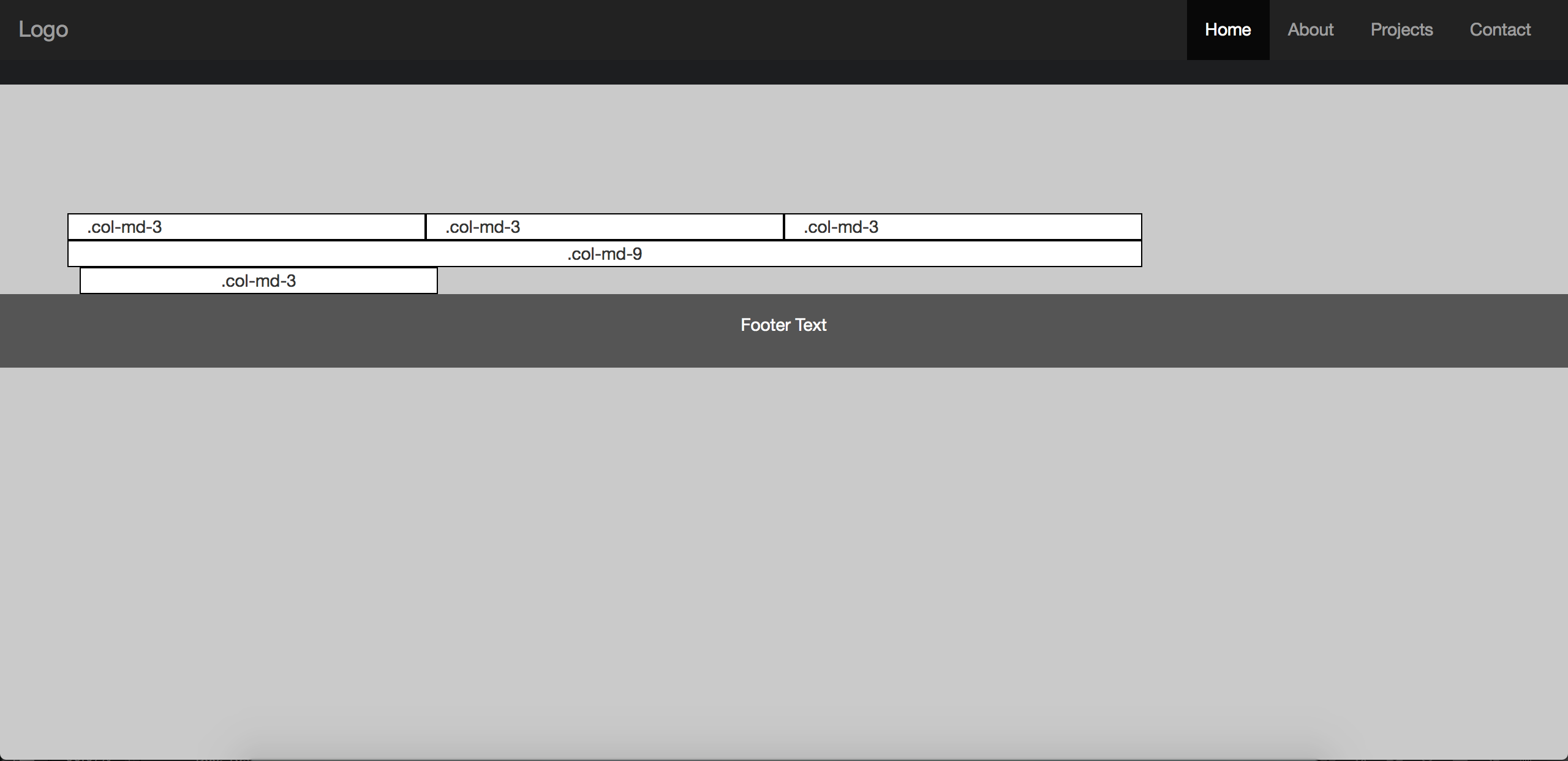
<div class="container text-center">
<div class="row content">
<div class="col-md-3 text-left">.col-md-3</div>
<div class="col-md-3 text-left">.col-md-3</div>
<div class="col-md-3 text-left">.col-md-3</div>
<div class="col-md-3"></div>
</div>
<div class="row">
<div class="col-md-9 blog">.col-md-9</div>
<div class="col-md-3 sidebar">.col-md-3</div>
</div>
</div>
<footer class="container-fluid text-center">
<p>Footer Text</p>
</footer>
</body>
</html>
My problem is that in my mockup, I have 10px of “gutter” between each column, whenever I add this in with “margin” CSS, it throws the page out of whack.
Also, the main blog block (the big white one) is 9 columns. the sidebar(black thing next to it) is 3 columns. Whenever I input the respective columns WITH margin, it pushes it to a new line. Like so:
I’m really new to bootstrap, but it’s throwing me for a loop! Any help is appreciated! I would really like to learn this properly.
Also, is there any way to center the columns like I have in my mockup?
2
Answers
first: remove the margin-right and margin-left from .blog and .sidebar.
then: you can put a div inside div.col-md-3 with width:100% and background-color: white, and remove background-color:white from div.sidebar.
I hope it helps you…
Have you tried closing the container div after the first row, and opening a second container for the second row? Bootstrap does a wrap-around type thing when you exceed 12 columns in a container