 Question posted in


Hello I am tasked to make an input field look like the screenshot below:

I can do everything except the border shadow thing. Is this possible using css?
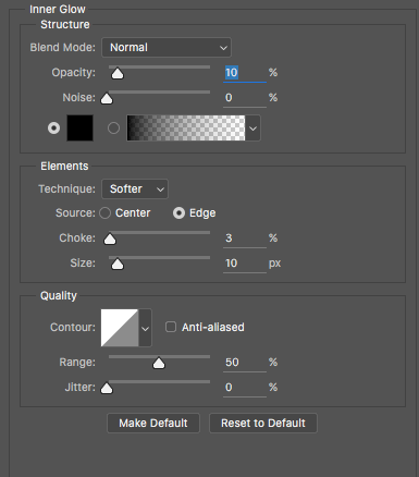
In the photoshop file, this layer is given an “Inner Glow” and this is responsible for the border shadow.
Here is a screenshot of the layer style:
Here is my css so far just incase it is needed:
#input_1_1 {
    background-color: #f1f5f6;
    border-radius: 12px;
    height: 47px;
    padding: 0 17px;
}
Thanks!
2
Answers
You need to use
box-shadow–just play around with the values until you match the mockup.Something like this: